Apluma opened its doors in 2018 with a concept that elevated traditional pollo a l’ast—rotisserie chicken—to a gourmet experience, led by chef Eugeni de Diego. In 2024, following a change of ownership, the new team approached the studio to completely renew the restaurant’s identity, both through its interior design and its graphic image.
The aim was to create a contemporary space that would preserve the essence of the traditional neighbourhood rotisserie: a modern setting with references to tradition, in keeping with a culinary offering based on a classic, high-quality product. Chef Víctor Ródenas, from Barcelona restaurant Maleducat, is now at the helm of the gastronomic proposal.
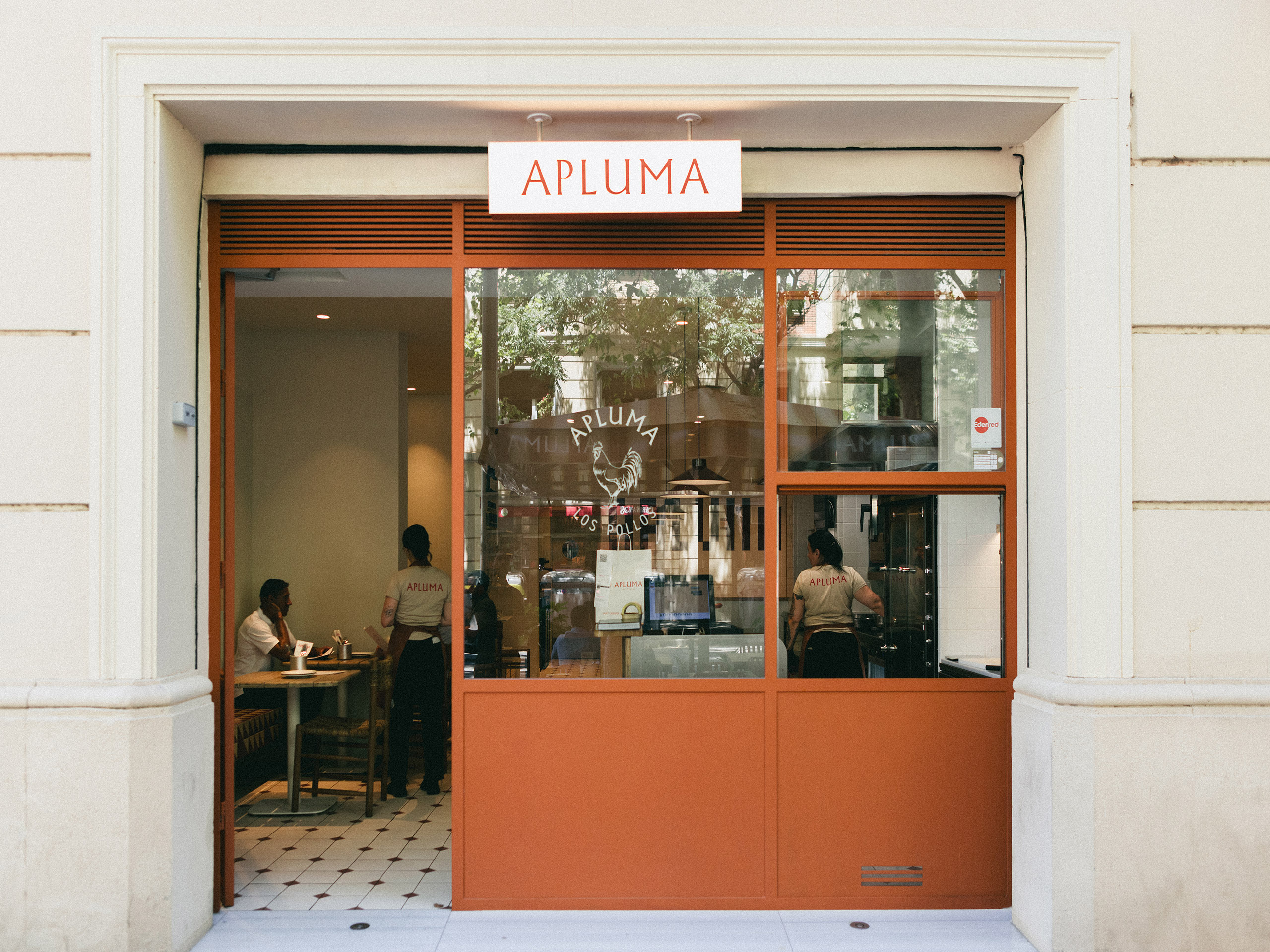
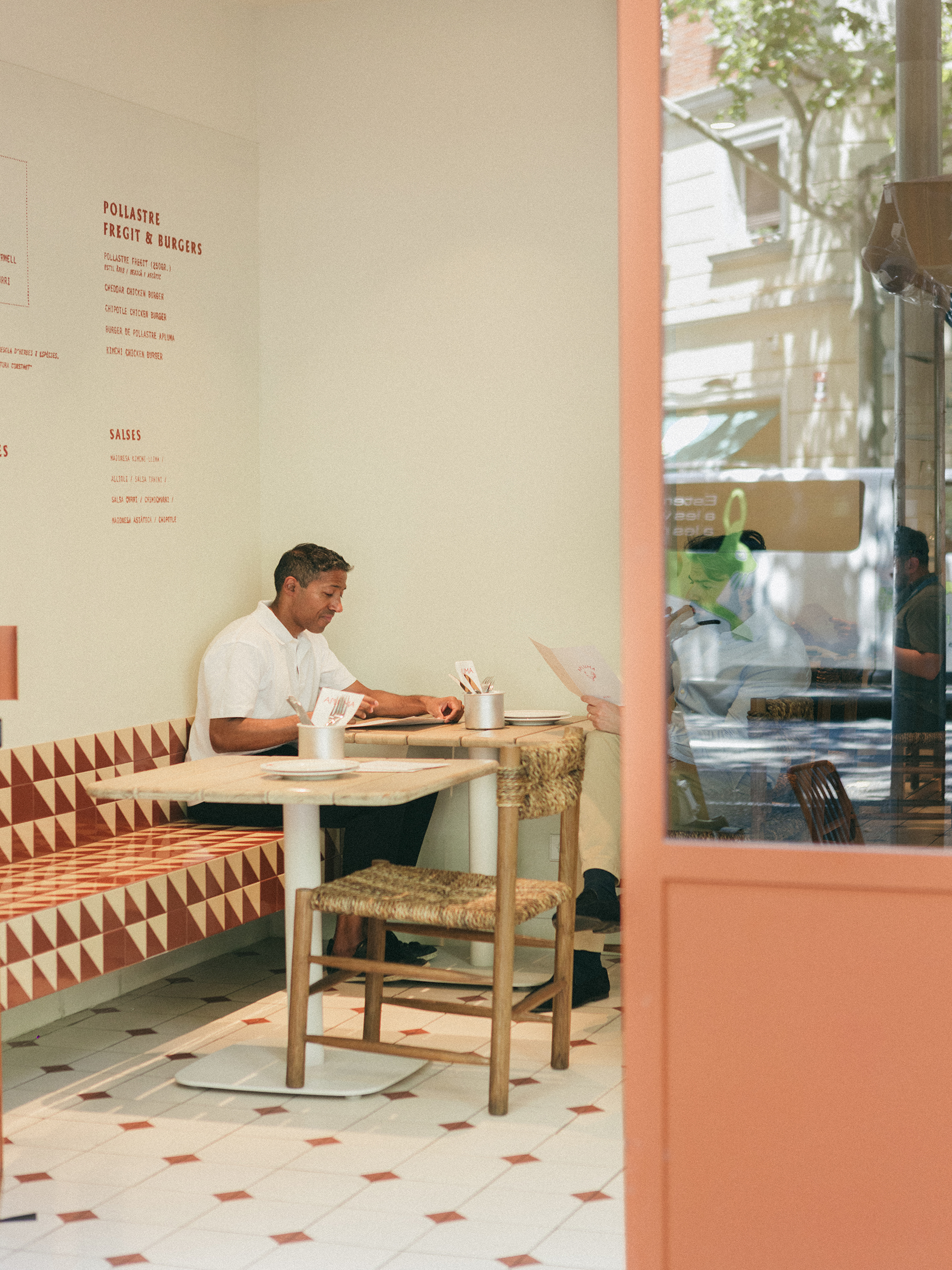
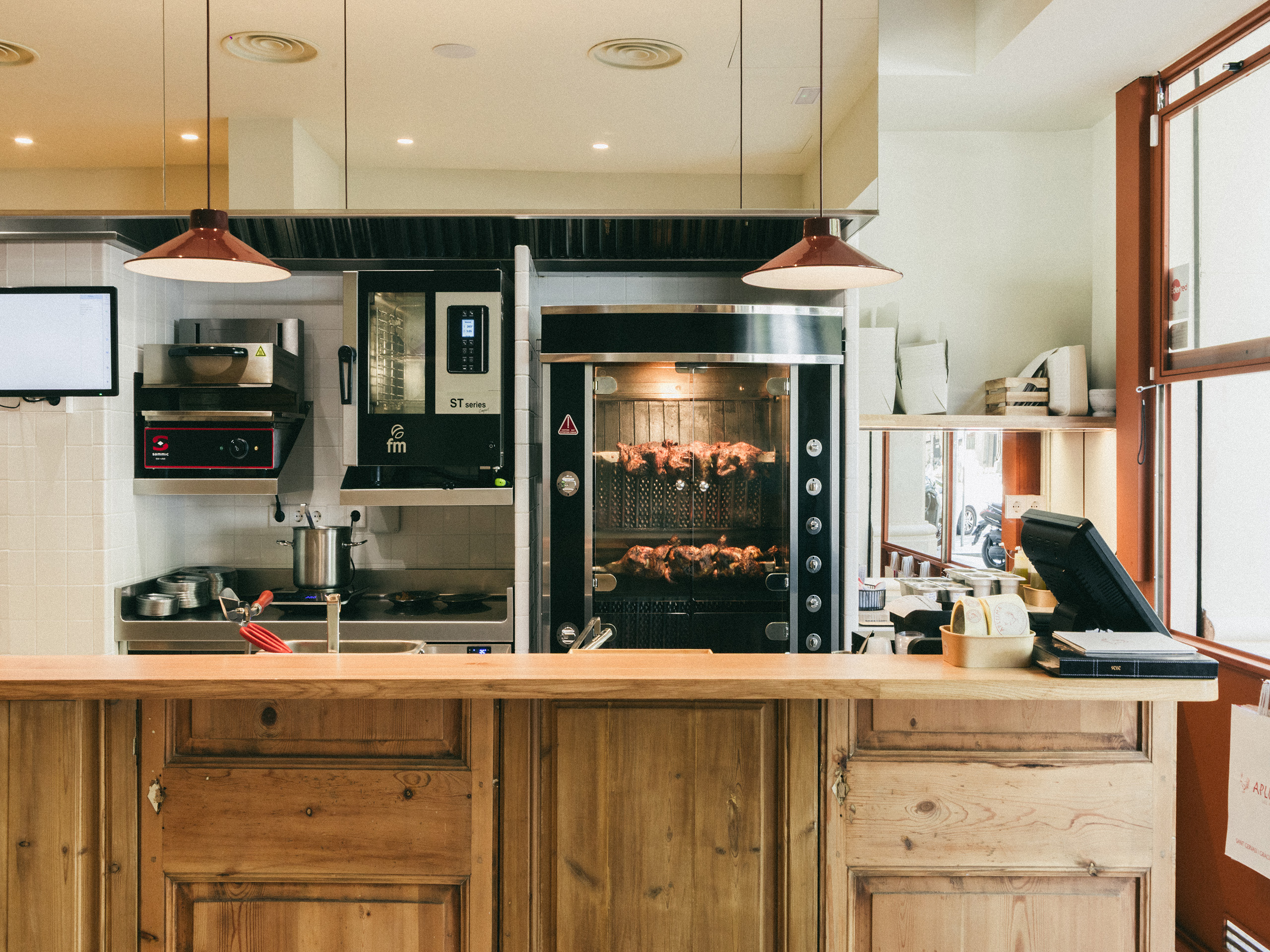
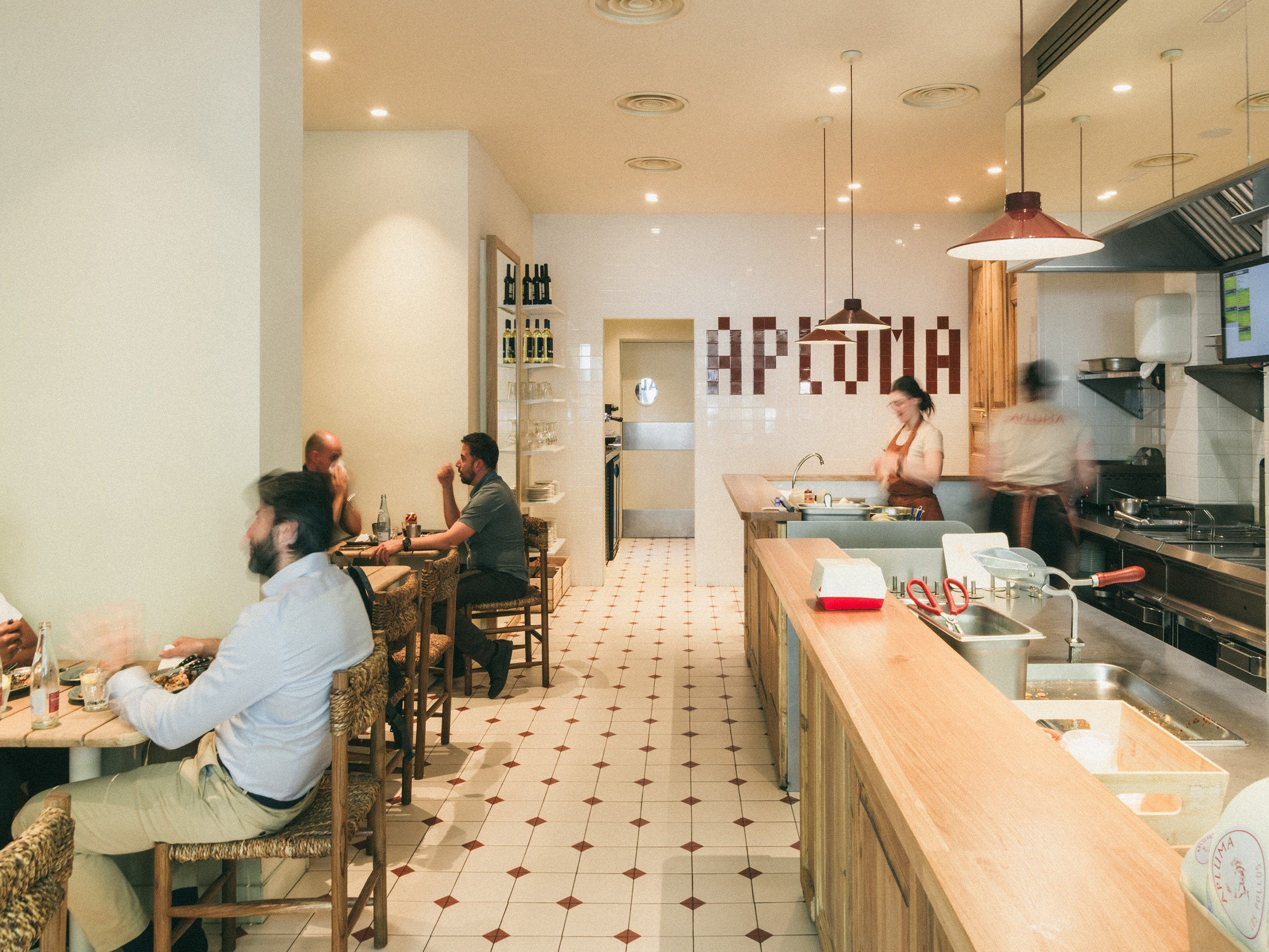
The interior design of Apluma, located on Carrer Europa, starts from the particular proportions of the premises: a rectangular space with a narrow façade. This characteristic led us to organise the restaurant into two clearly defined areas: the dining room on one side and the open kitchen on the other, making the kitchen the heart of the space.
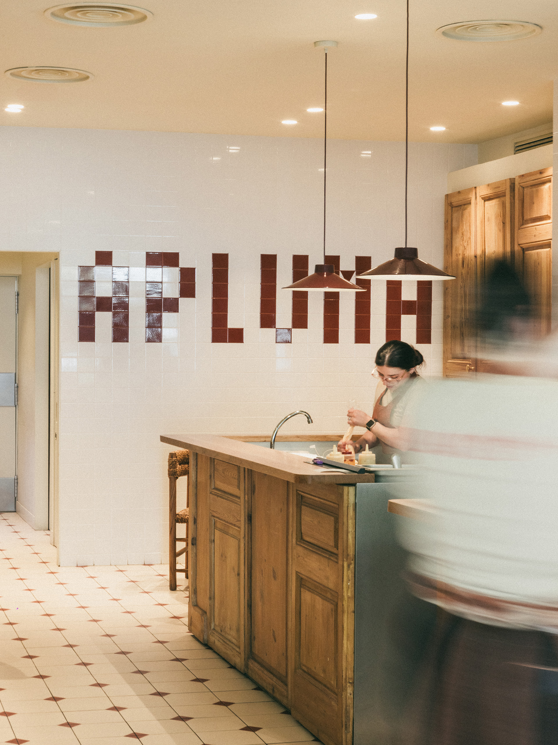
The materials reflect the culinary proposal: traditional, familiar cooking, but with quality and a contemporary touch. We therefore chose elements reminiscent of classic rotisseries, such as white tiles, hydraulic flooring, white marble and wood. Combined with earthy tones, these materials bring warmth and character to the space.
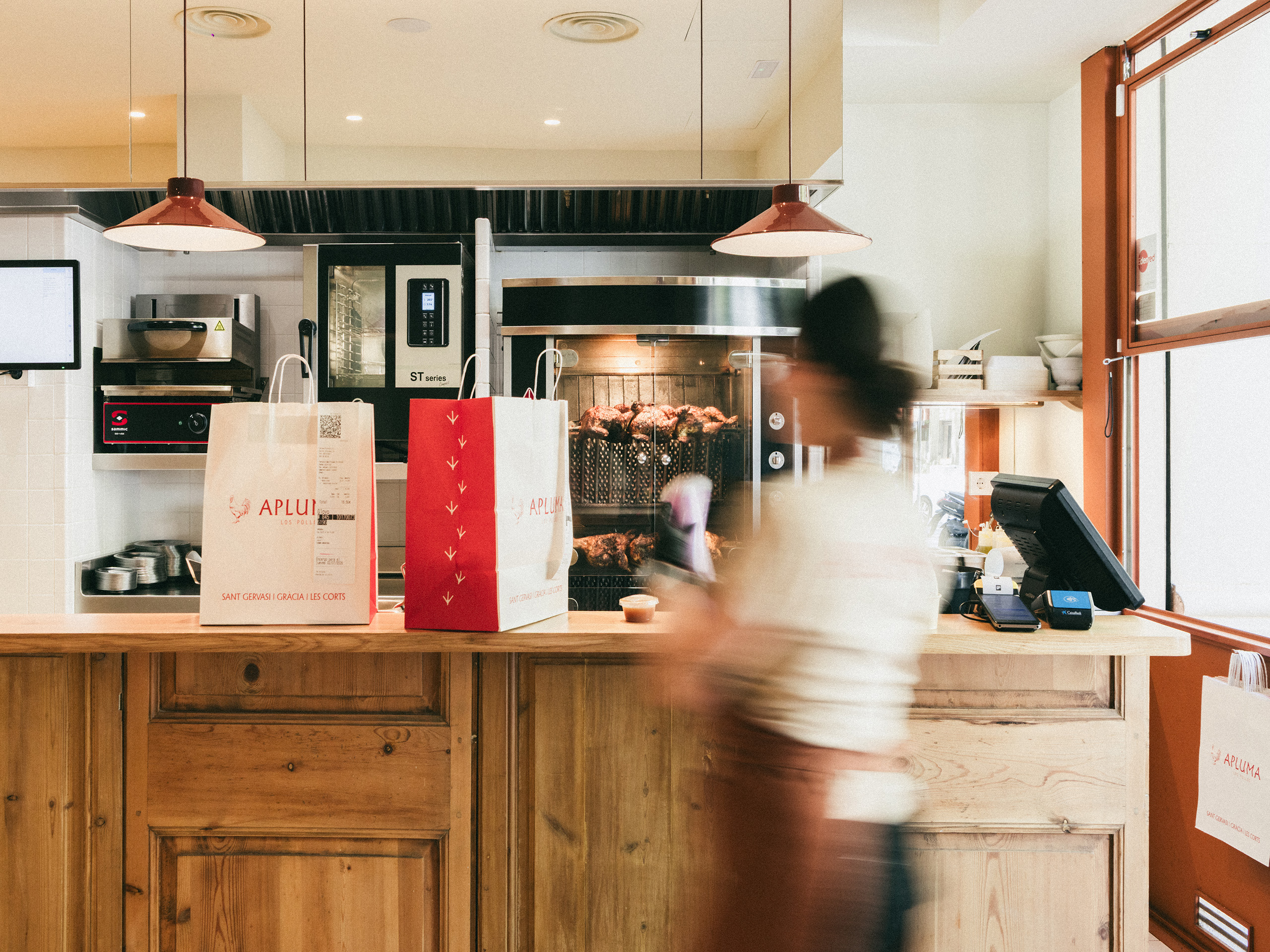
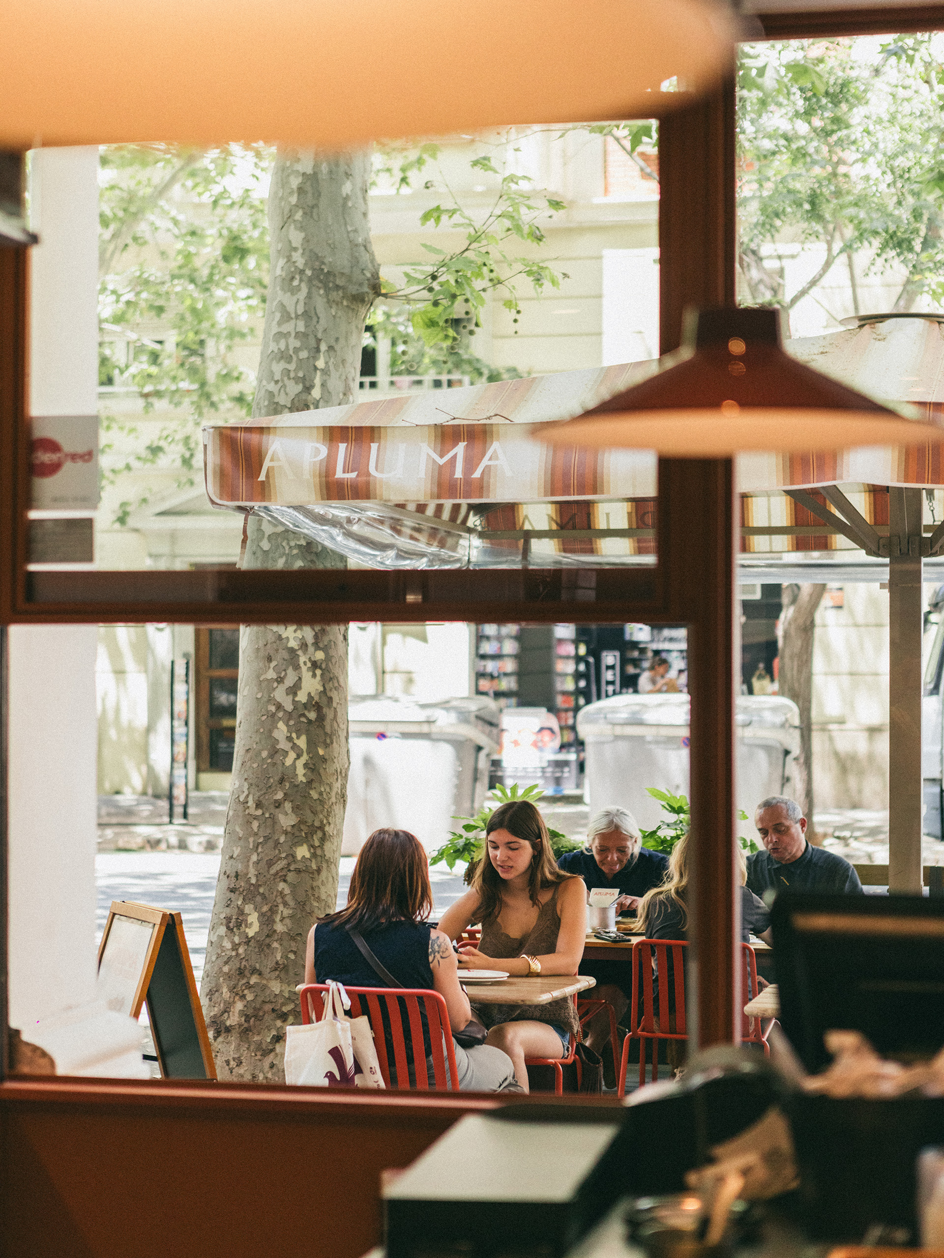
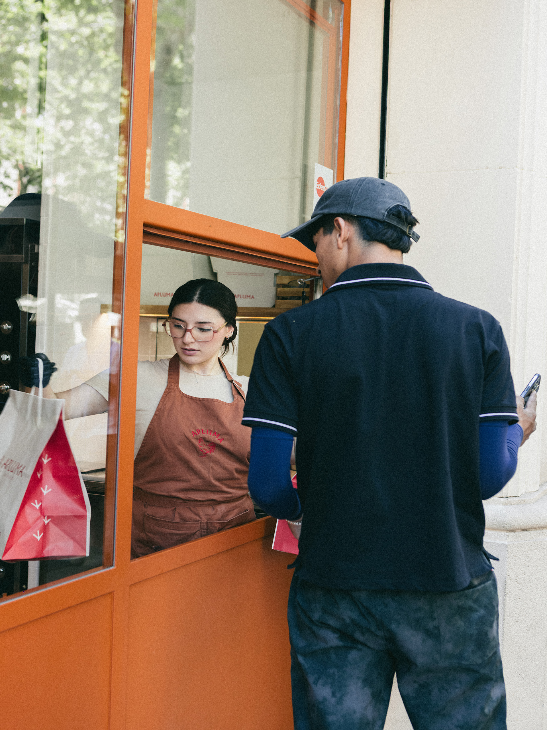
One of the main objectives was to optimise the working area for the kitchen and service staff without interfering with the flow of customers. The guillotine-style opening in the façade allows riders to be served directly from the street, keeping the interior more open and comfortable for diners.
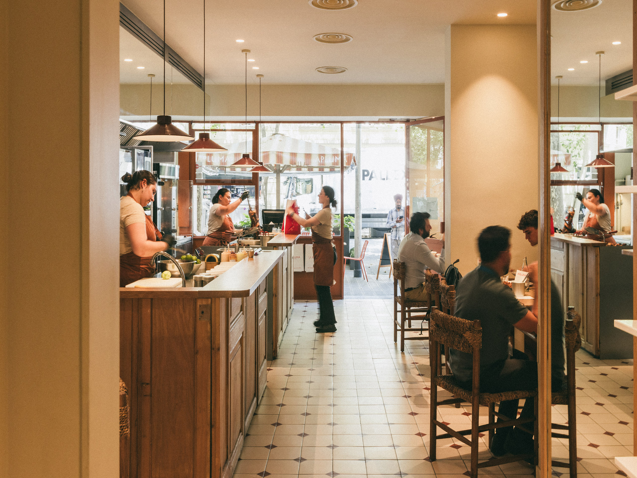
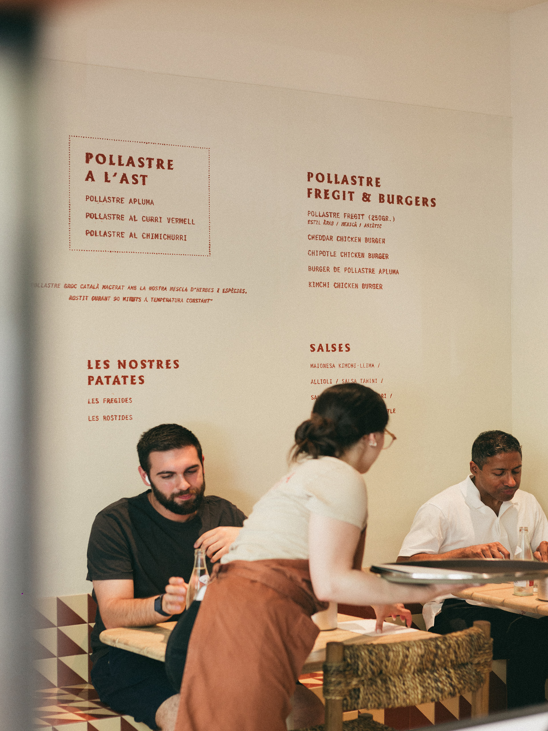
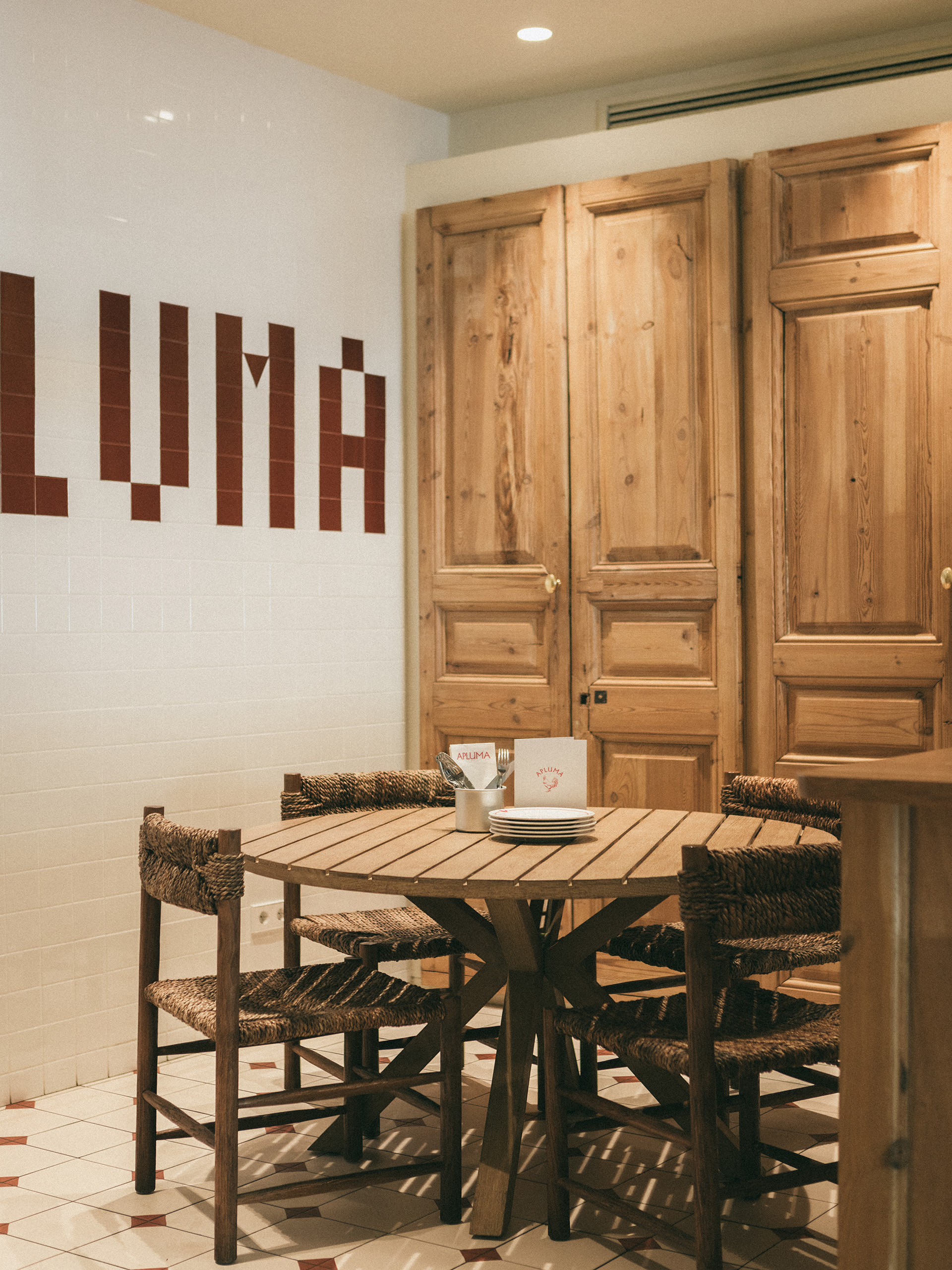
From the street, the kitchen takes centre stage, and above all, the chickens themselves. Counter units made from reclaimed wooden doors divide the two areas, bringing warmth and an authentic character to the space, while also serving as a pass for the waiters. At the back, a wall clad in white tiles incorporates a mosaic spelling out the name APLUMA, integrating the graphic identity into the space in a more distinctive way.
The use of mirrors in certain elements, such as the extractor hood, helps to visually enlarge the space and reduce the feeling of narrowness, bringing more light and a greater sense of openness to the restaurant.
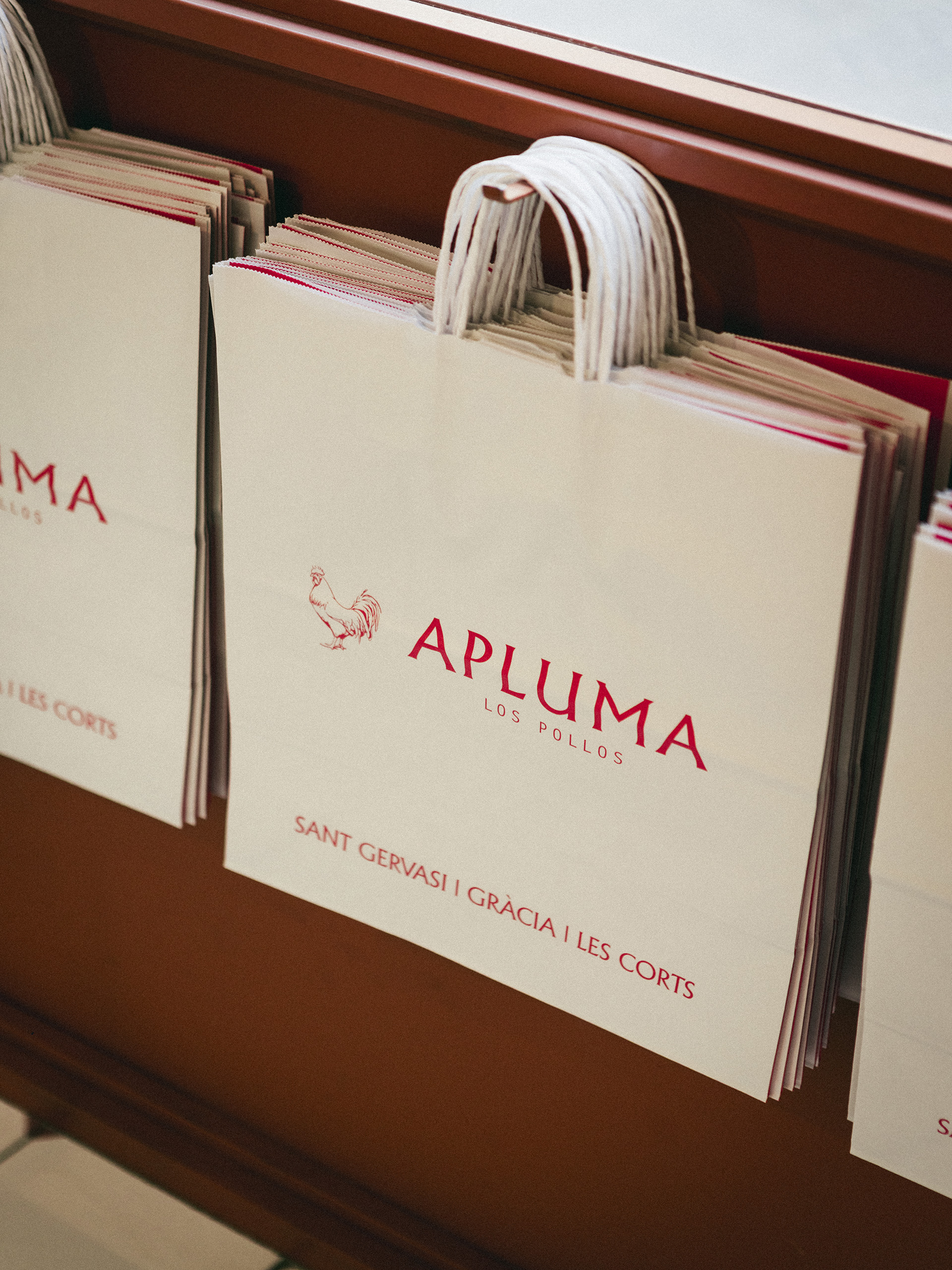
In terms of graphic design, the brief was to update the logo, visual identity and packaging. The previous identity had become outdated and no longer reflected Apluma’s new positioning. At the owner’s request, the proposal retained the original corporate colour and typeface, while redefining the logo through a more restrained and contemporary language, aligned with the new identity of the brand.