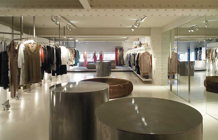
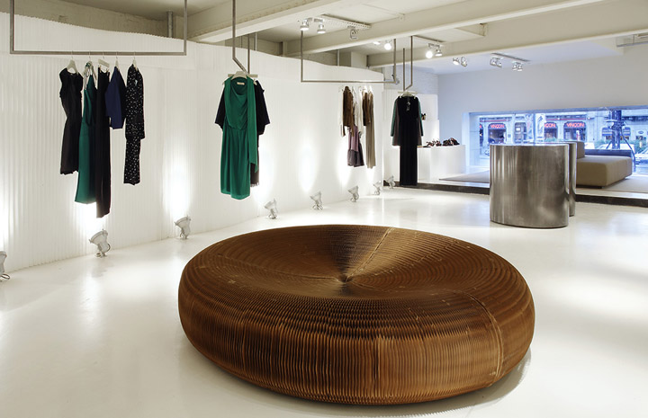
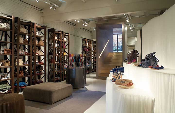
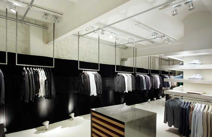
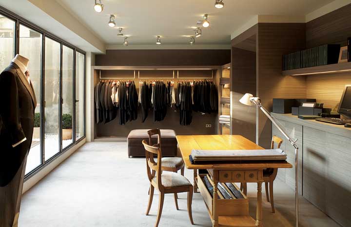
Santa Eulàlia interior design on Paseo de Gracia in Barcelona is unique and focuses on the temporality and transience of the space. The decision to move the store to an adjacent location for a year has led to an approach that largely preserves the existing characteristics, using minimal resources for the transformation.
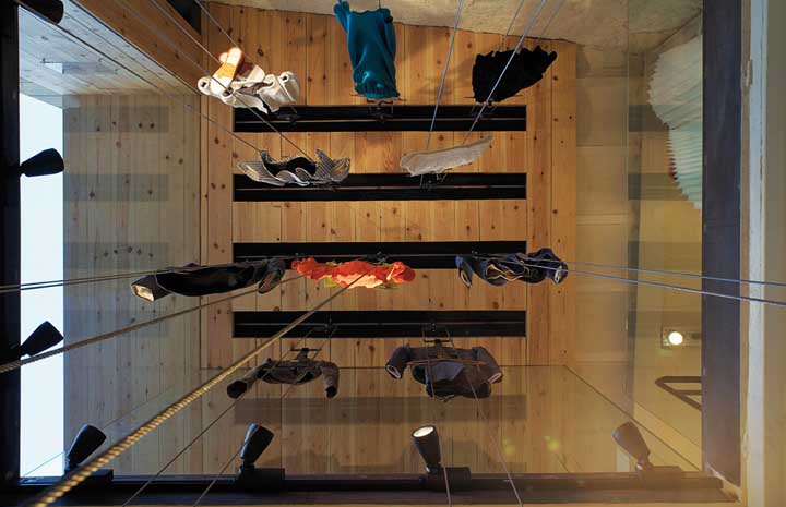
On one hand, the original layout has been largely maintained. One notable feature is a void on the ground floor that provides a visual connection between the basement and allows natural light to enter. This decision contributes to a more open and luminous experience inside.
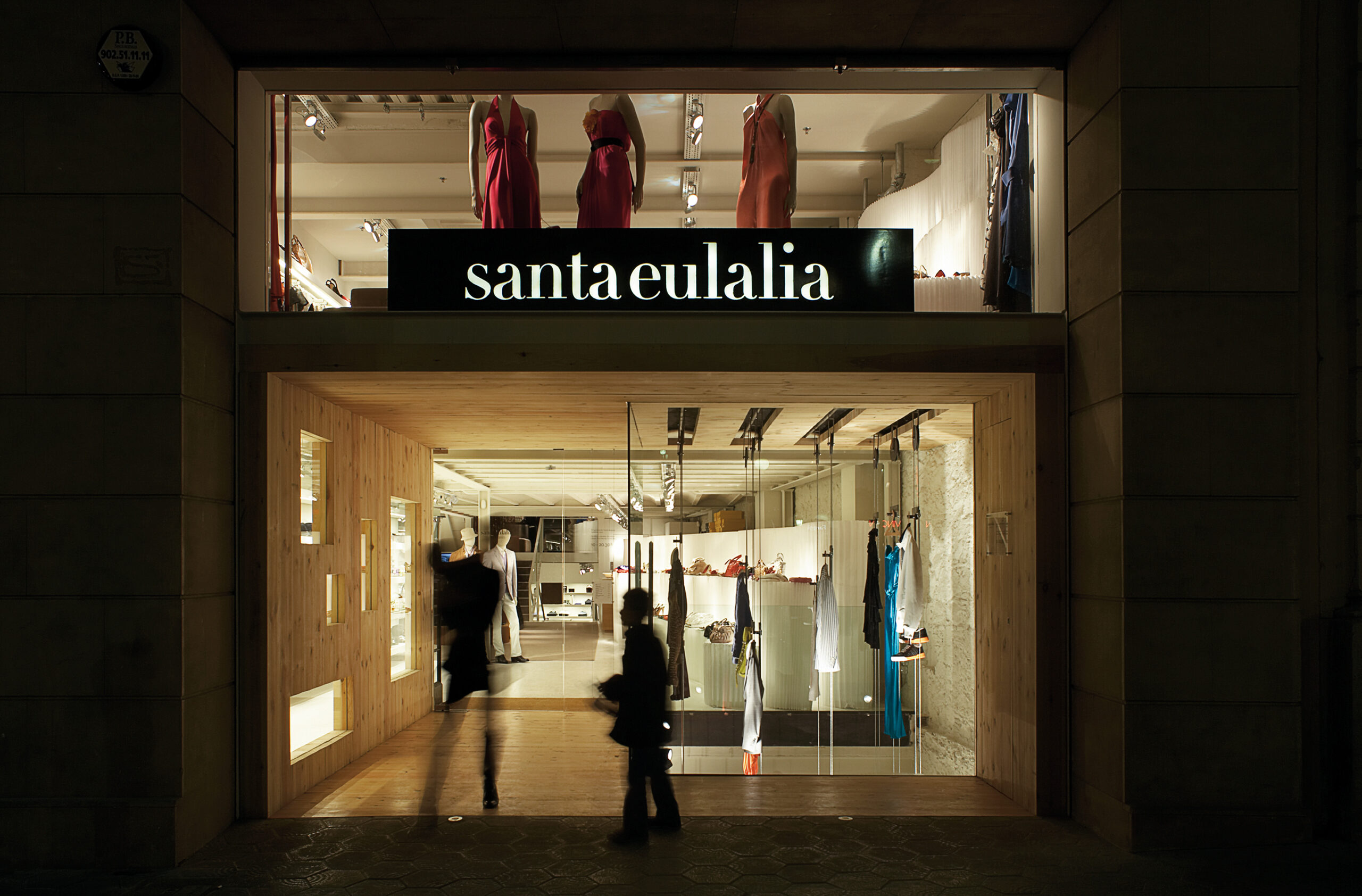
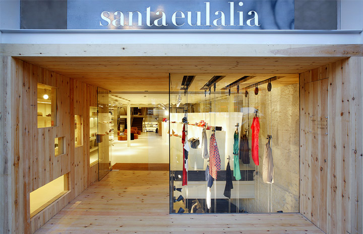
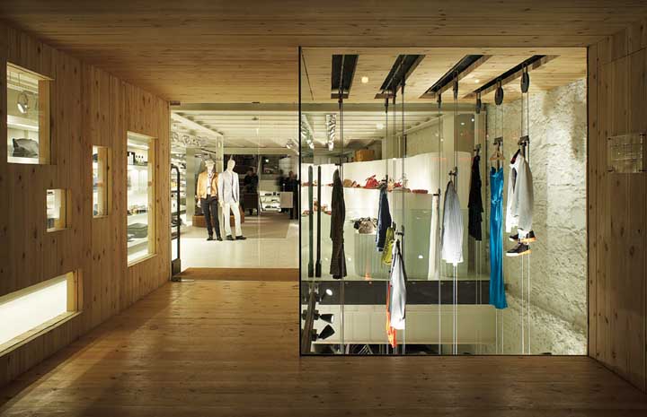
The vertical arrangement of the mannequins in the new window, spanning two and a half floors, creates a visual unity that facilitates understanding of the space as a whole. This architectural choice reinforces continuity between the different levels and provides a unique perspective for customers.
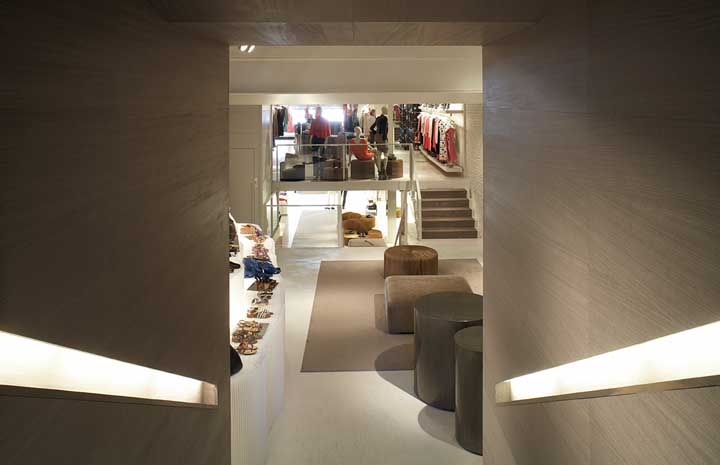
The presence of a wooden tunnel at the end of the store, with stairs leading to an adjacent space where the tailoring area is located, adds an intriguing and functional element. This tunnel not only serves as a visual transition element but also fulfills the practical function of linking the main store with the area dedicated to tailoring.
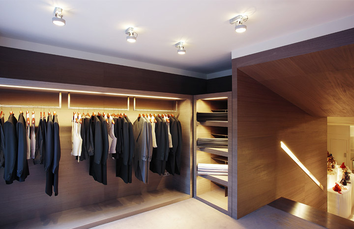
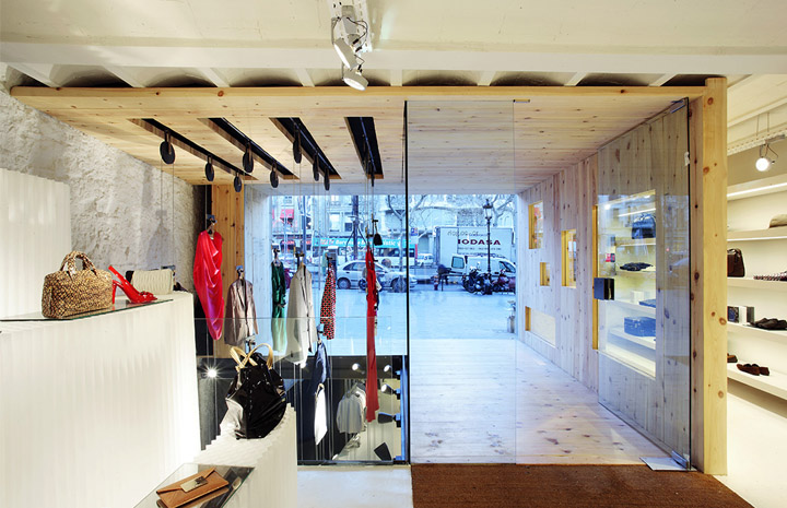
Overall, the interior design for the Santa Eulàlia store seems to focus on spatial cohesion, maintaining the identity of the original space while introducing visual and functional elements that enrich the customer experience.
Discover here other stores renovated and designed by the Sandra Tarruella Interioristas studio.
