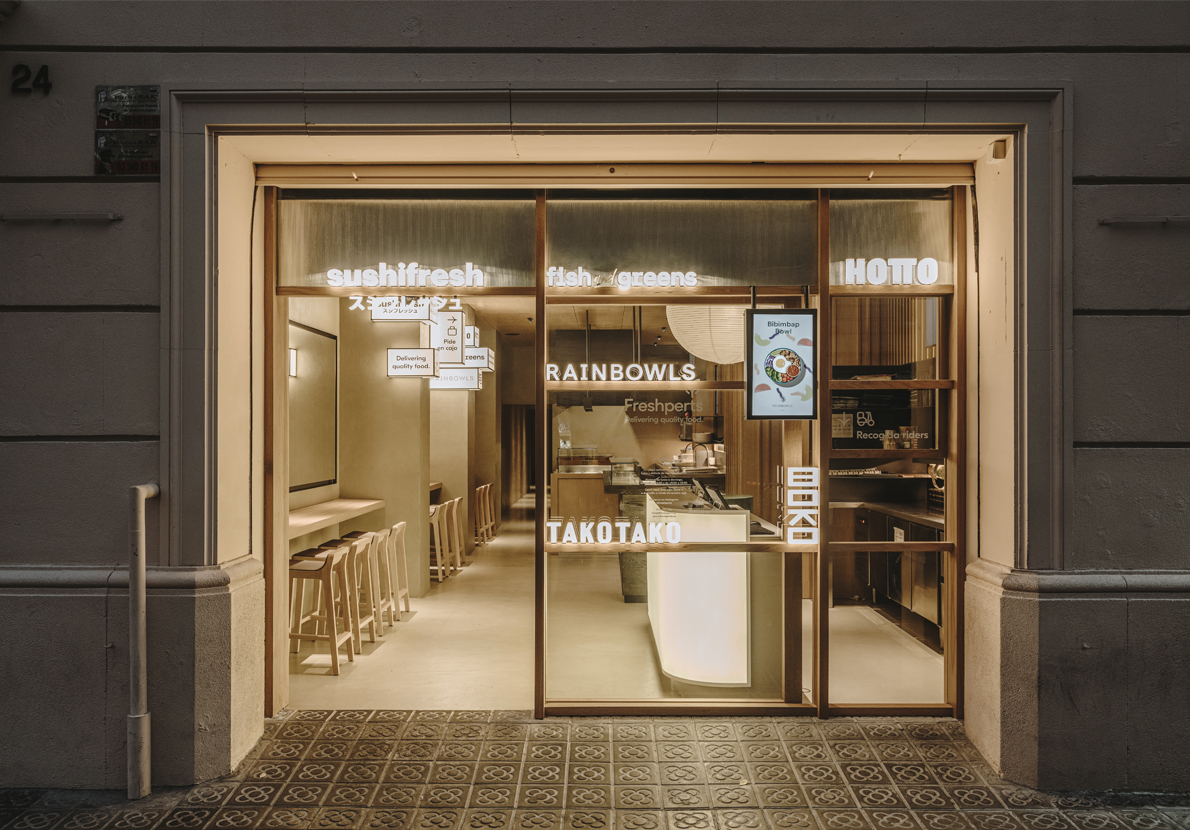
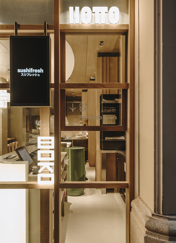
Freshperts Barcelona restaurant renovation marks the continuation of Freshperts’ expansion plan, being the second location in the Ciutat Comtal, on Europa Street, and featuring a different morphology from the first, being rectangular with a narrow facade.
The use of a guillotine window, perfect for riders, to connect the interior and exterior is due to the loss of independent access. Additionally, the wooden carpentry and signage adapt to this new typology, maintaining the essence with vertical slats that give materiality to the facade and support luminous acrylic signs.
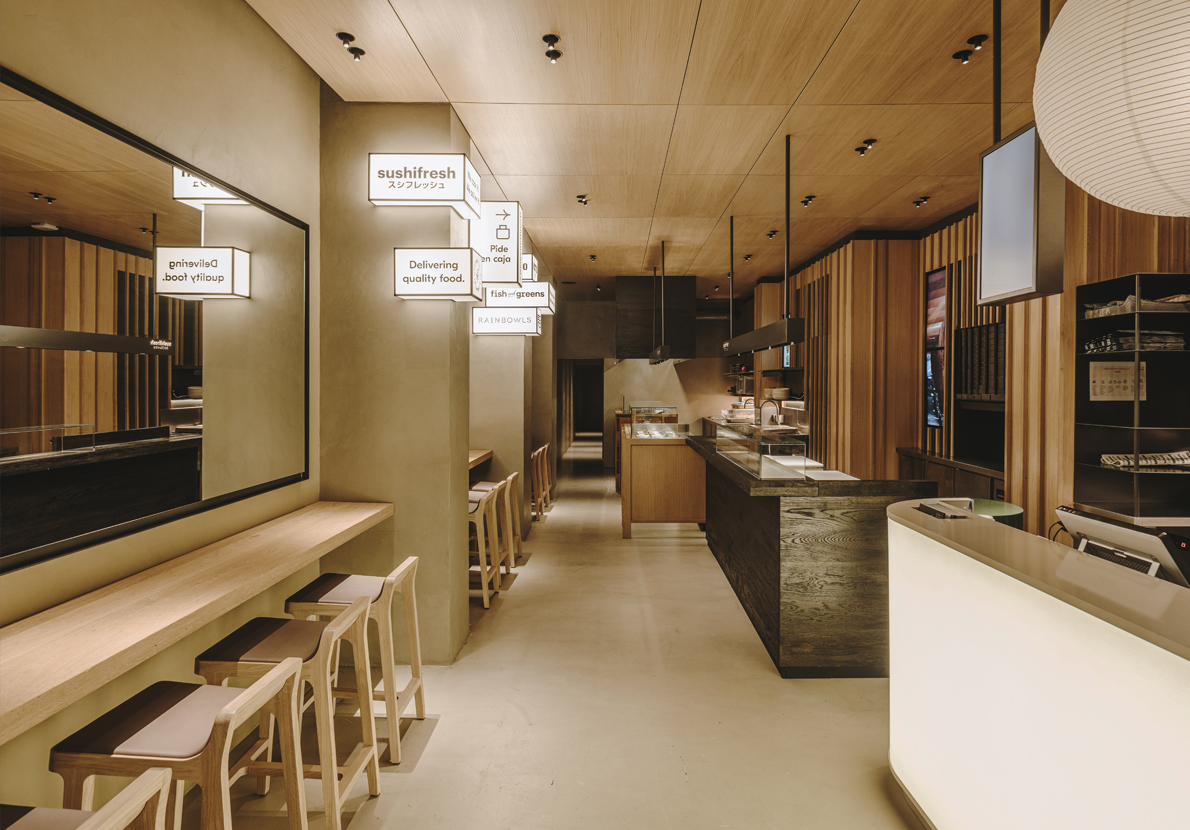
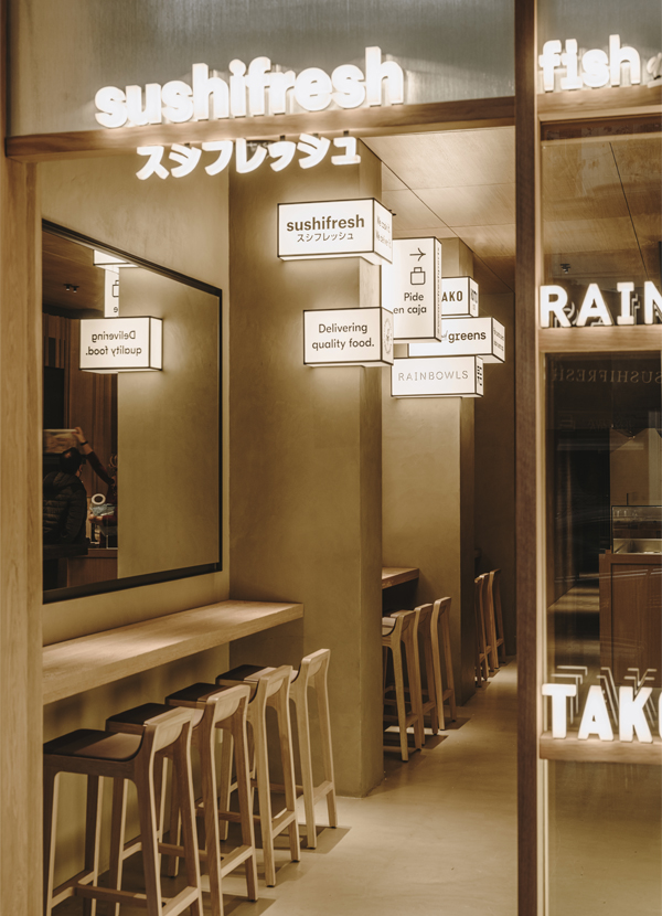
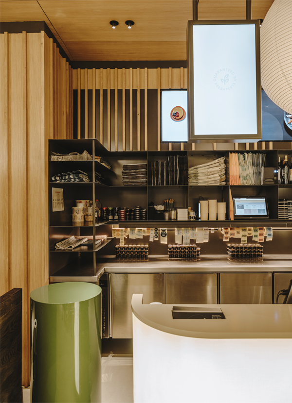
Despite having a narrow interior, the counters are arranged in a row, alternating for dynamism and versatility. The counter for customer service, payment, and order pick-up is located next to the facade.
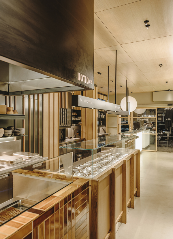
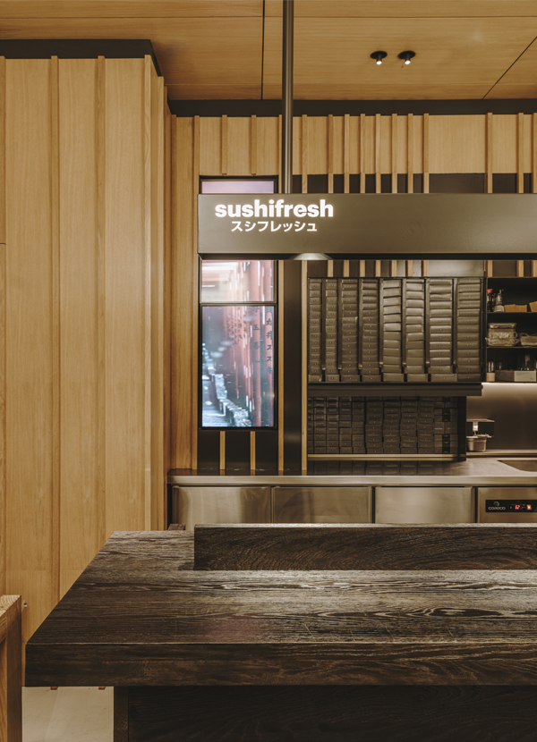
Specific counters are placed for different gastronomic offerings such as Sushifresh, with black oak wood; Fish&greens and Rainbowls, in natural oak; and Boko Hotto, inspired by Asian aesthetics with artisanal tiles and a large black iron hood.
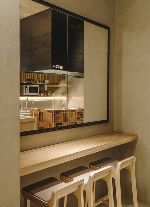
Finally, in front of the counters and as part of the renovation of the Freshperts restaurant in Barcelona, wooden bars with stools and large mirrors with iron frames are designed to visually expand the space and provide an area for tasting dishes.
Explore more restaurant projects designed by Sandra Tarruella Interioristas.