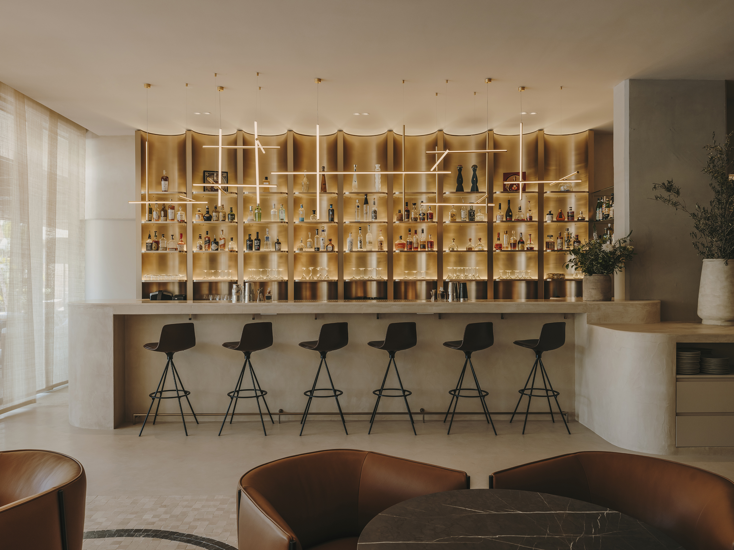
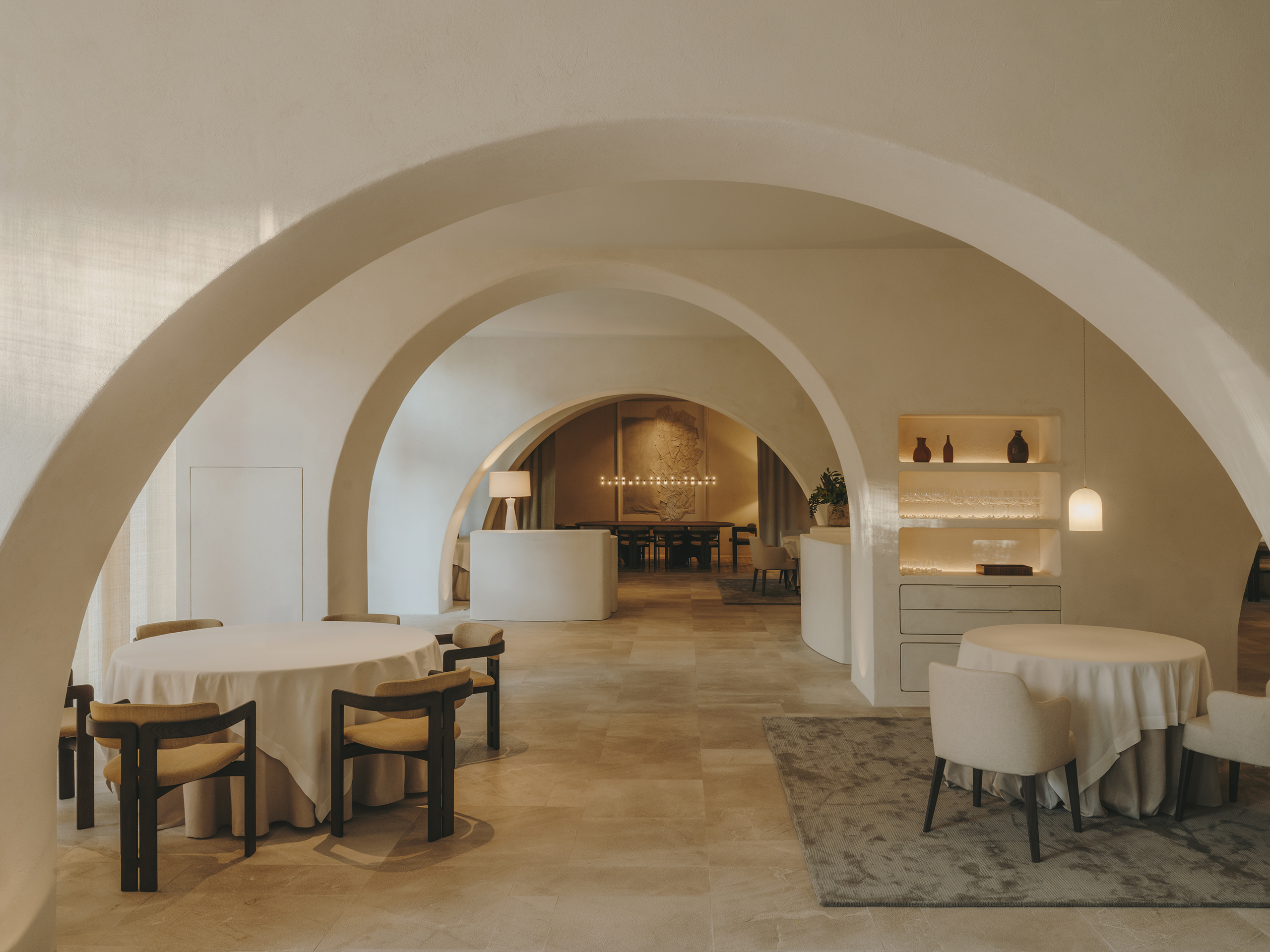
Cuines Mexico restaurant design, where our client developed for this new adventure a business concept inspired by different markets around the world.
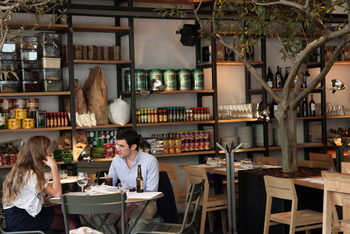
The interior design project creates a space where the mixes of different cuisines from around the world is very important, therefore they are arranged separately and open, where they interact with the rest of the premises. The storage was also solved with a market pantry language, where the product is displayed on a large double height iron and wood display shelf.
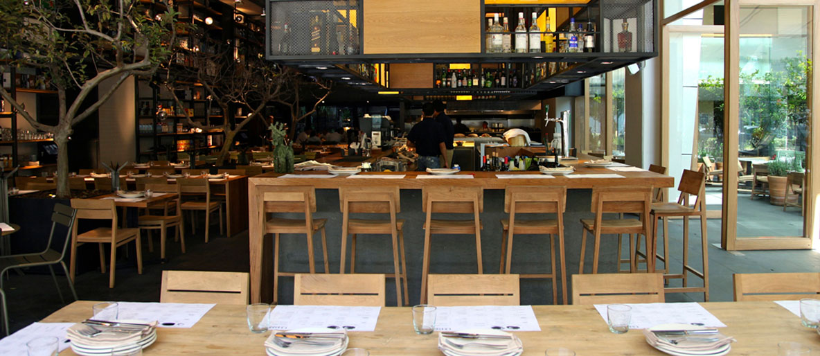
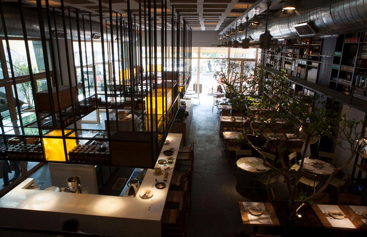
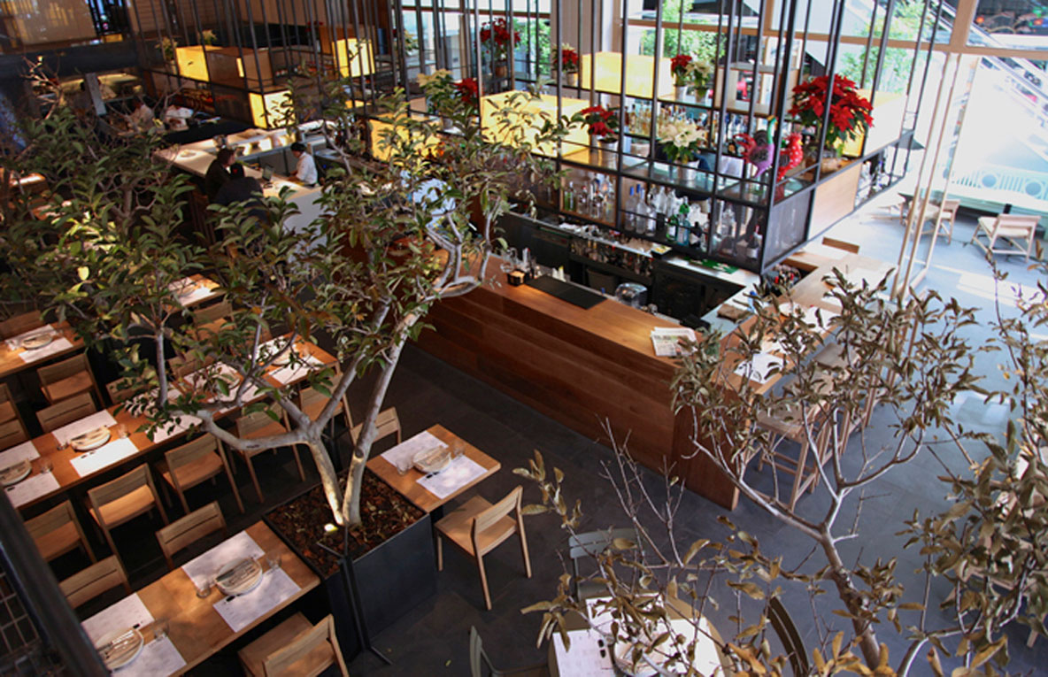
The main rectangular space with a high ceiling is open on two of its four sides to the outside, and has a mezzanine on the rear. One of these openings connect to an inner square where much of the dining room is also distributed here.
Due to this connection, the double-height display shelf is located on the opposite wall, and the freestanding bars and kitchens are placed in the middle of the space, hence allowing to articulate the connection between both indoor and outdoor dining rooms.
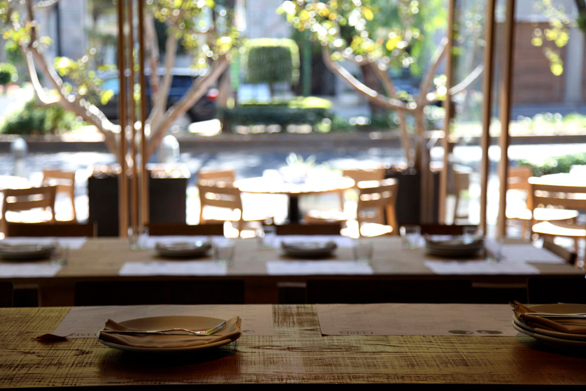
There is a clear intention to blur the boundaries between the two dining rooms, and therefore, the same volcanic rock flooring has been used in both areas, and where the permeability has been enhanced with the use of large oak wood pivoting doors, that once they are open, they serve as windbreakers and provide some privacy to the outdoor tables.
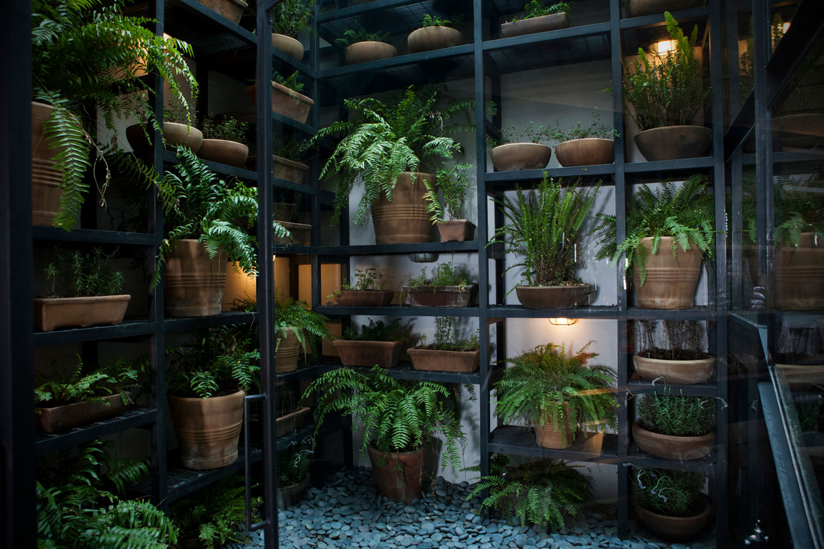
The landscape is another element present in both spaces and evokes vegetable garden products, and of crops, allowing to reinforce the idea of fresh, natural products. A living space, that also helps to organize the central dining space.
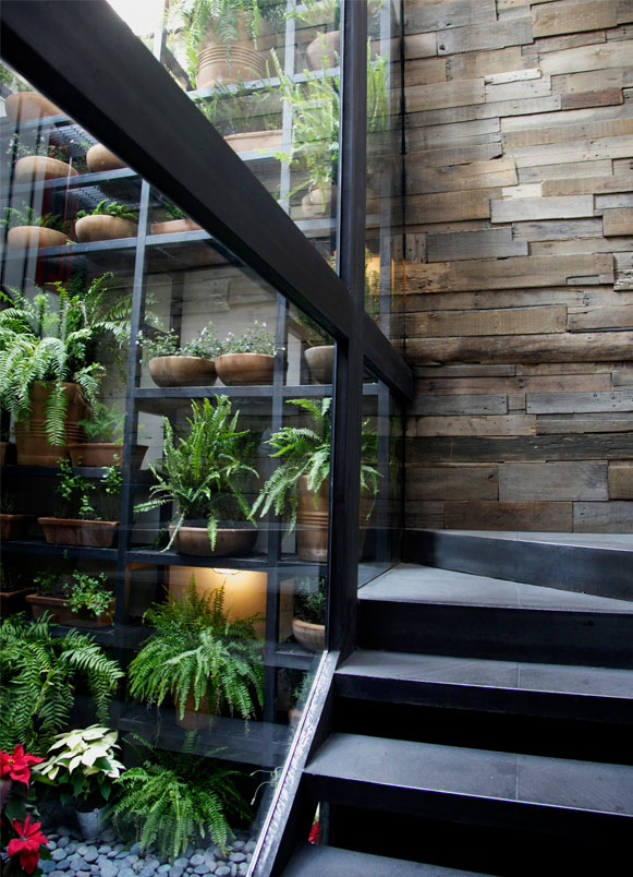
At the rear of the restaurant there is a small outdoor patio that houses the mezzanine stairs. In this courtyard, the double-height display shelf extends outdoors and has dozens of diverse pots with different plants, thus, creating a green wall. Once again, the idea of unifying spaces is carried out and the presence of vegetation is enhanced.
Both Bars and kitchens placed in between the two dining rooms are built from different materials such as natural oak wood, white marble or volcanic rock. Above them, a large iron wine glass racks hang from the double height ceiling in a container-like mode finished in oak wood, deploye iron sheet, and parchment. These large structures emphasize the verticality of the space, while they help to mixed the views to reinforce the idea of mixing, variety and the richness of various cultures.
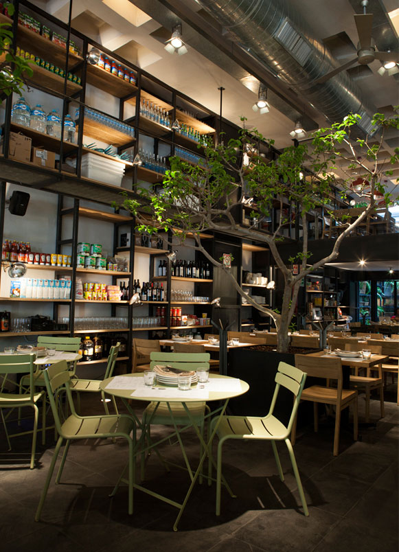
The existing concrete waffle slab is exposed, and a random light installation, within the waffles, help transform all this great partition into a lamp that enhances its beauty, while illuminating the whole.
The furniture that runs among the bars, the display shelf, and pots is a mixture of a very functional oak wood furniture collection by Ethnicraft, outdoor furniture pieces by Fermob, and large tables made with reclaimed wood tabletops especially designed for this restaurant. On the outdoor space, this same combination, besides garden benches -in painted wood -and a mixture of brightly colored cushions are found.
To end, on the mezzanine level, the VIP room and toilets are found. In both spaces, as well as the access staircase, the use of reclaimed wood for divisions, as well as to finish some walls, was carried out, and helps bring some warmth to the space.
Explore more restaurant projects designed by Sandra Tarruella Interioristas.
