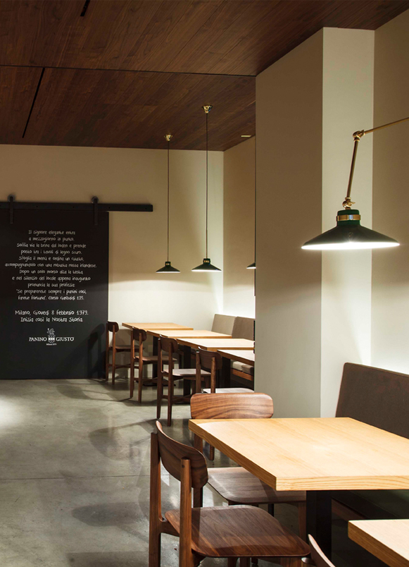
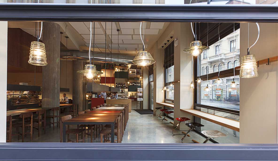
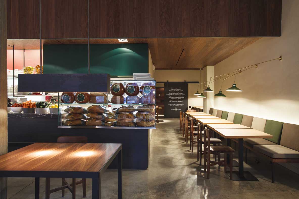
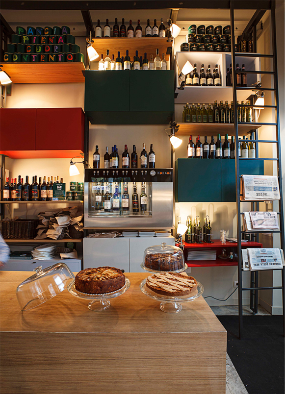
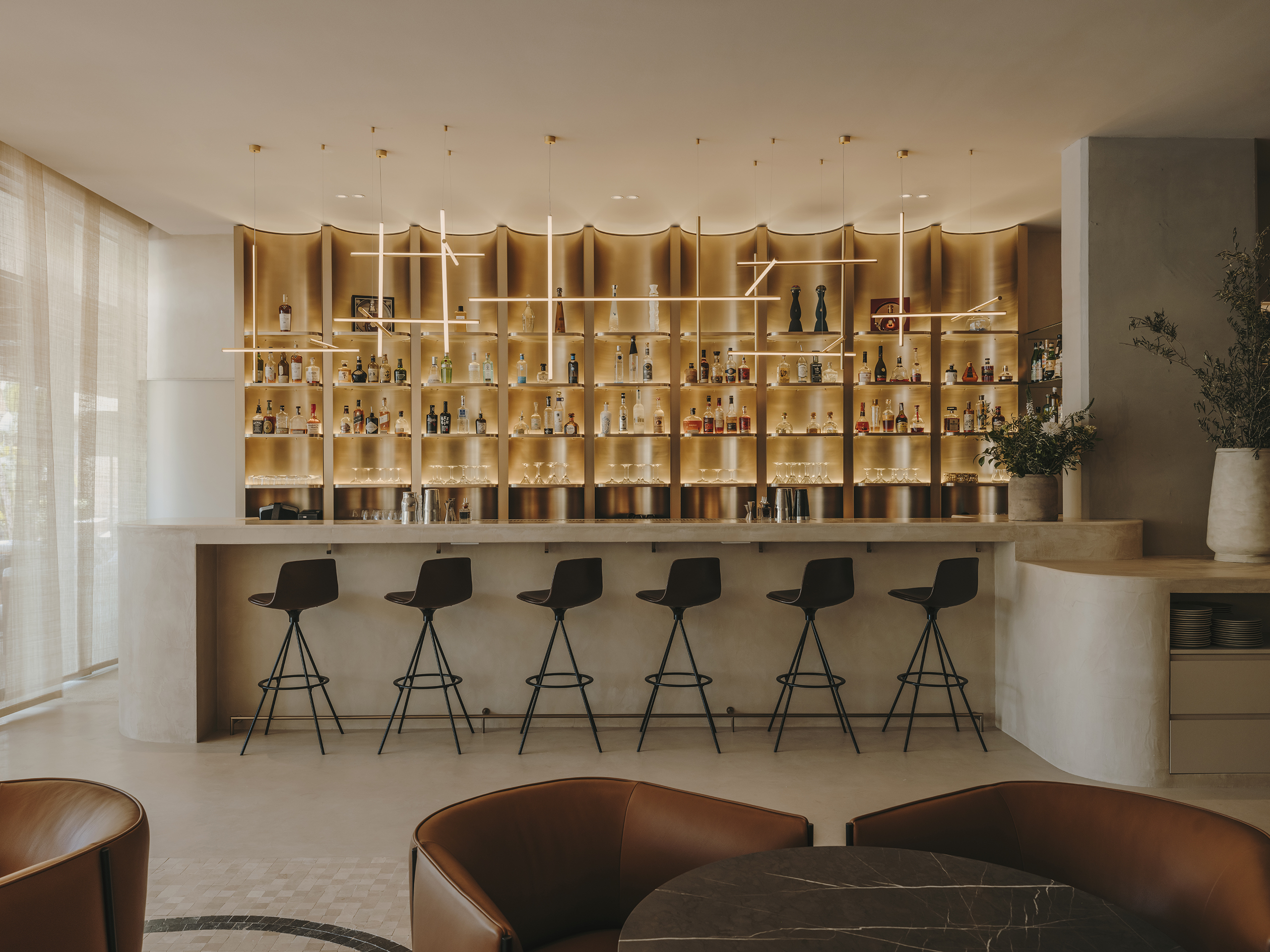
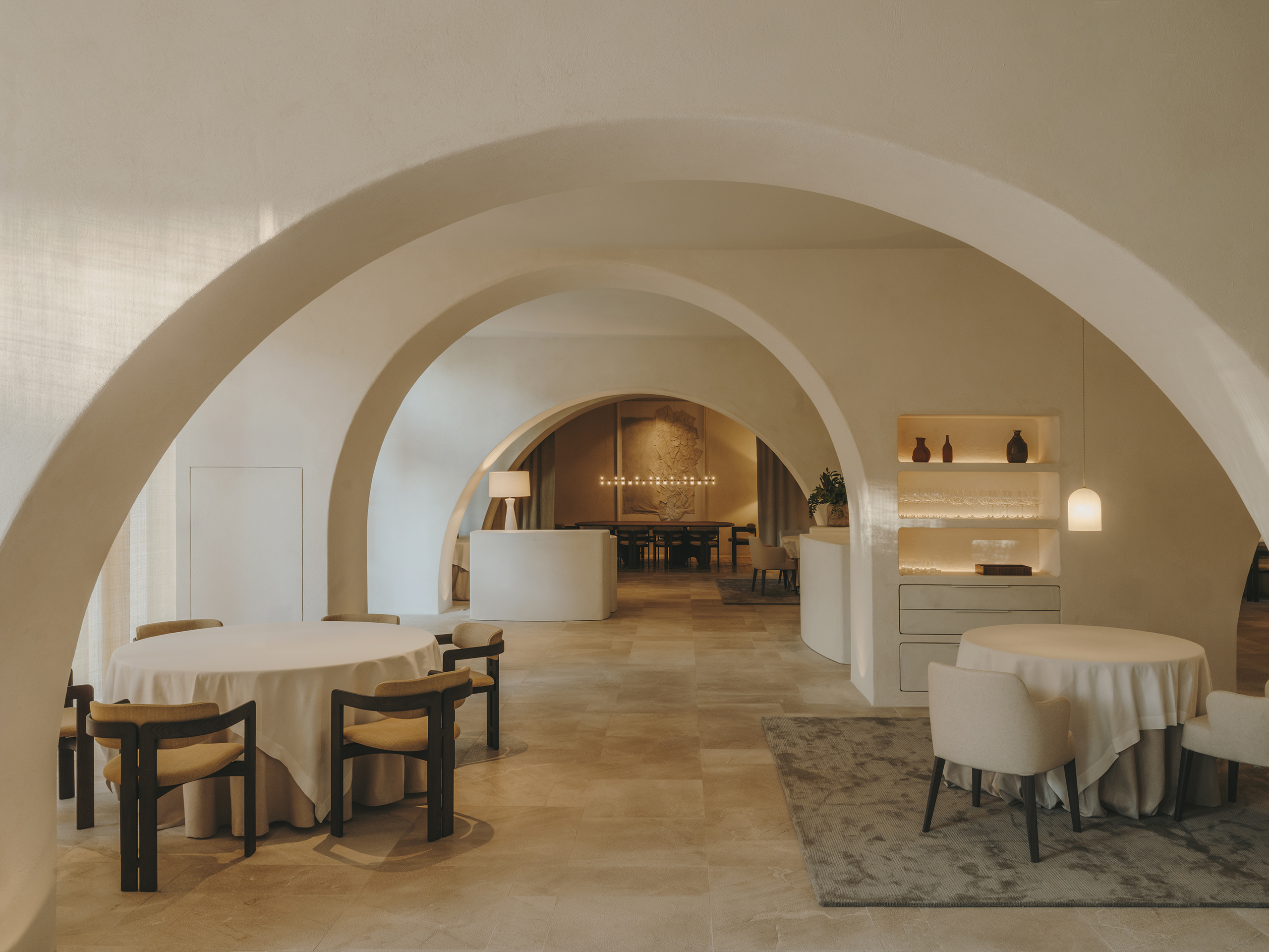
Panino Giusto interior design has been guided by the idea of creating an atmosphere that allows customers to immerse themselves in the history and essence of the brand from the moment they enter.
The goal was to establish a parallel between the history of Panino Giusto and the history of Milanese design. In this way, the concept is present at all times and is understandable and perceptible even from outside the premises. Inspiration came from elements of Italian Milanese architecture and design from the 1950s, 1960s, and 1970s, involving prominent designers such as Albini, Gio Ponti, Castiglioni, Caccia Dominioni, and Vico Magistretti. These references were merged with the use of Panino Giusto’s historical colors, namely green, red, and beige-cream.
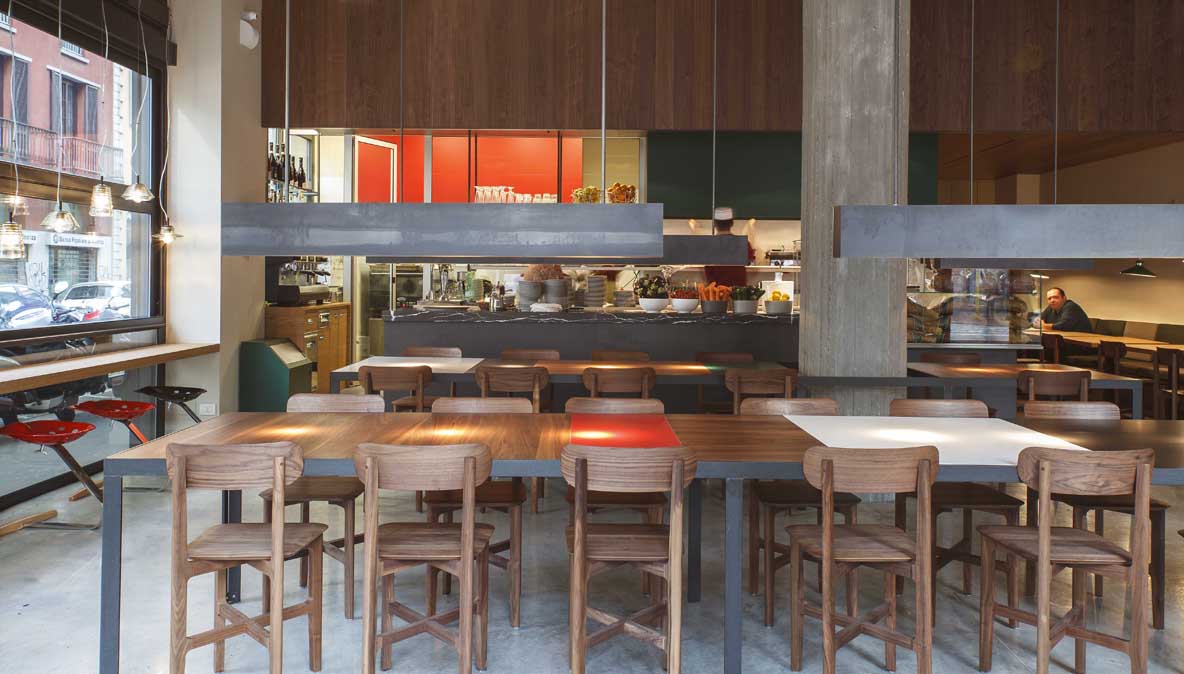
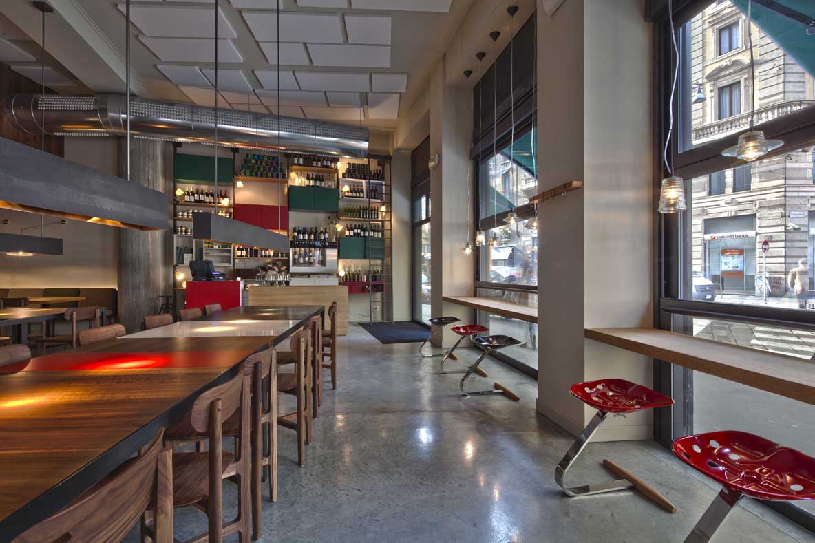
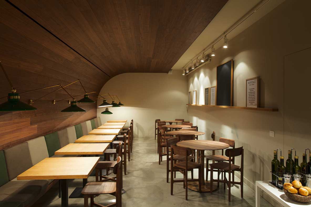
The intention in the interior design project of the Panino Giusto restaurant was to achieve a coherent visual narrative that conveyed the identity and legacy of the brand while honoring the rich tradition of Milanese design. The choice of specific colors and inspiration from the Italian design masters of those decades contribute to creating an environment that not only reflects the history of the brand but also immerses itself in the elegance and timeless aesthetics of Milanese design.
Explore more restaurant projects designed by Sandra Tarruella Interioristas.
