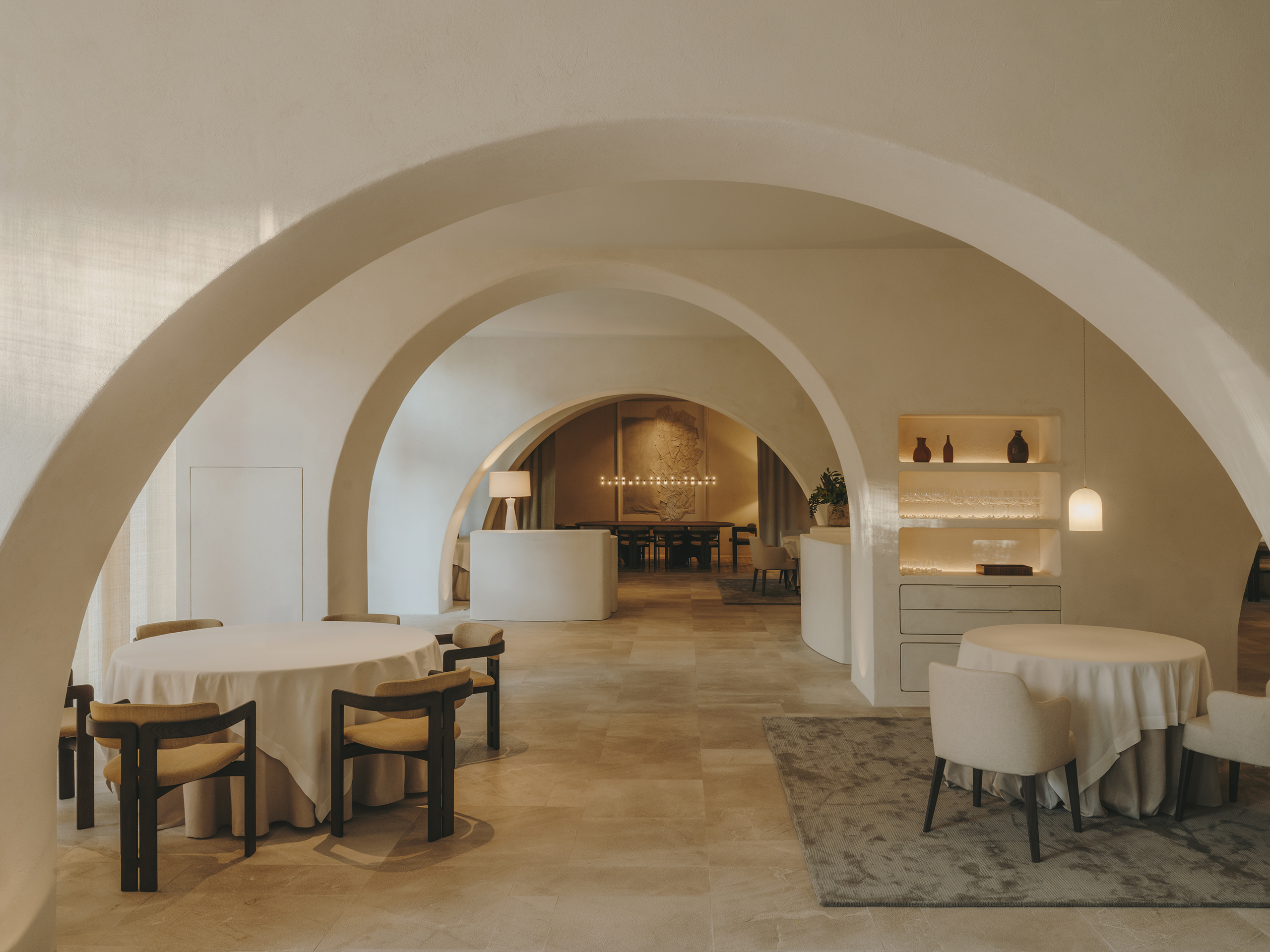
Grand Hotel Central’s renovation is based on the premise of creating a timeless space by blending the existing classical elements of the original building structure with others that add a cosmopolitan and modern touch.
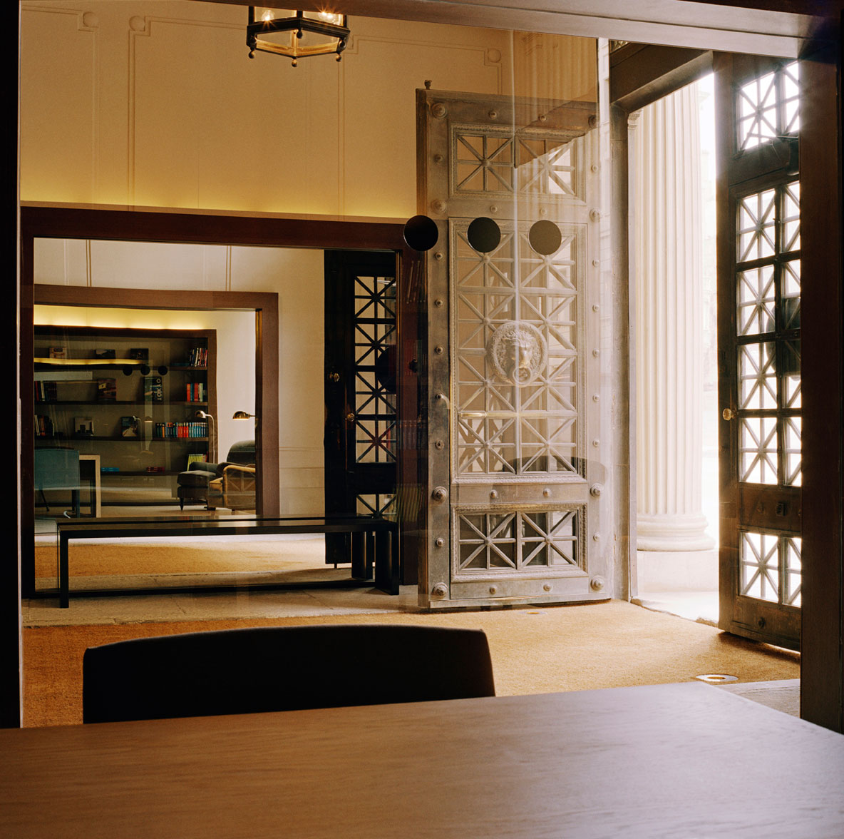
The lobby entrance of the Grand Hotel Central retains its original appearance, including ornamentation, flooring, lighting, and the main staircase. All these elements have been arranged respecting the preexisting character, with the exception of large wooden frames that float on the existing walls. On one hand, these frames serve to visually connect the library with the lobby on one side, while on the other, through a mirror, they reproduce the effect to maintain the symmetry of the ensemble.
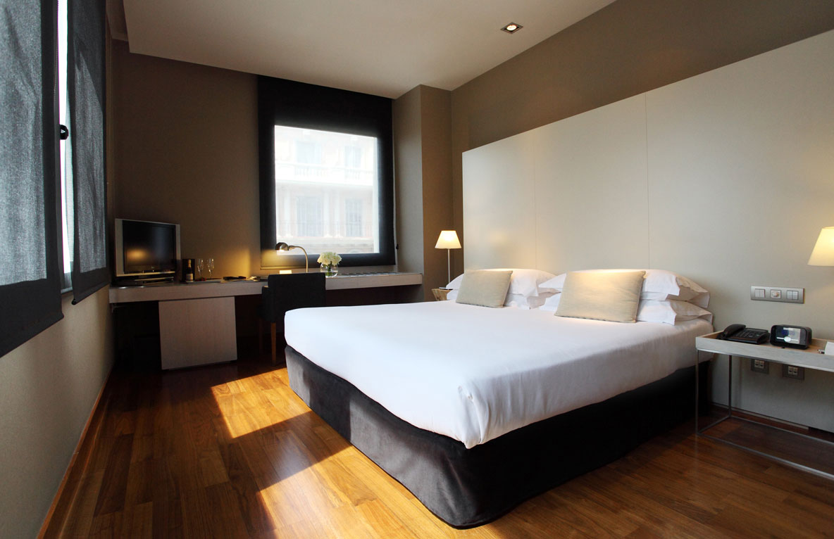
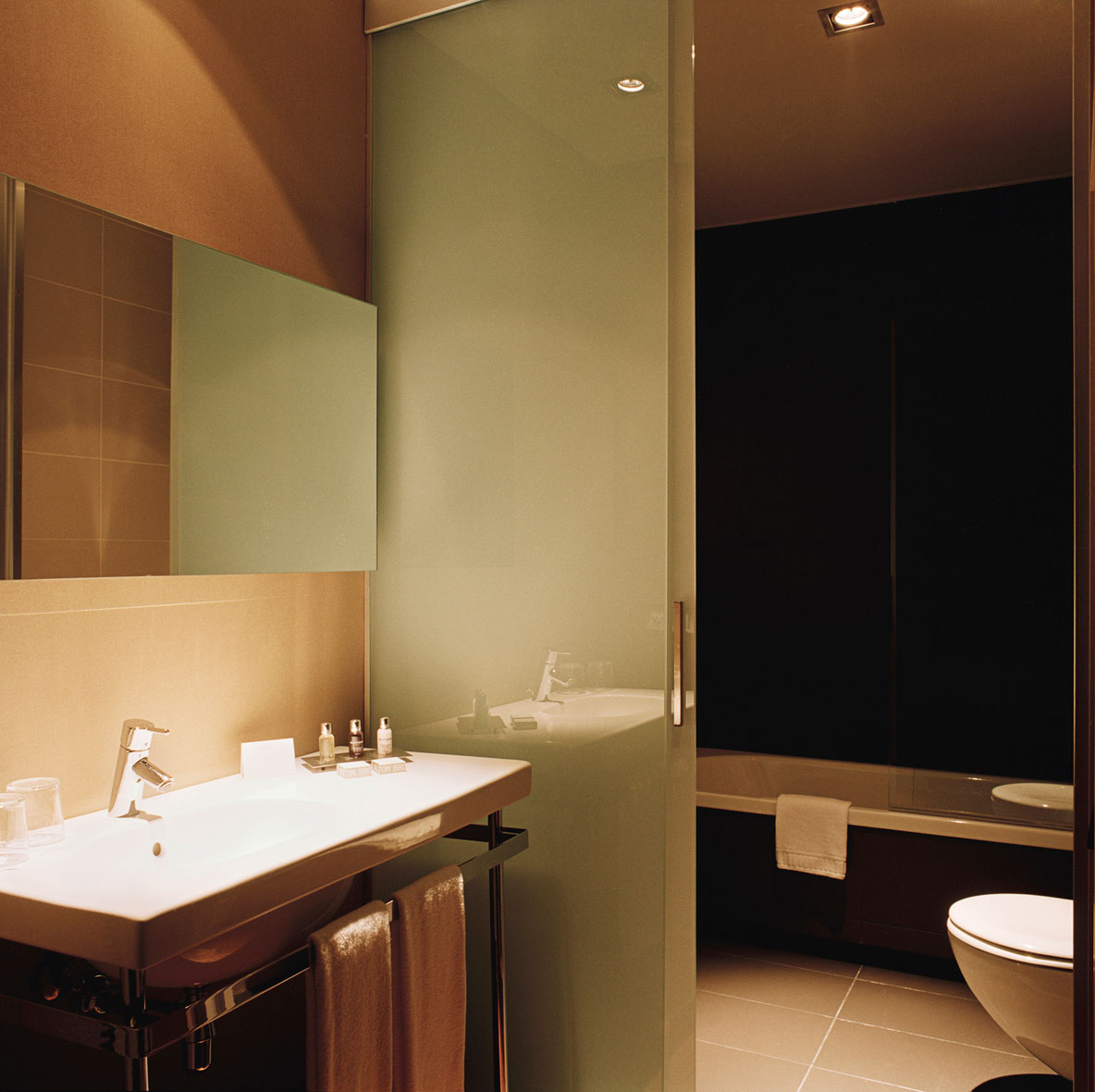
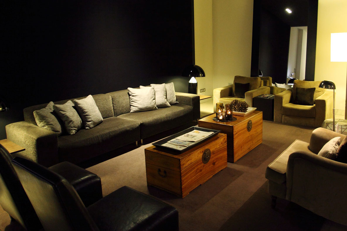
In contrast, in the lounges, the space adopts a more modern style, with contrasts between matte and glossy materials, as well as light and dark colors. Despite the modernity, the simplicity of lines is maintained, seeking a balance between shapes, textures, and colors.
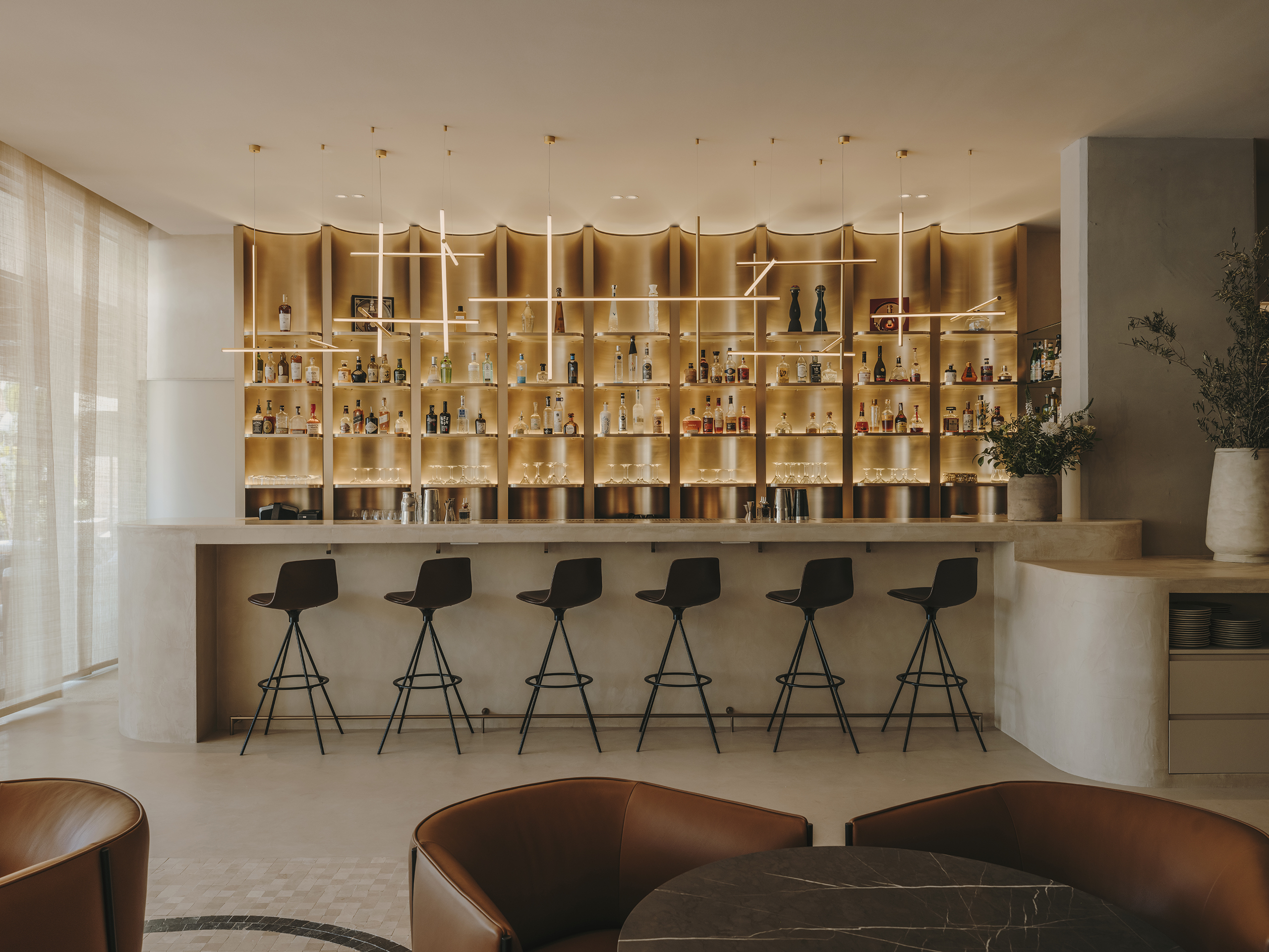
These criteria are maintained throughout the development of the Grand Hotel Central’s renovation, both in the restaurant and in the rooms, with the aim of creating a welcoming and elegant atmosphere for the guest. In other words, the coherence in design, combined with the fusion of classical and modern elements, contributes to guests feeling immersed in a space that reflects sophistication and warmth.
Explore more hotel projects designed by Sandra Tarruella Interioristas.
