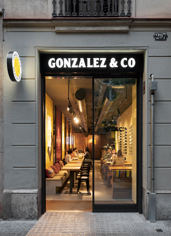
Gonzalez&Co Barcelona restaurant design. The objective was to create a striking and fun image while ensuring that the kitchen was highly visible, a challenging task in a very elongated and narrow space. Additionally, we had to maintain continuity with the first restaurant, using intense yellow as the corporate color and utilizing iroko wood.
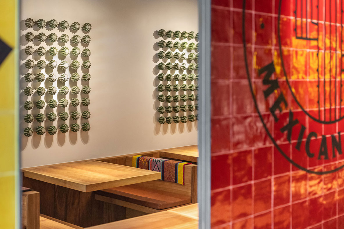
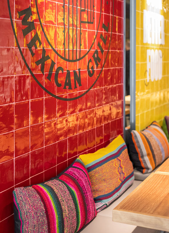
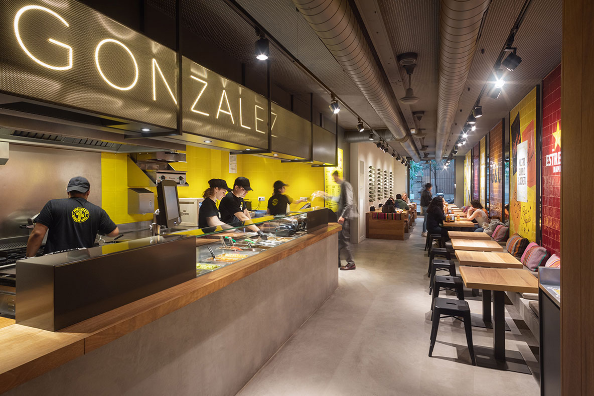
The first goal was to create a sense of spaciousness in the venue and provide visibility towards the interior kitchen. To achieve this, we decided to line one wall with a mirror onto which we placed vertical panels of vitrified tiles in warm and intense colors. These elements were inspired by Barragán’s architecture and also incorporated the corporate yellow color.
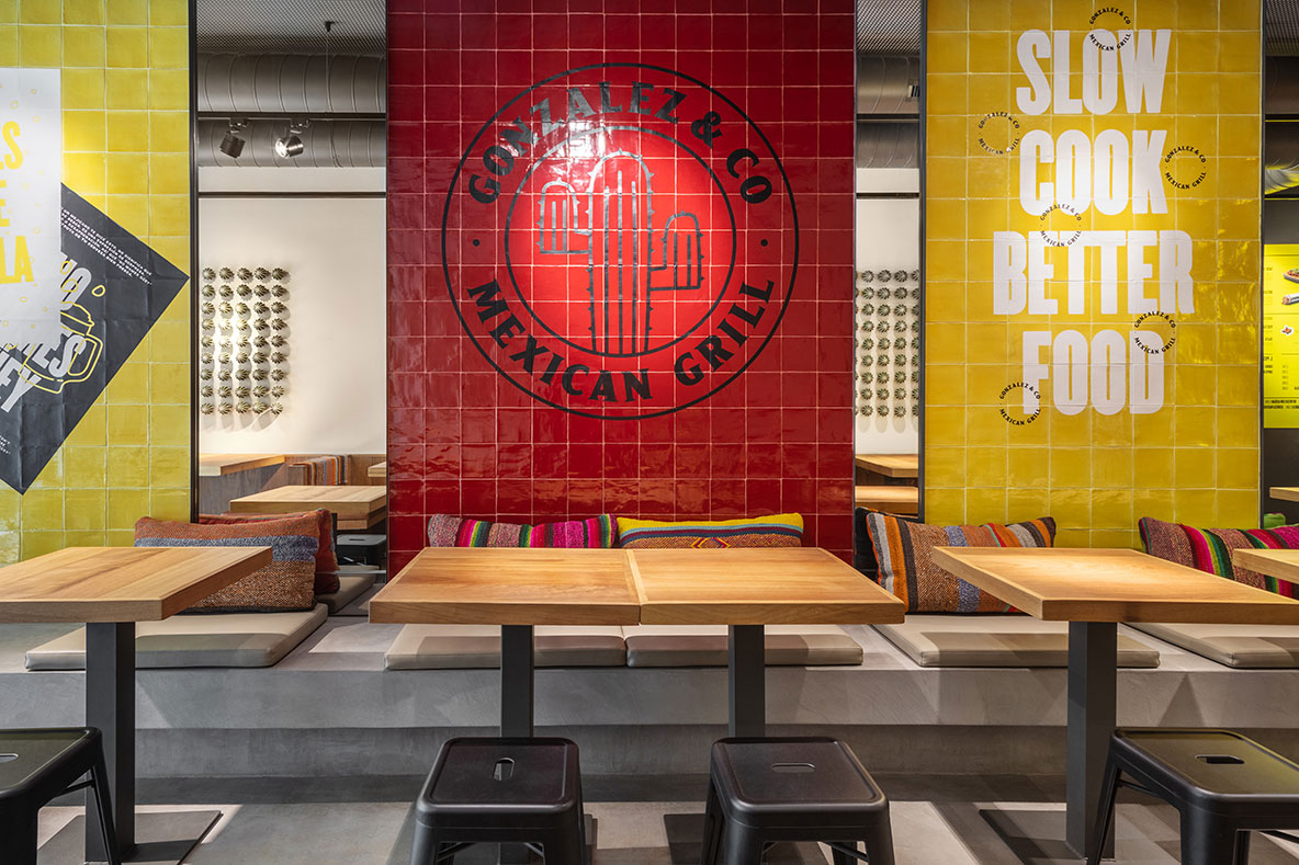
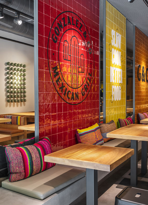
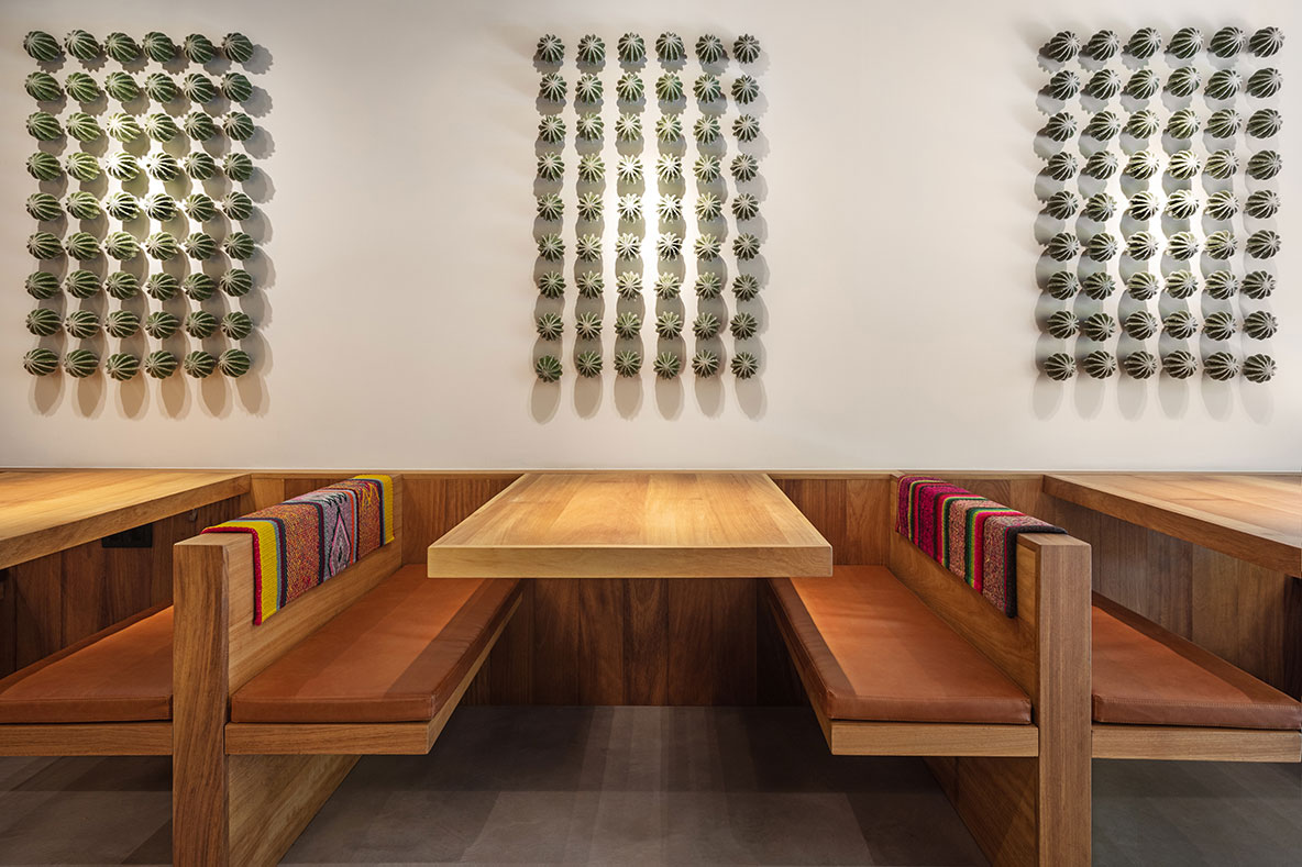
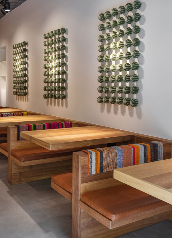
On this backdrop, a concrete bench supports solid iroko wood tables. This seating arrangement works well for creating groups of different diners and maximizing the use of space.
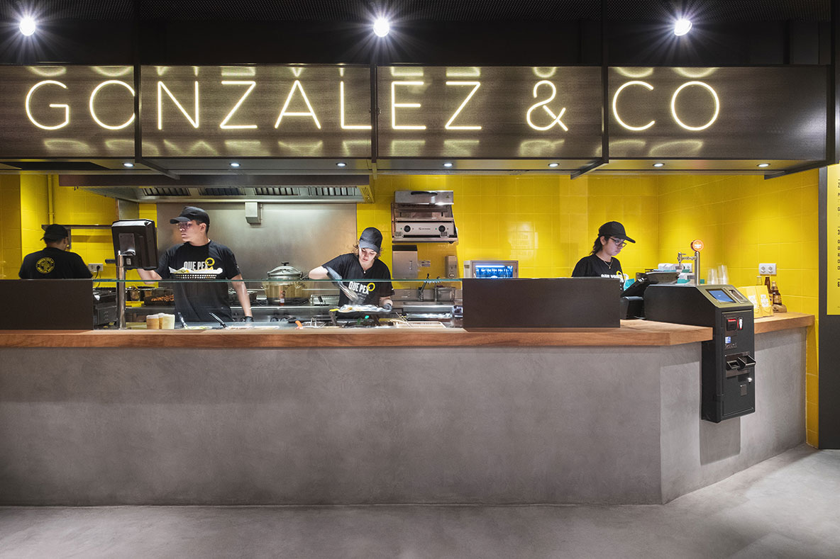
The highlight of Gonzalez & Co is the quality of the product, so the visible kitchen had to be the focal point of the space. With this in mind, we created a luminous sign integrated into a volume of perforated sheet metal, floating above a kitchen clad in intense yellow tiles. Additionally, the concrete and iroko wood bar emphasizes the product and transparency in the preparation process.
Another issue to address was the coexistence of diners and the queue for orders at the bar. To solve this, we designed a closed volume of iroko wood benches and tables, which not only introduced another seating option but also provided protection to the customers.
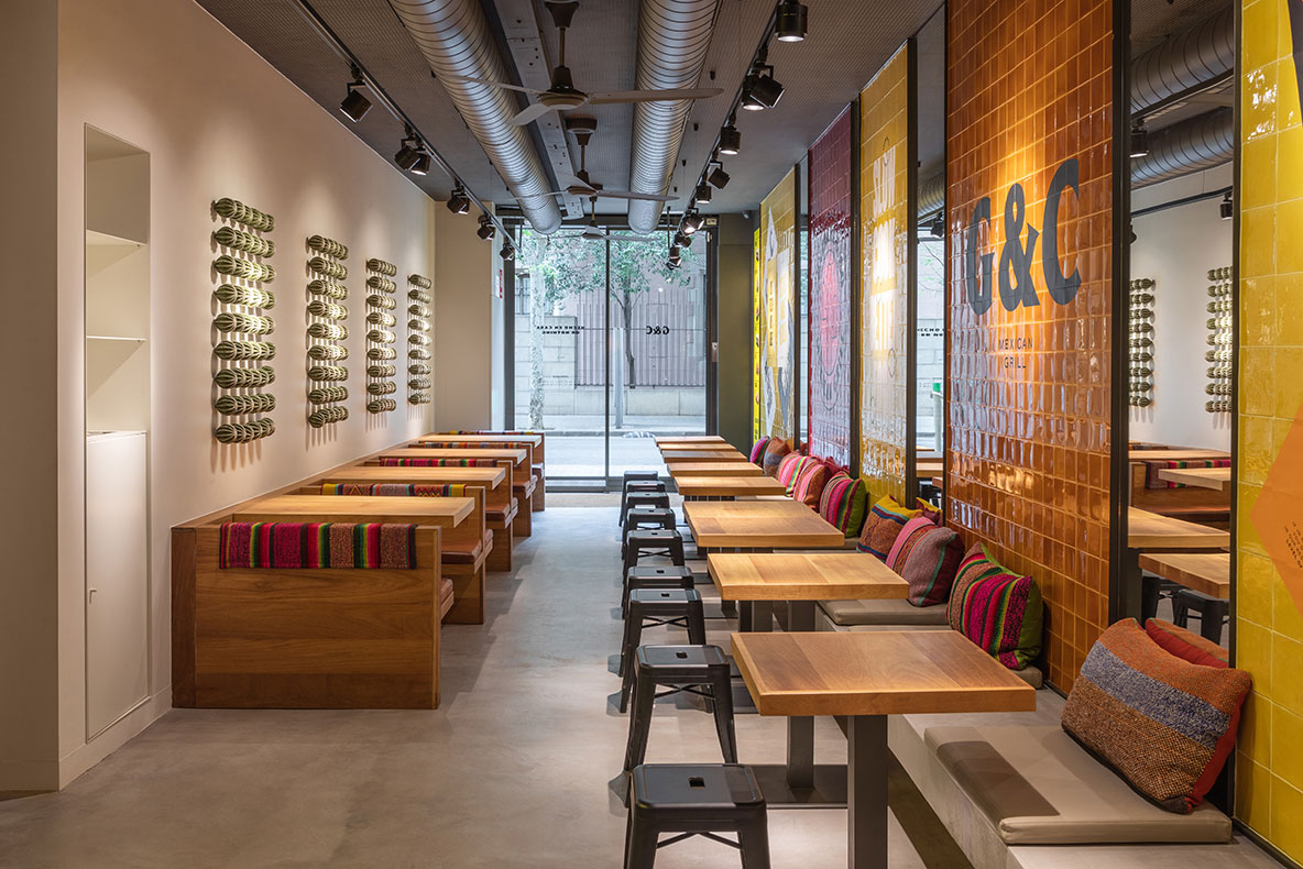
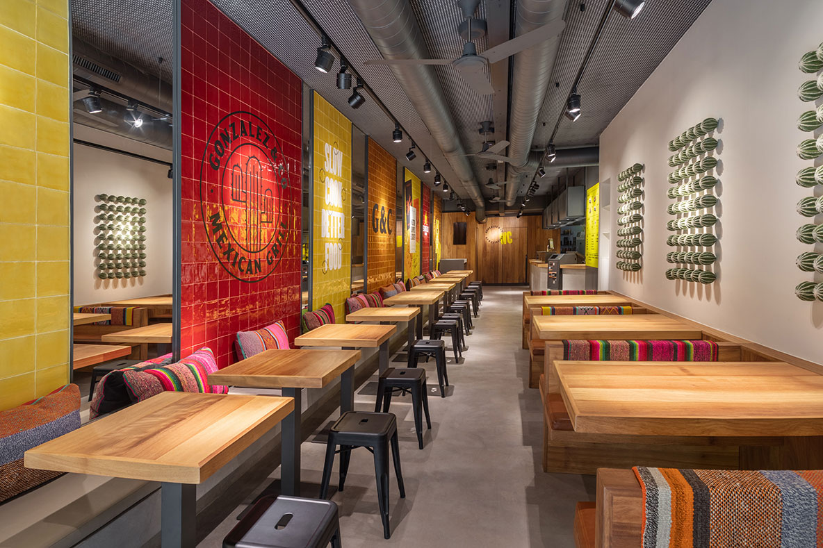
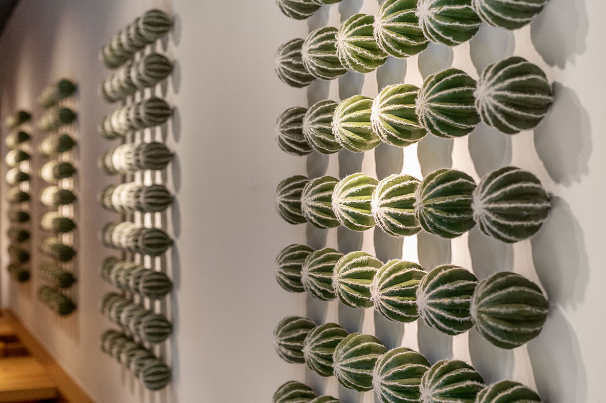
References to Mexico, besides in the colors, are present in elements such as artisanal rugs with ethnic designs, as well as the cactus mural on the wall opposite the striking graphic panels.
Overall, the design of Gonzalez & Co restaurant has succeeded in giving the venue a Mexican-inspired aesthetic that is unexpected, fun, and functional, with a focus on the visible kitchen and the quality of the product.
Explore more restaurant projects designed by Sandra Tarruella Interioristas.
