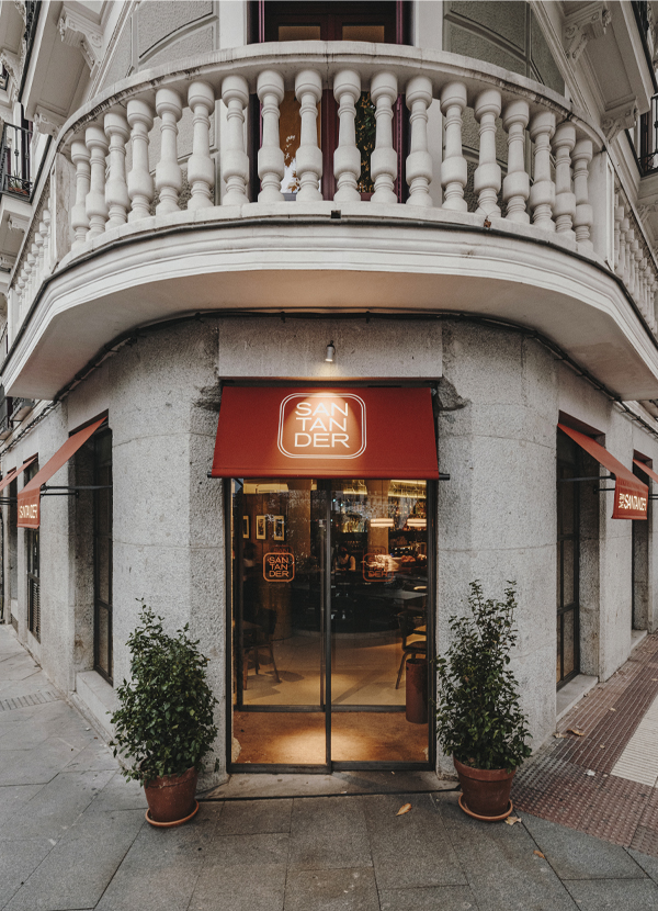
Gran Café Santander renovation by Sandra Tarruella Interioristas by entrepreneurs Carlos Crespo and Paco Quirós of the Cañadio Group, following La Bien Aparecida and La Primera.
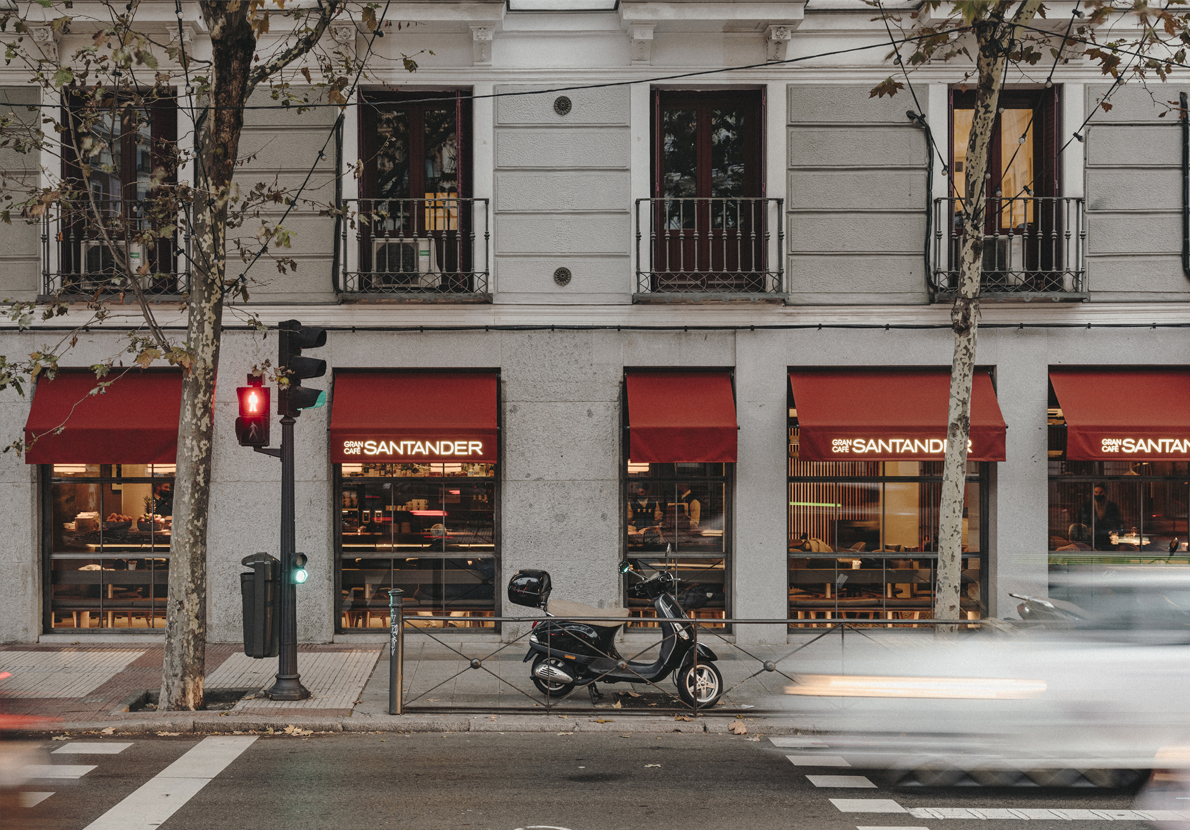
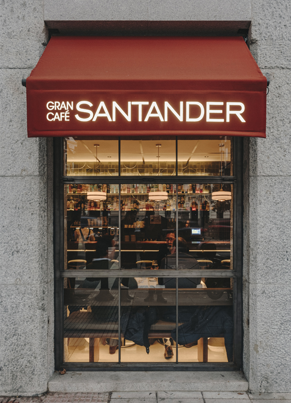
After the closure of the iconic Cafetería Santander with 52 years of history, the goal was to preserve the essence in the new Gran Café Santander, the “first updated café in Madrid.” The venue preserves the aesthetics of the seventies, reminiscent of the old café.
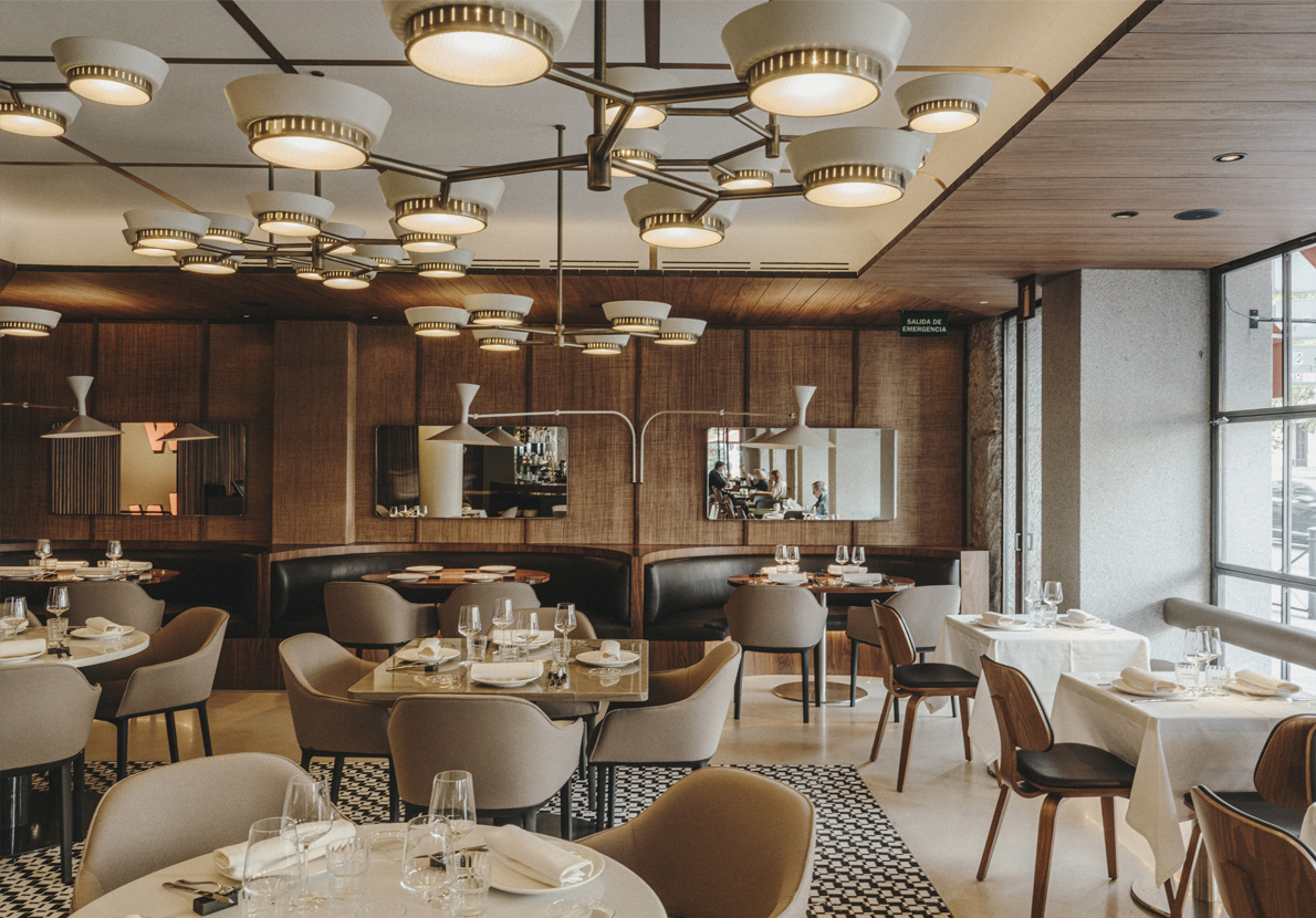
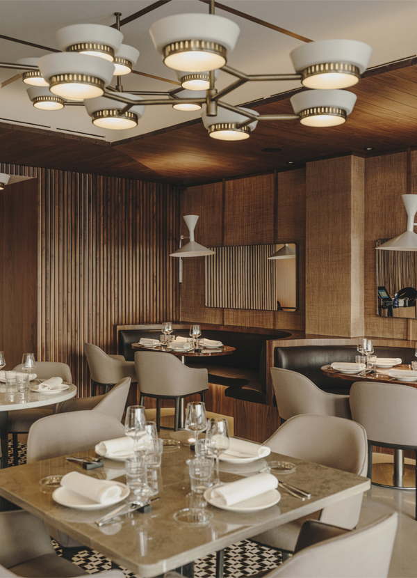
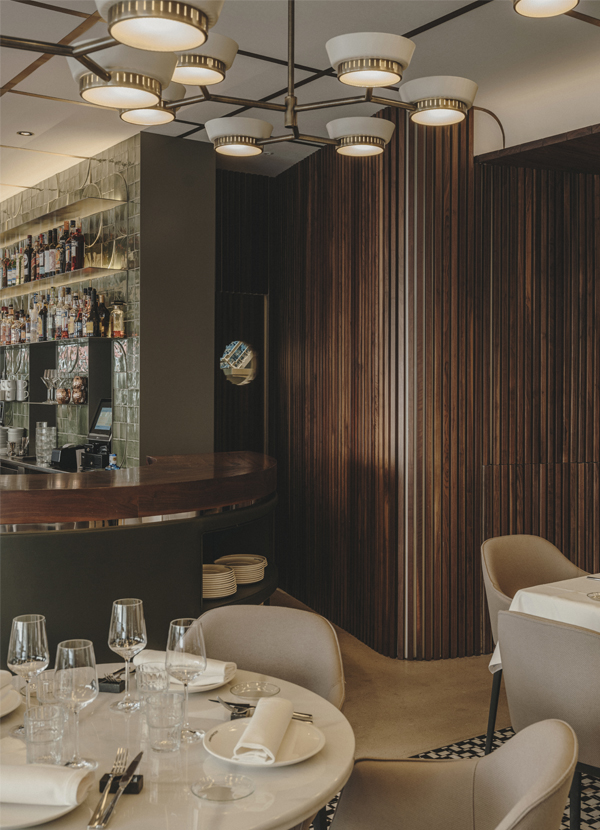
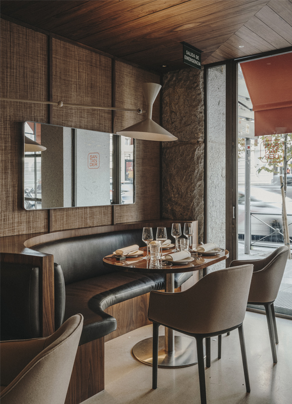
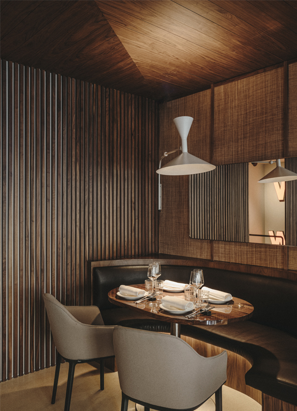
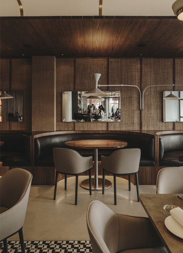
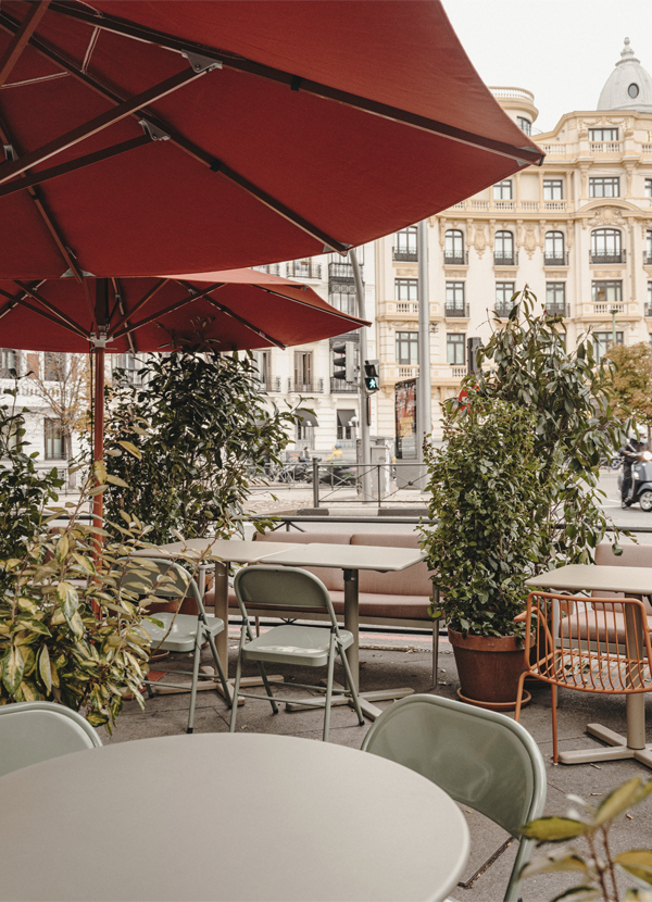
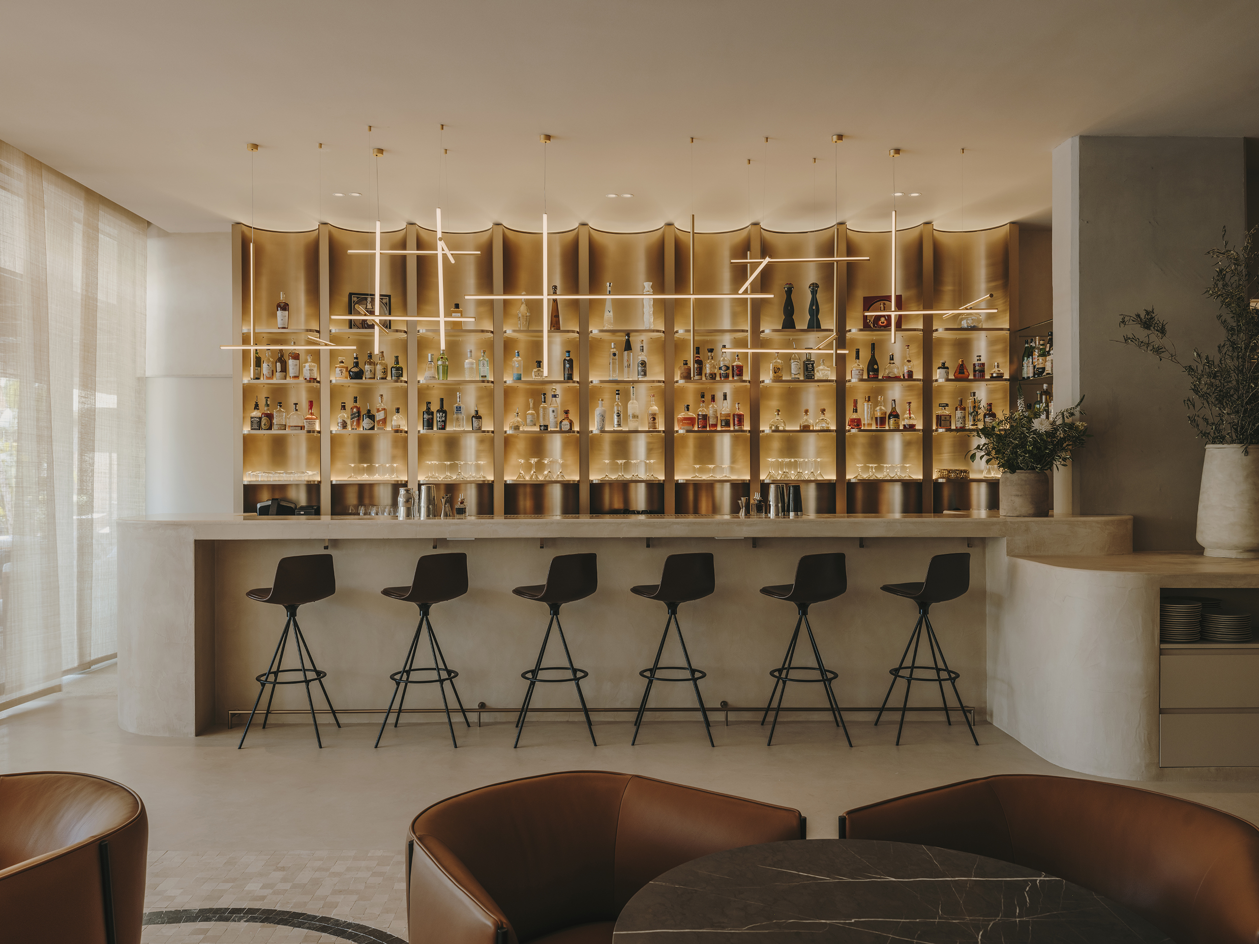
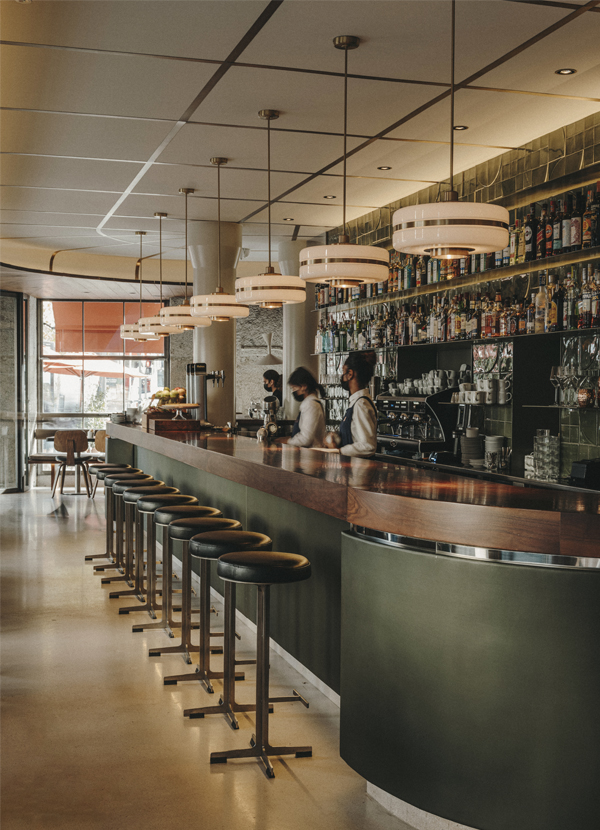
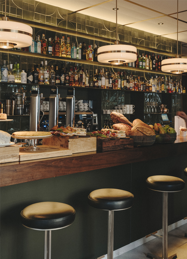
Two large stone block façades with iron windows open to the outside. At the same time, the bar is redesigned maintaining a retro look, with rounded ends, a walnut wood top, and a dark green leatherette front. Leather benches facing the windows allow for interior movement to be observed.
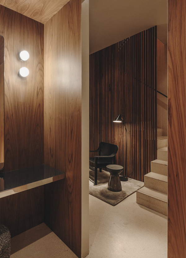
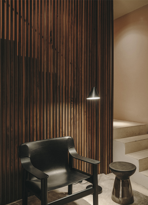
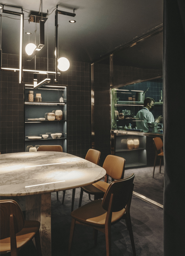
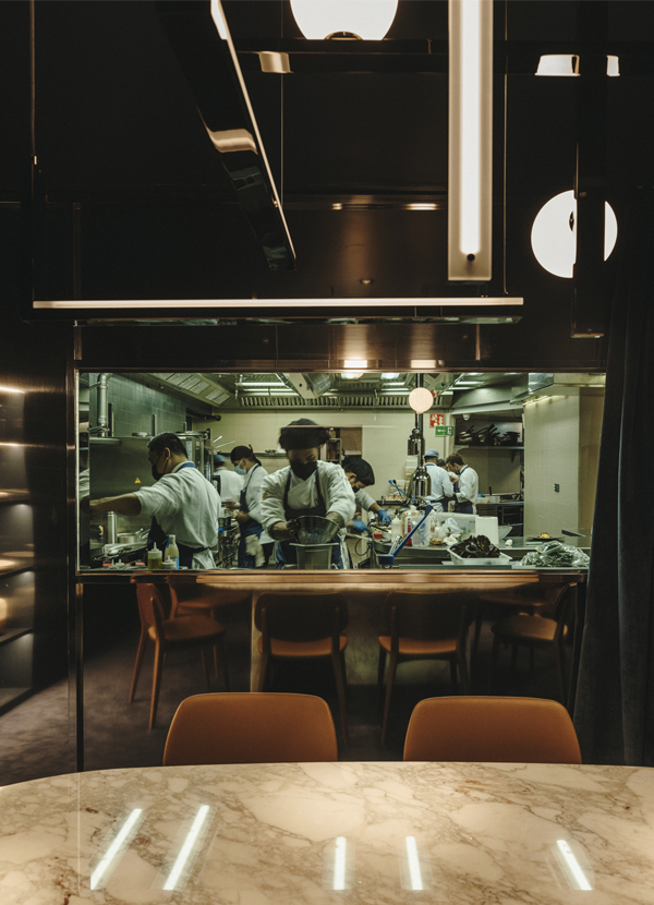
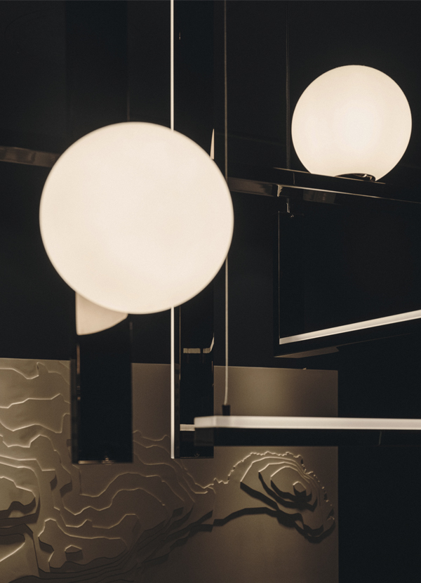
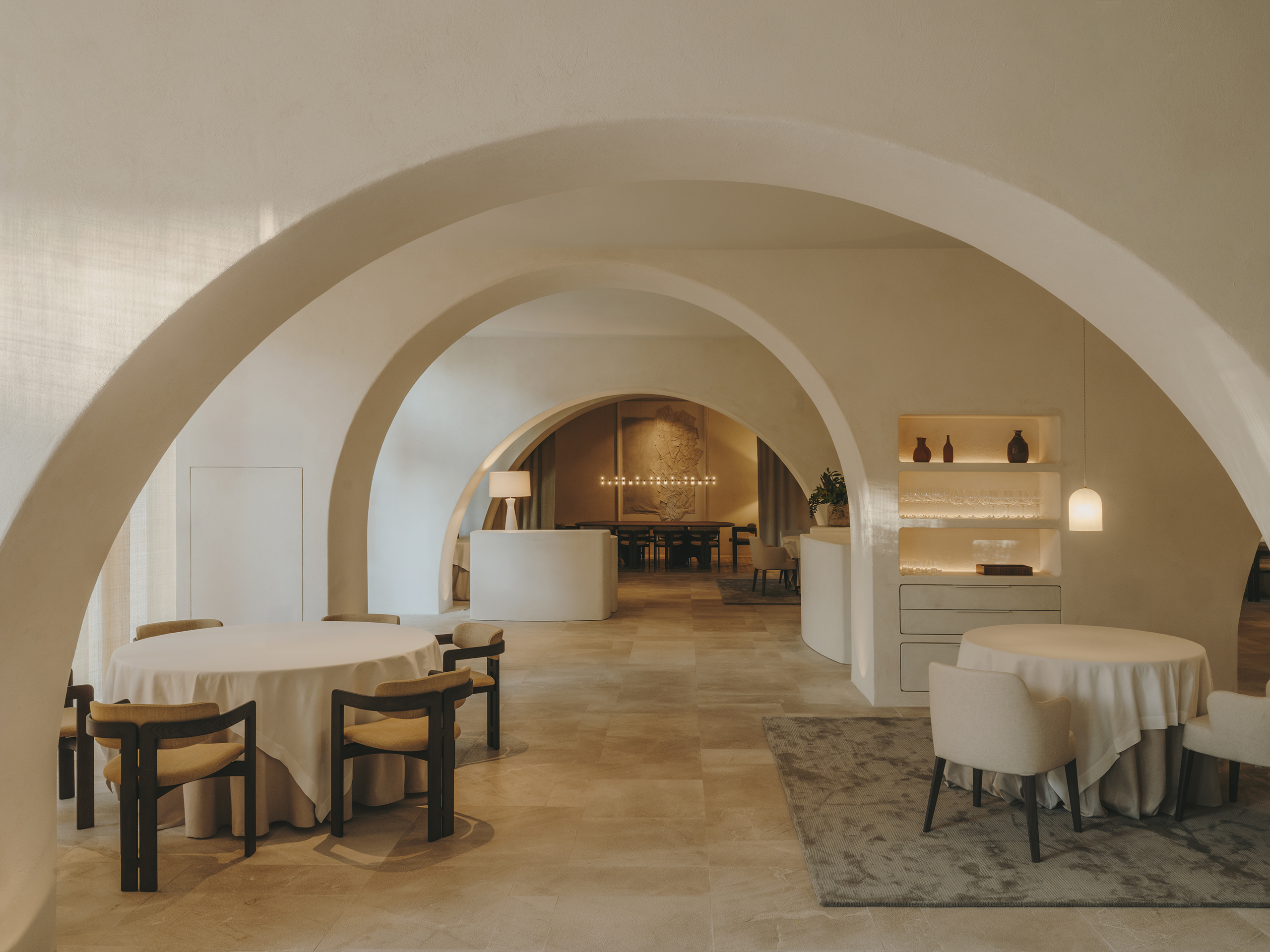
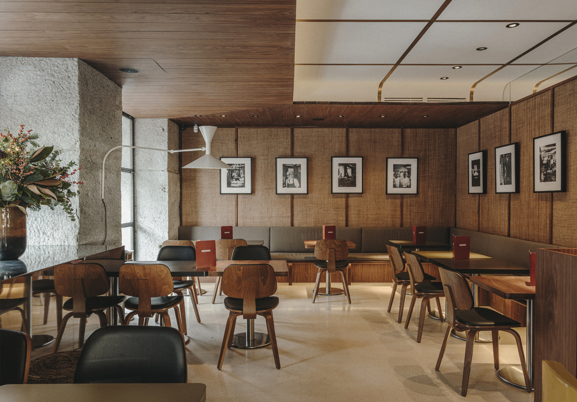
The back bar stands out with exclusive olive green tiles for the project. Furthermore, the use of materials such as terrazzo, natural fiber panels, walnut slats, and Le Corbusier sconces contribute to the seventies aesthetic. A area with round tables for groups is distinguished by a black and white marble mosaic carpet. Finally, in the basement reserved area, a dark and intimate atmosphere in navy blue is created, with carpeting and matte Mutina tiles. The kitchen, connected to the reserved area, can be closed off with a blue velvet curtain.
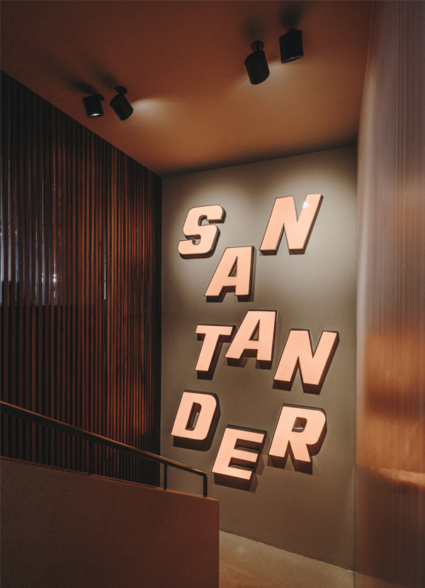
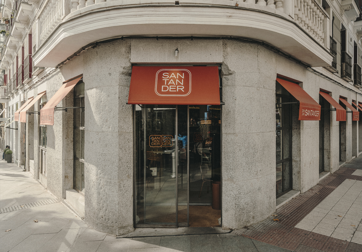
For the renovation of the Gran Café Santander, the orange letters of the Cafetería Santander have also been restored and placed on the wall of the staircase to the basement. Additionally, the creative direction includes the creation of uniforms inspired by the 70s, in navy blue and green tones, and graphics designed by Mandaruixa based on the oval shape of the long bar.
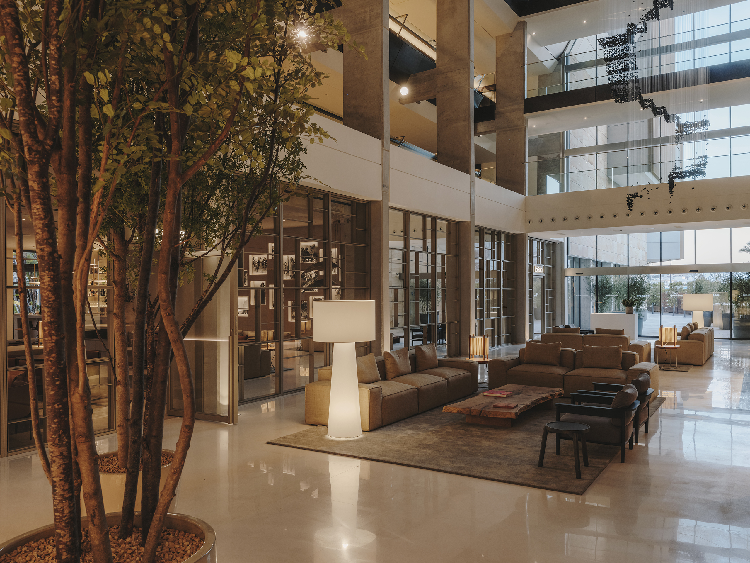
Explore more restaurant projects designed by Sandra Tarruella Interioristas.