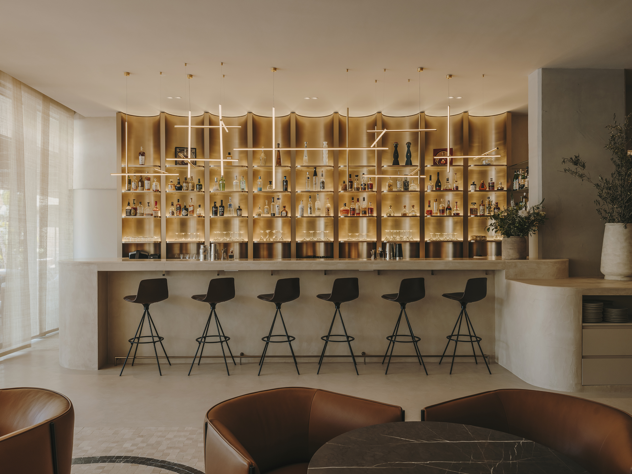
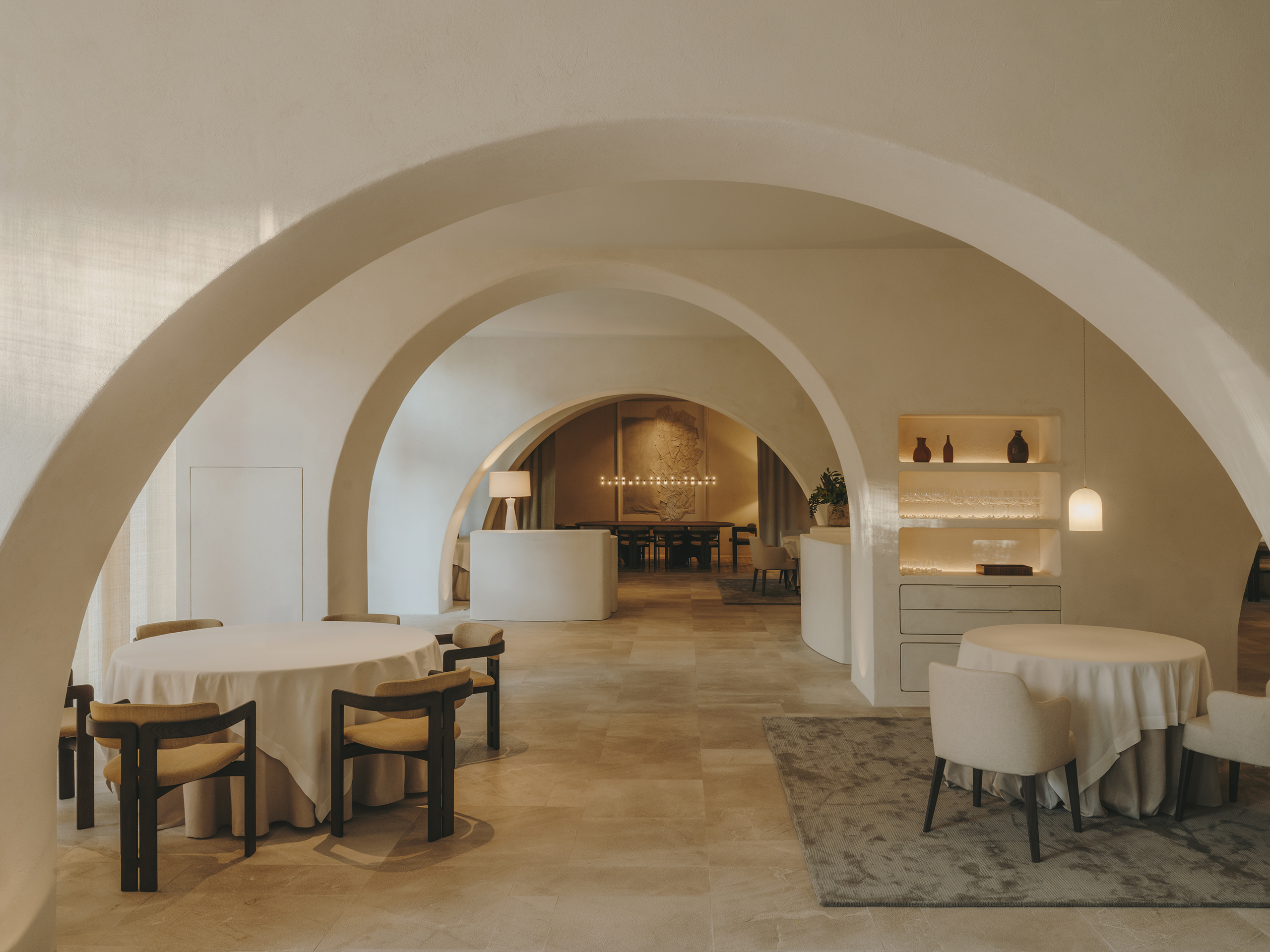
Sabatic Sitges Hotel design has been carried out for the Massot family of the Vertix company, under the Autograph Collection signature of the Marriott hotel chain with AC Hotels.
From the outset, the family conveyed that the hotel should exude a vacation aesthetic with an urban touch, not overly summery or beachy, as the building is located in the northern and residential part of Sitges. The hotel will be open all year round, so we have drawn inspiration from a European vacation aesthetic, where the atmosphere exudes calm, light, and sophistication.
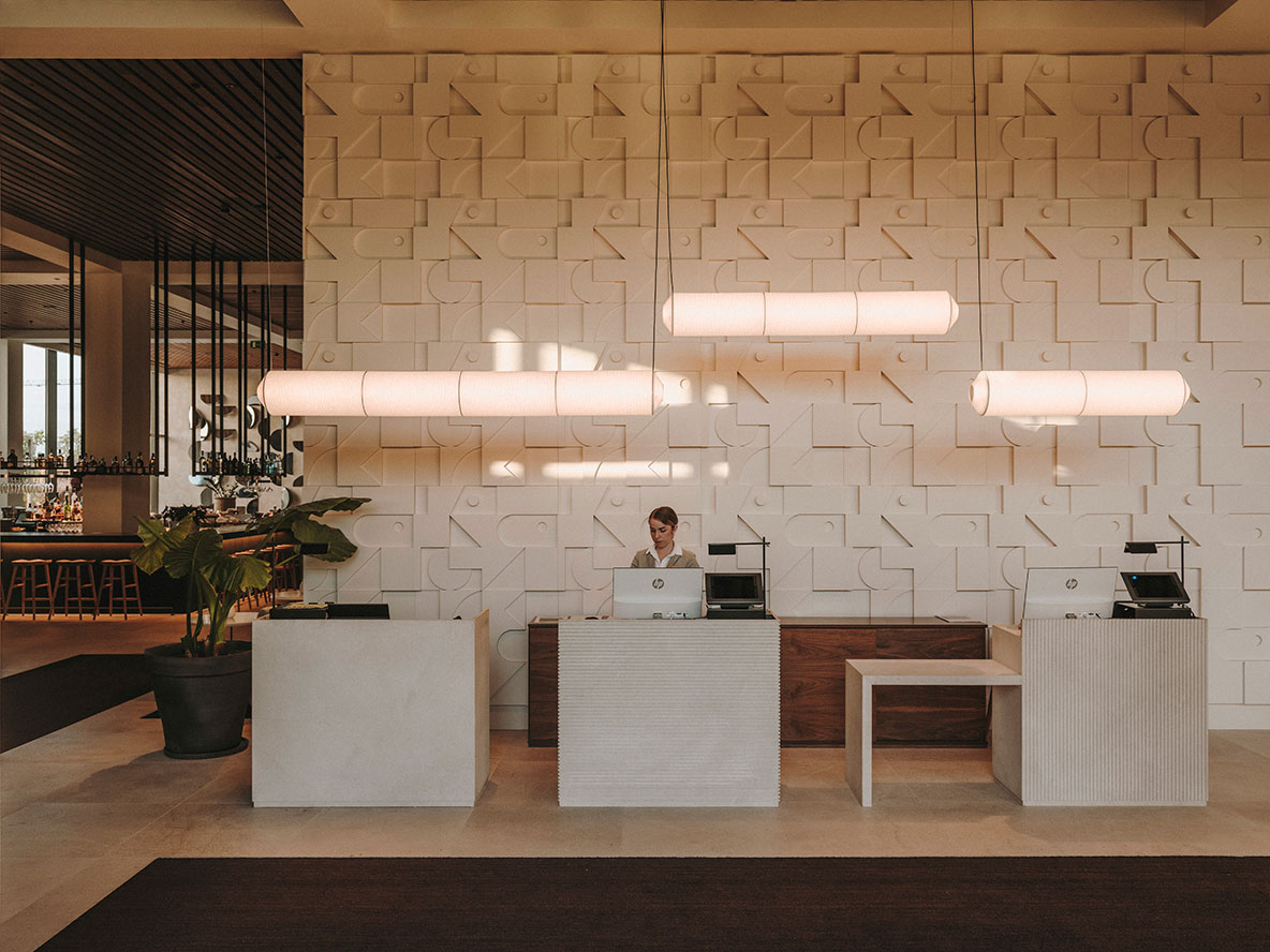
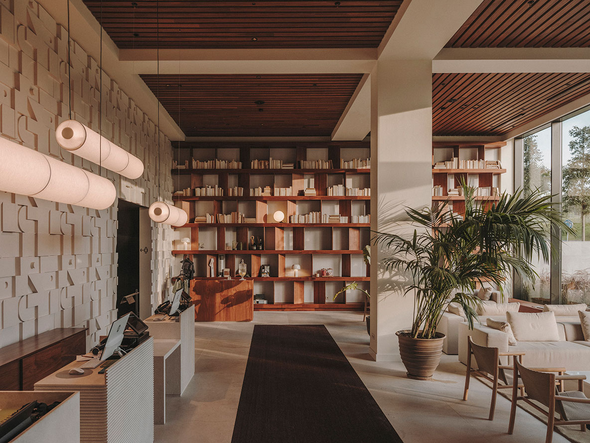
One of the most exciting aspects of the space was the great height of the ground floor, where the hotel’s common areas are located, including the reception, bar, restaurant, and winter lounge. This led us to create a large mural as a backdrop for the reception counters. The counters are pieces of natural stone treated in different finishes, listed in two directions or bush-hammered, accompanied by the Santa & Cole Tekiò lamp. The front mural is made of satin-finished lacquered MDF and houses the communication core that leads to the room floors.
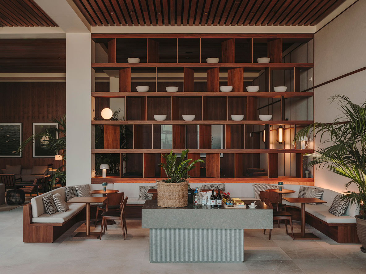
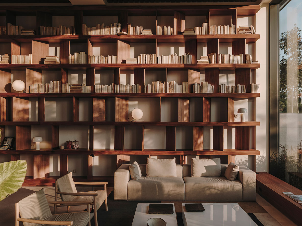
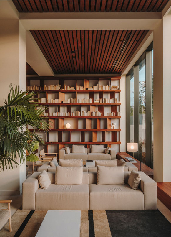
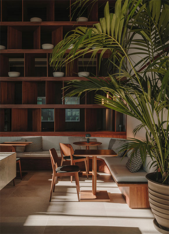
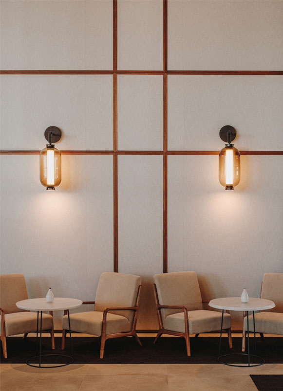
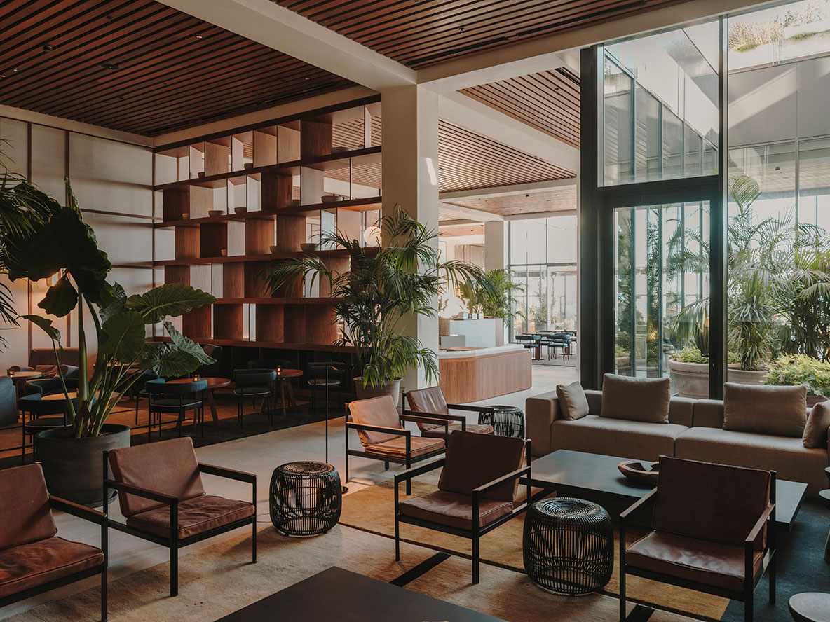
Reception is framed by two large bookshelf-lattices that filter the views and collect the two lounges, equipped with Perobell sofas and Arper Kata armchairs. Custom-made carpets by Cumellas follow the aesthetic line of the concept. The waiting room is completely open to the outside, where the morning light naturally enters and allows for views of the entire garden.
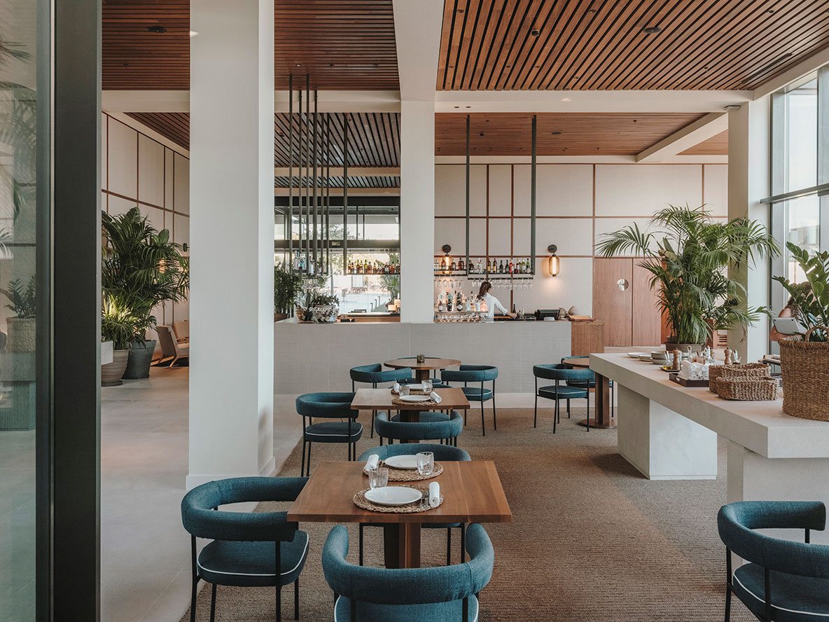
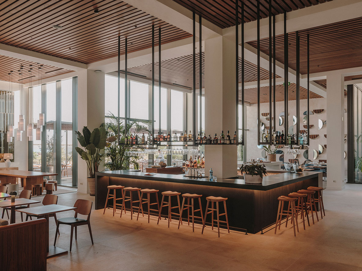
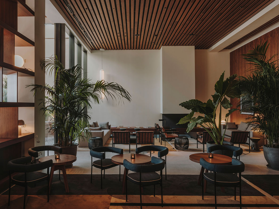
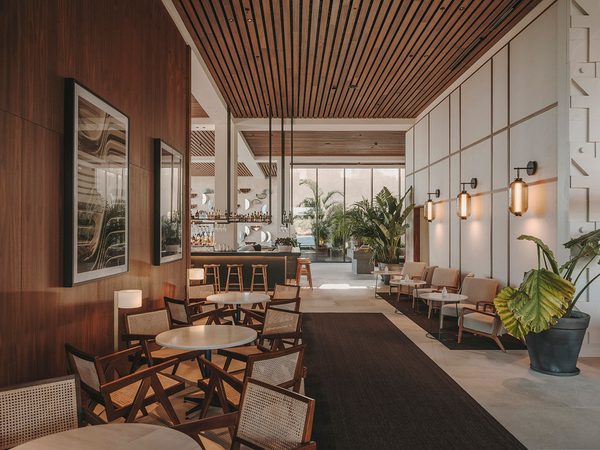
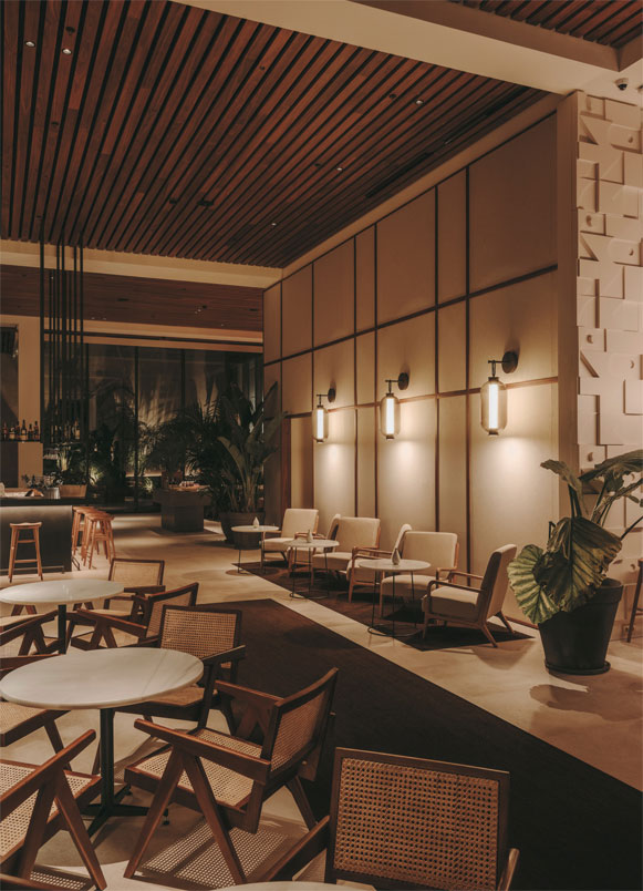
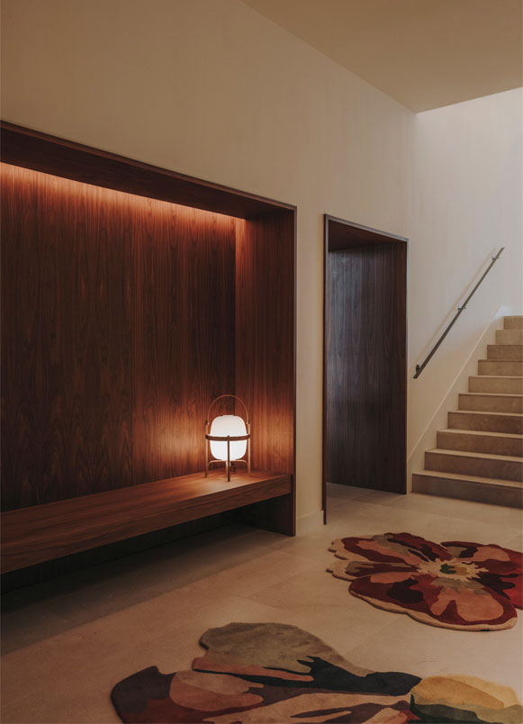
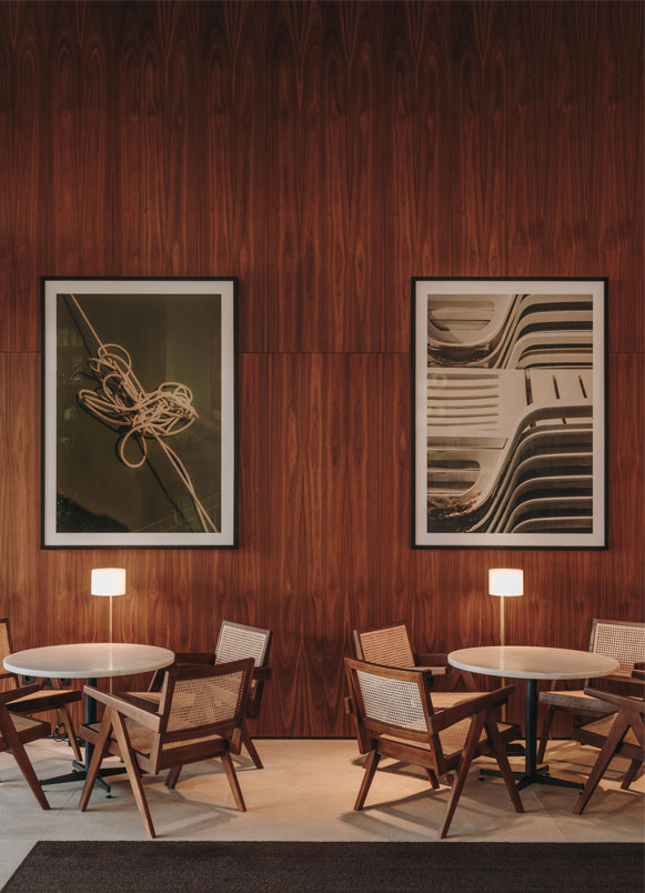
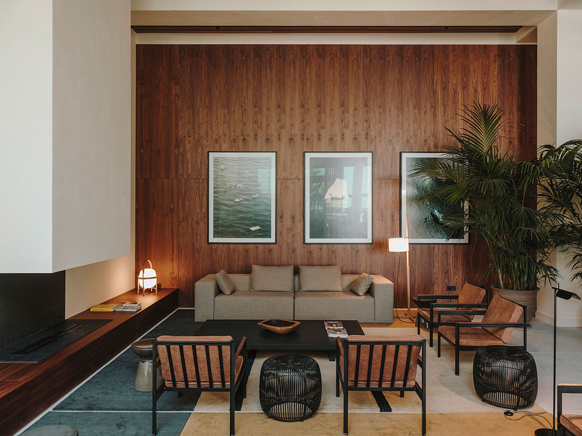
The entire ground floor maintains the exposed beams that organize the space, with a false ceiling between beams made of walnut wood slats integrating lighting, air conditioning, and acoustic fabric. In addition, walnut wood wall coverings and fabric upholstery provide warmth and acoustic comfort to all common areas.
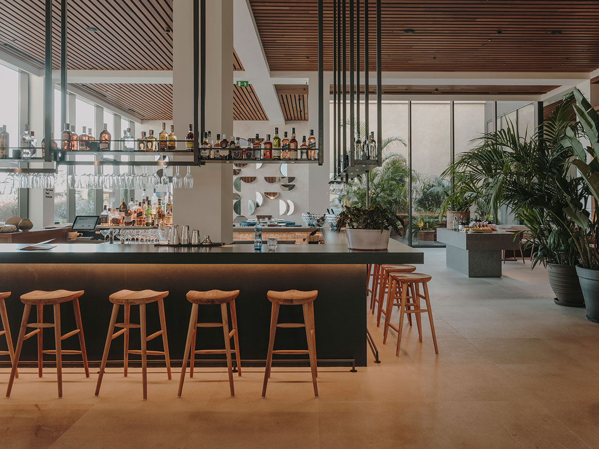
Central bar articulates the spaces around it. All areas are visually connected but distributed throughout the floor, without interfering with the view of the English patio, whose vegetation brings freshness and light to the entire hall. The furniture runs along the walls with continuous sofas upholstered in sandy, black, and navy blue colors. The prints reference the European vacation aesthetic, where the perimeter tables are located. In the lounges, the tables feature a chair upholstered in blue with white trim, designed by the studio.
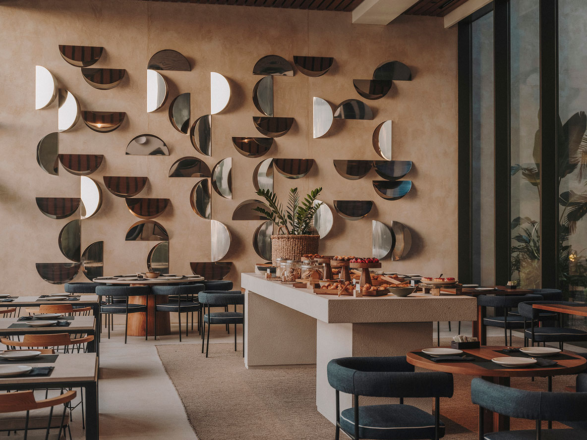
All areas have a large central element made of noble material, either stone or solid iroko wood. This is a solution to facilitate breakfasts, distributing the buffet in a more enjoyable way that separates sweet from savory. The large communal table is presided over by a large brass mirror with a beveled pattern, which enlarges the space while echoing the window that connects to the outdoor dining area.
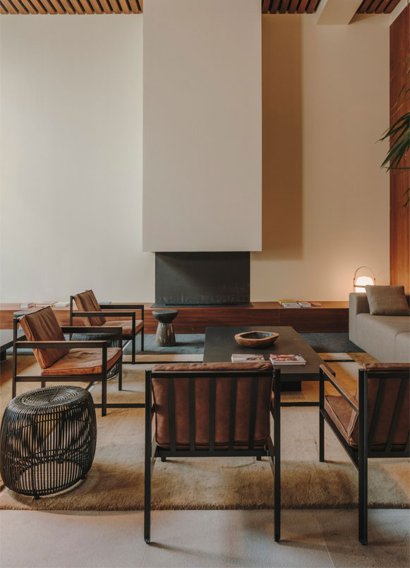
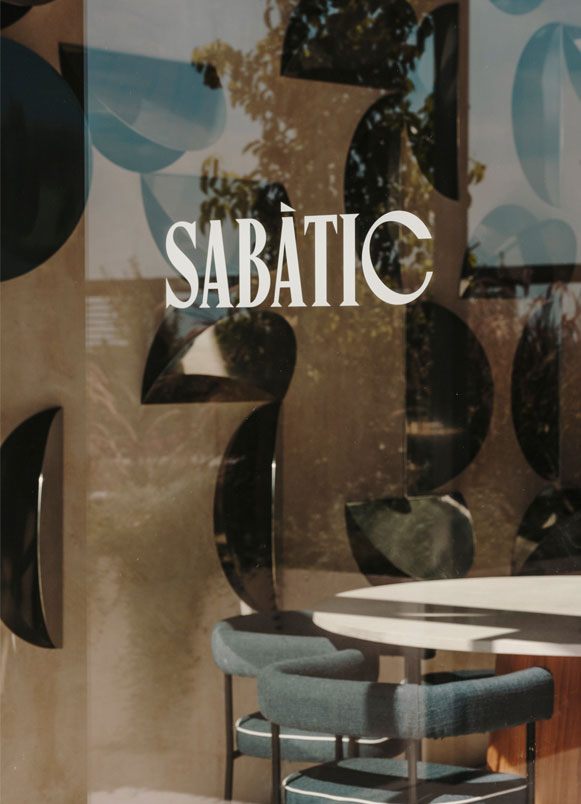
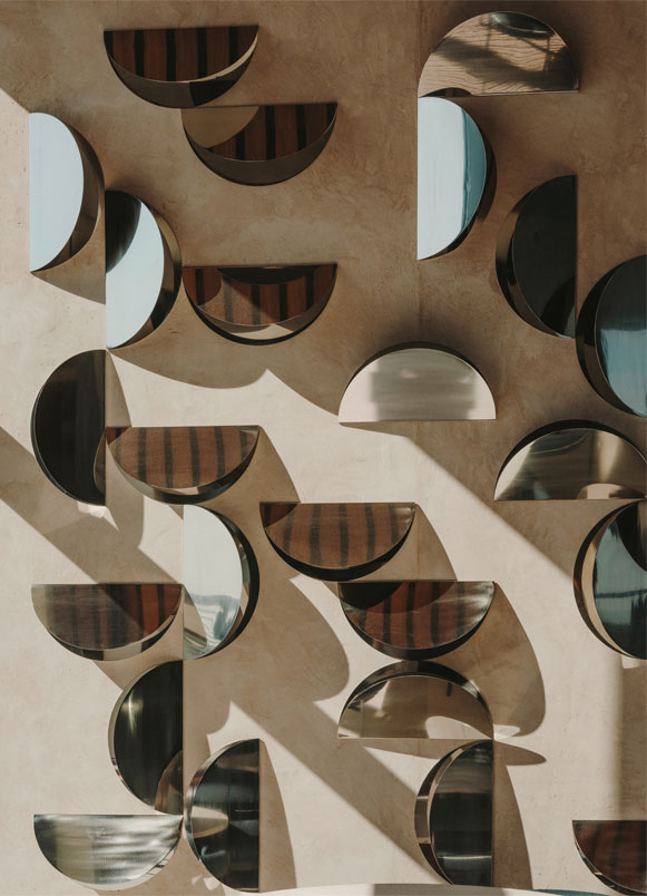
In the design of the Sabatic Hotel in Sitges, there are nods to the marine world thanks to some semi-circular elements in bright stainless steel. On the other hand, the lattice of the restaurant houses the most sheltered space from views, the winter lounge. A zone that must be intimate, where you can relax, play billiards, or enjoy a good book in the lounge chairs. It is a more comfortable and relaxed environment.
The graphic work throughout the floor is done in large frames with photographs by Salva López. Thanks to them, the vacation aesthetic is conveyed, where the guest feels as if every day were Saturday, every day is a vacation, no matter the time of year.
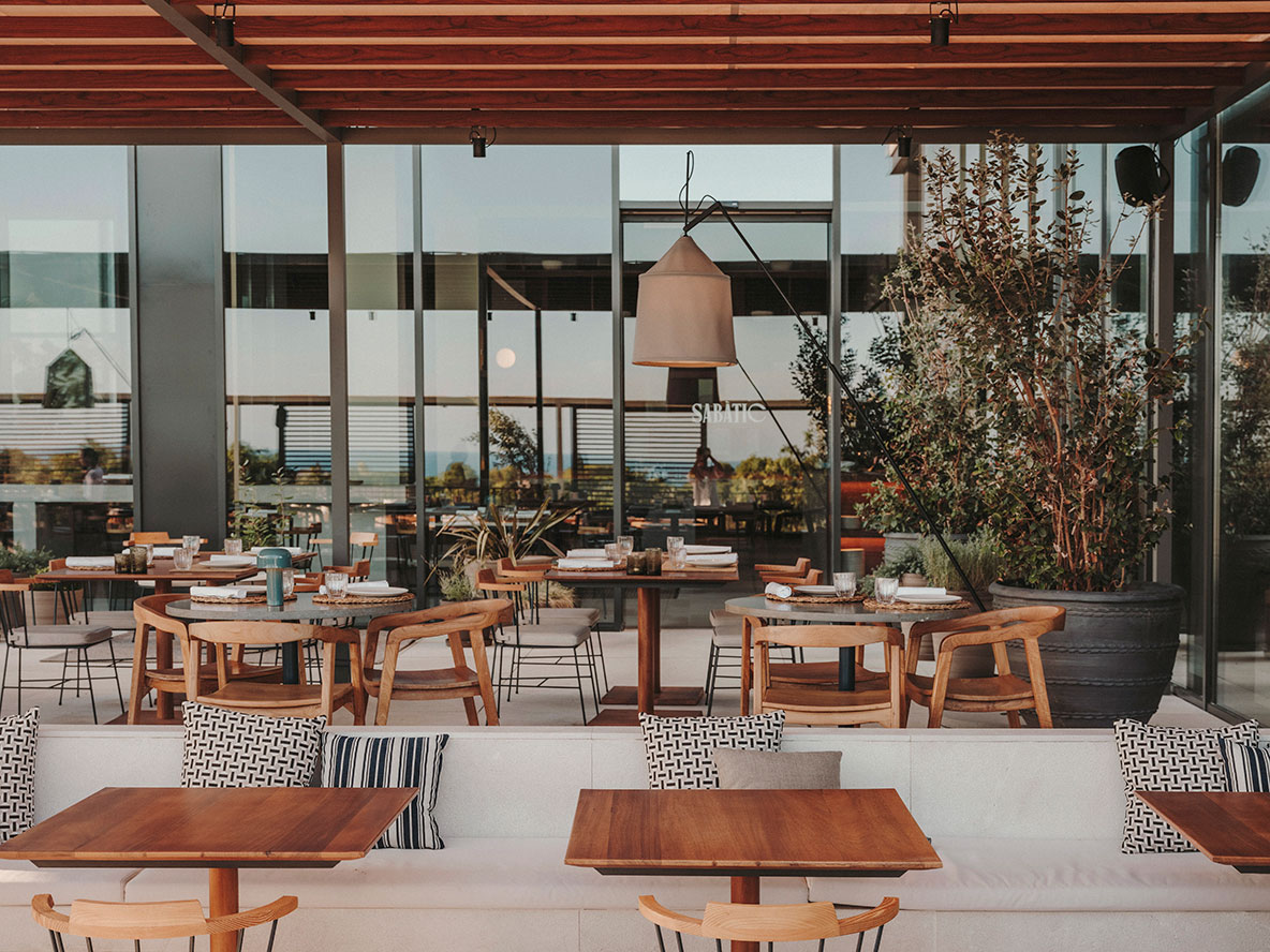
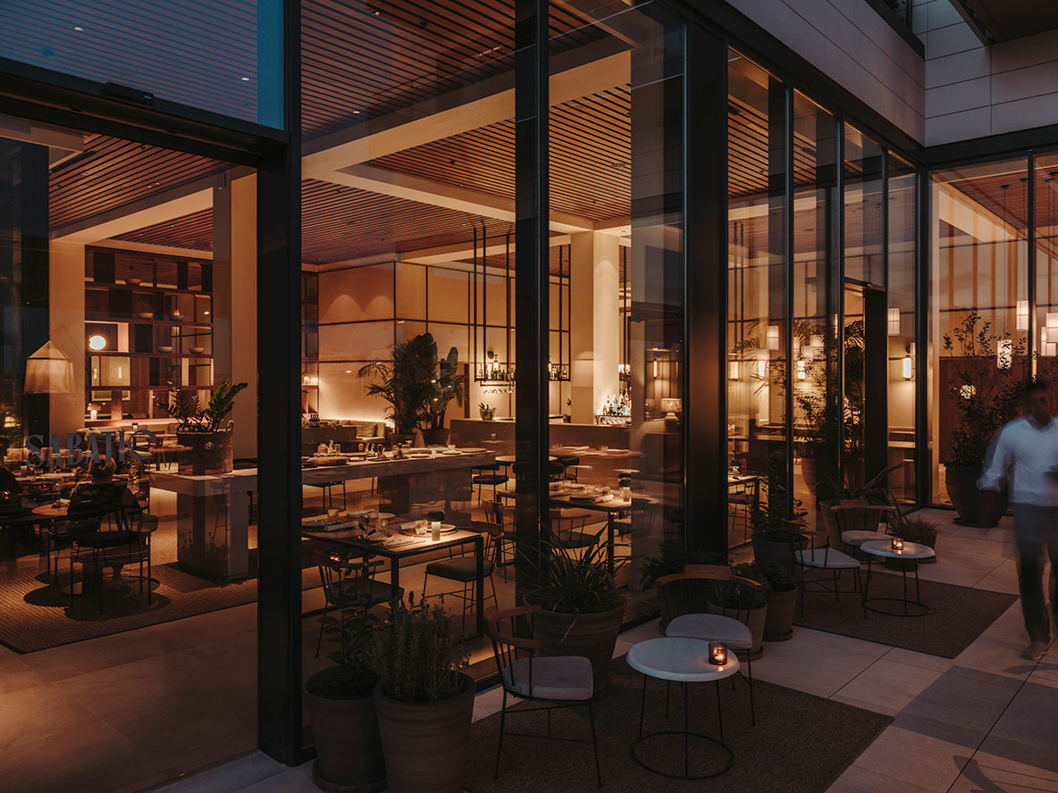
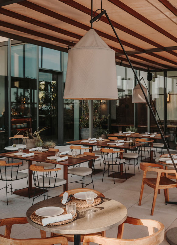
Access to the ground floor terrace is through the restaurant at the same level. A relationship between interior and exterior has been created, enhanced by the use of the same pavement, large bush-hammered stone. This first level is protected from the sun by metal pergolas with wooden slats and leads to a lower level. Here, a bench, made of the same stone as the previous level, appears. For the outdoor service, there is a micro-cement bar where the bartender, cocktail maker, and DJ can share space.
On the exterior of the first floor is the infinity pool with destonified green stone in the basin, a bar, the outdoor lounge, and the gym. To separate the terraces of the rooms from the pool, a walkway has been created where the straight line is blurred with stone and earth, and daybeds with slat structures have been placed on the first row of sun loungers, providing privacy between the views of the private terraces and the solarium.
For the rooms, we wanted to convey a sense of freshness and warmth, applying a sandy color on the walls and introducing wood on floors, walls, and ceilings to configure the dining space, where the kitchen cabinet is integrated and completely transformed. The sink and ceramic hob are integrated under wooden trays, so if not in use, it is not present in the room, and the furniture becomes part of the entrance as another element. In the same element, the fridge and hood are integrated.
The bathrooms are made with a piece of ceramic that resembles a bush-hammered stone from the Florim brand, ideal for creating a unique envelope on walls, floors, and even the sink.
On the walls of the rooms, we have incorporated wooden frames with manual work in paper from the Museu Molí Paperer de Capellades, forming a play of volumes that conveys calm, tradition, and quality. Dominating the living room is a large painting with different levels that brings color to the room, and the tone of the glossy lacquer of the painting varies depending on the floor you are on.
Explore more hotel projects designed by Sandra Tarruella Interioristas.
