Sushifresh Barcelona restaurant renovation commissionted by Sara Setantes and Sergi Zacharias from Freshperts. This new brand encompasses five varieties of food for delivery.
With the brand’s new expansion plan, problems of visibility, comprehension of the premises, as well as operational and organizational issues that had arisen, affecting the design of the spaces, were addressed and solved.
The renovation of the Sushifresh restaurants for Freshperts begins at their first location, located in the north of Barcelona. The objective is for the new spaces to convey the essence and values of the brand, and for both customers and delivery drivers to recognize the different restaurants within the same place. The different kitchens are visible, with aesthetics appropriate to the type of food, thus promoting transparency in the use of quality raw materials and with the intention of involving the customer more in the creation process.
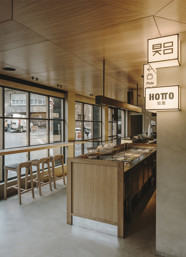
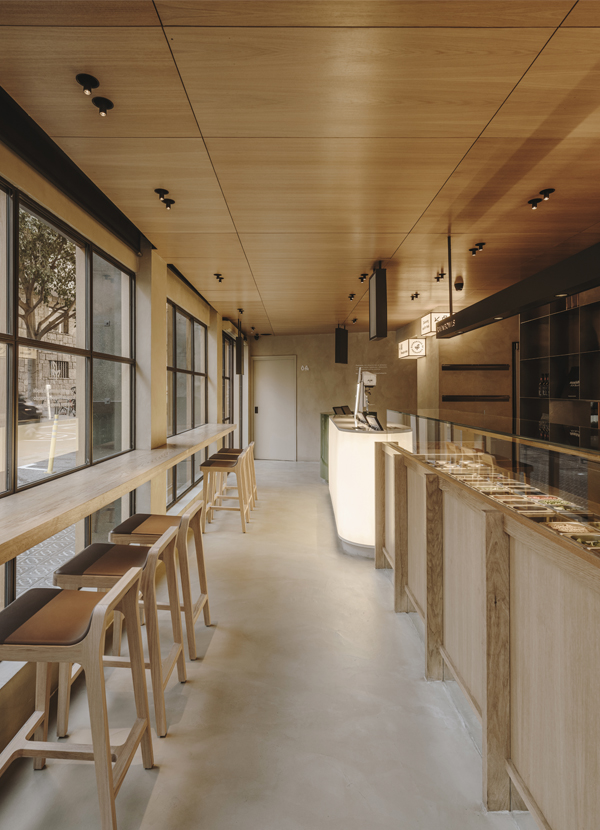
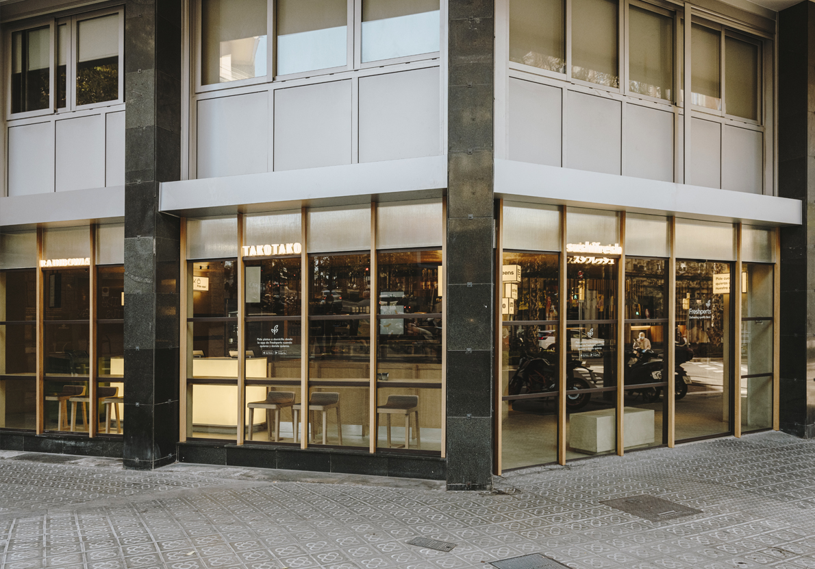
The irregularly shaped corner premises have two large glass facades with existing iron frames. It was decided to utilize the carpentry and cover them with vertical wooden slats to eliminate the coldness of the iron and visually lengthen the low height of the premises.
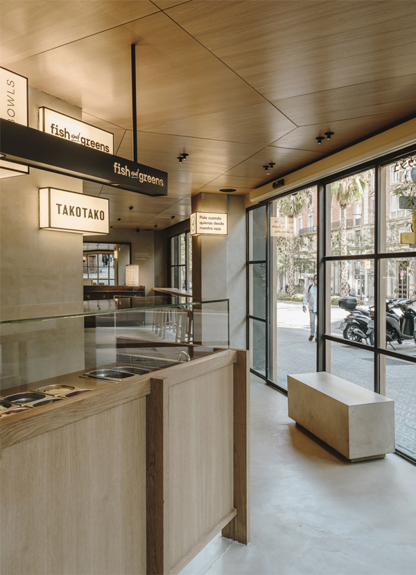
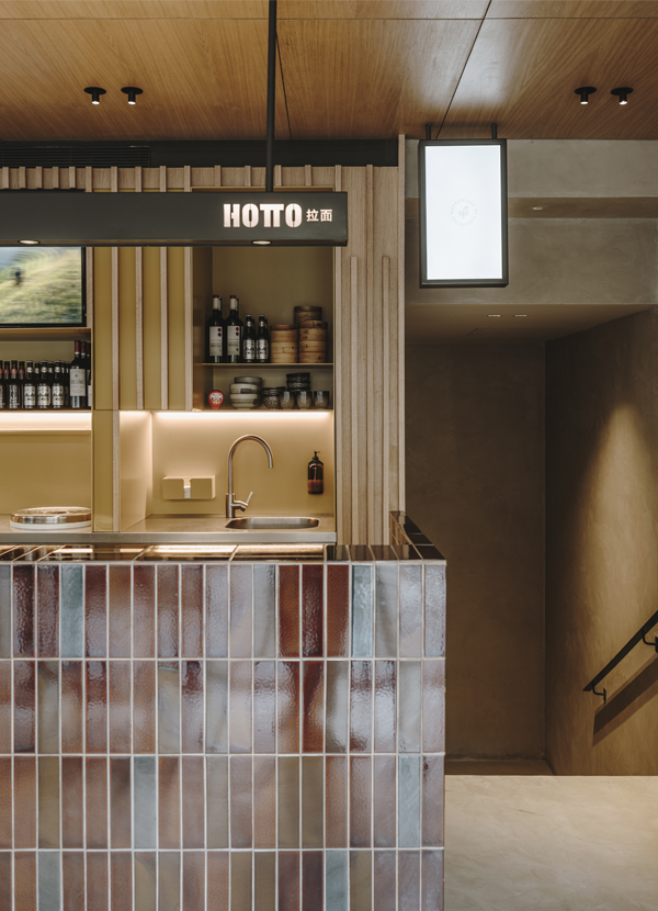
From functional and experiential needs, the idea arose to design a common space with warm oak wood ceilings, microcement floors and walls, and kitchens facing outwards. The back wall of the cooks is clad with vertical wooden slats that integrate workspaces, washing, and storage areas. This wall also includes details such as a custom-designed iron piece of furniture, which organizes and dispenses packaging boxes to streamline the cooks’ work, and each area is painted in its corporate color to identify them quickly within the overall finish.
The circulation of cooks, delivery drivers, and customers is resolved through two separate entrances. One for the delivery drivers to collect orders that run behind the furniture of the various kitchens and another for customer entry.
Right upon entering the premises, the most emblematic counter stands out, that of Sushifresh, made of solid wood stained black.
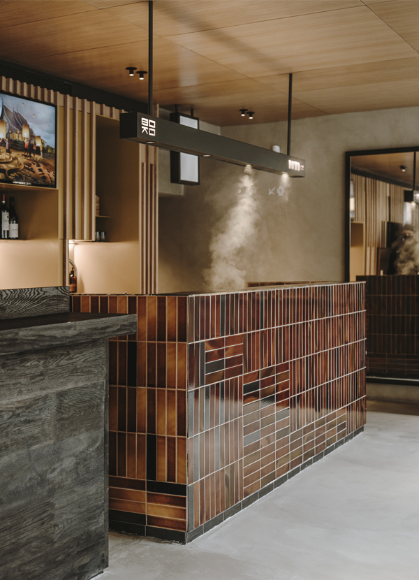
Next to it is the Boko Hotto piece of furniture with an Asian inspiration, made of handmade tiles covering the entire piece of furniture, custom-made, in different warm tones, terracottas, caramel, and browns with a touch of the 1970s.
We worked with a wealth of noble materials such as woods, stones, and iron, combined with refined volumes and shapes to achieve a functional aesthetic, without added or superfluous decorations.
The organization and functionality of food preparation are optimized, and a custom-designed dividing shelf separates the hot kitchen area from the rest of the open kitchens.
This stainless steel piece of furniture is the central axis of the premises and serves to receive all orders waiting to be delivered. Special drawers are designed to thermally insulate the food so that it is preserved before being delivered to the customer.
In the center of the premises are the Fish&greens and Rainbowls counters with a proposal for vegetarian food, designed with a fresher and more youthful aesthetic, made of natural oak wood.
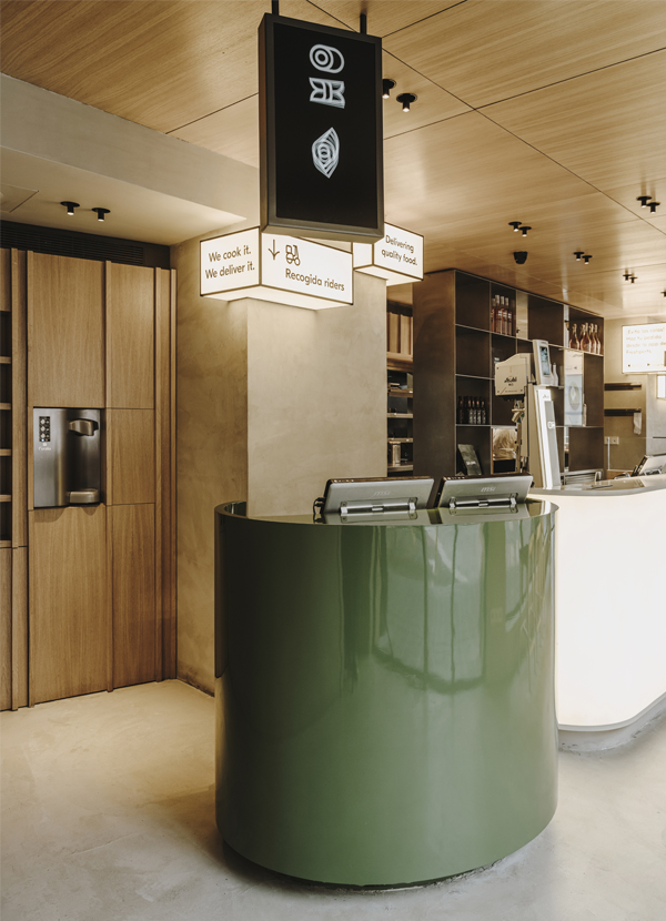
The dynamism and versatility of the counters are complemented by the cylindrical counter, lacquered in green for delivery drivers to collect orders. Next to it, the payment and beverage counter, made with a translucent fabric that allows light panels to backlight it, making it a visible attraction from the other side of the street.
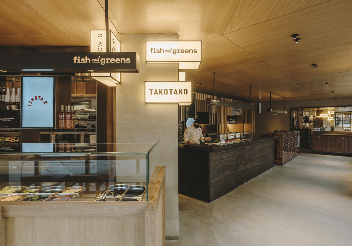
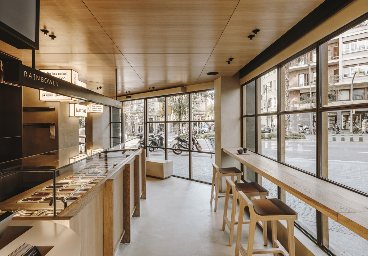
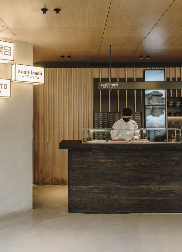
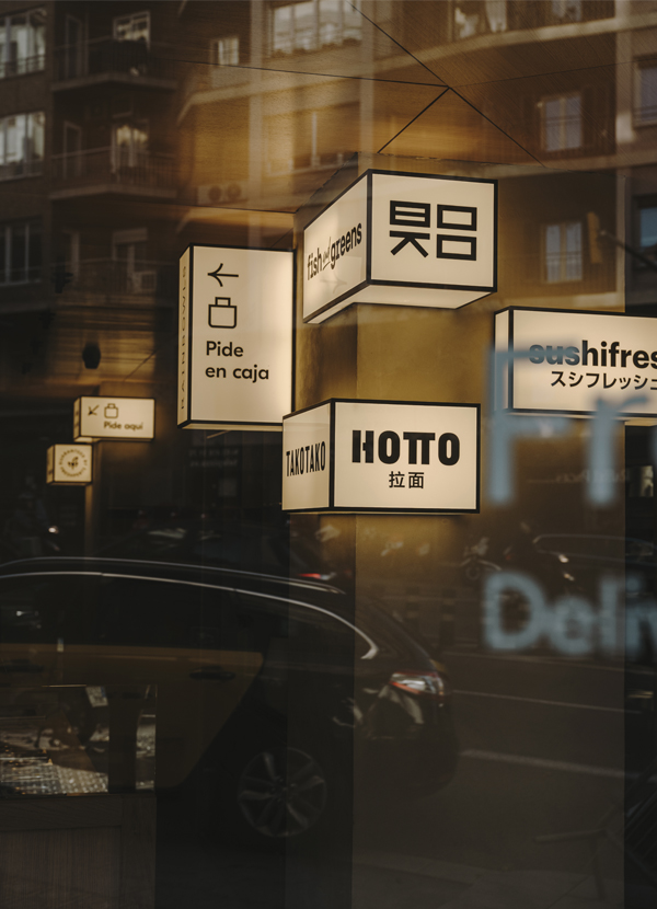
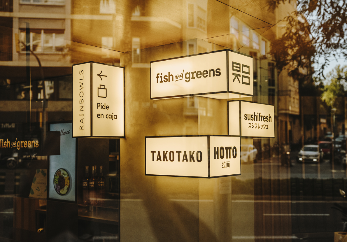
Lighting design has been very important to provide a more nocturnal and enigmatic atmosphere during the renovation of the Sushifresh restaurants for Freshperts. In order to divert attention from large pillars that appear in the center of the premises, they are decorated with asymmetric light boxes inspired by the major cities of Asian countries, which serve as communication supports, helping the customer experience in the space.
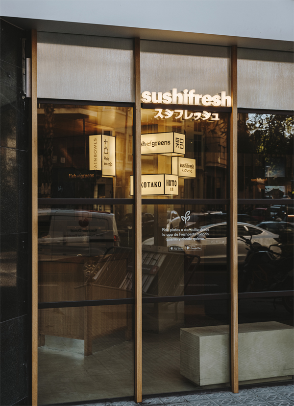
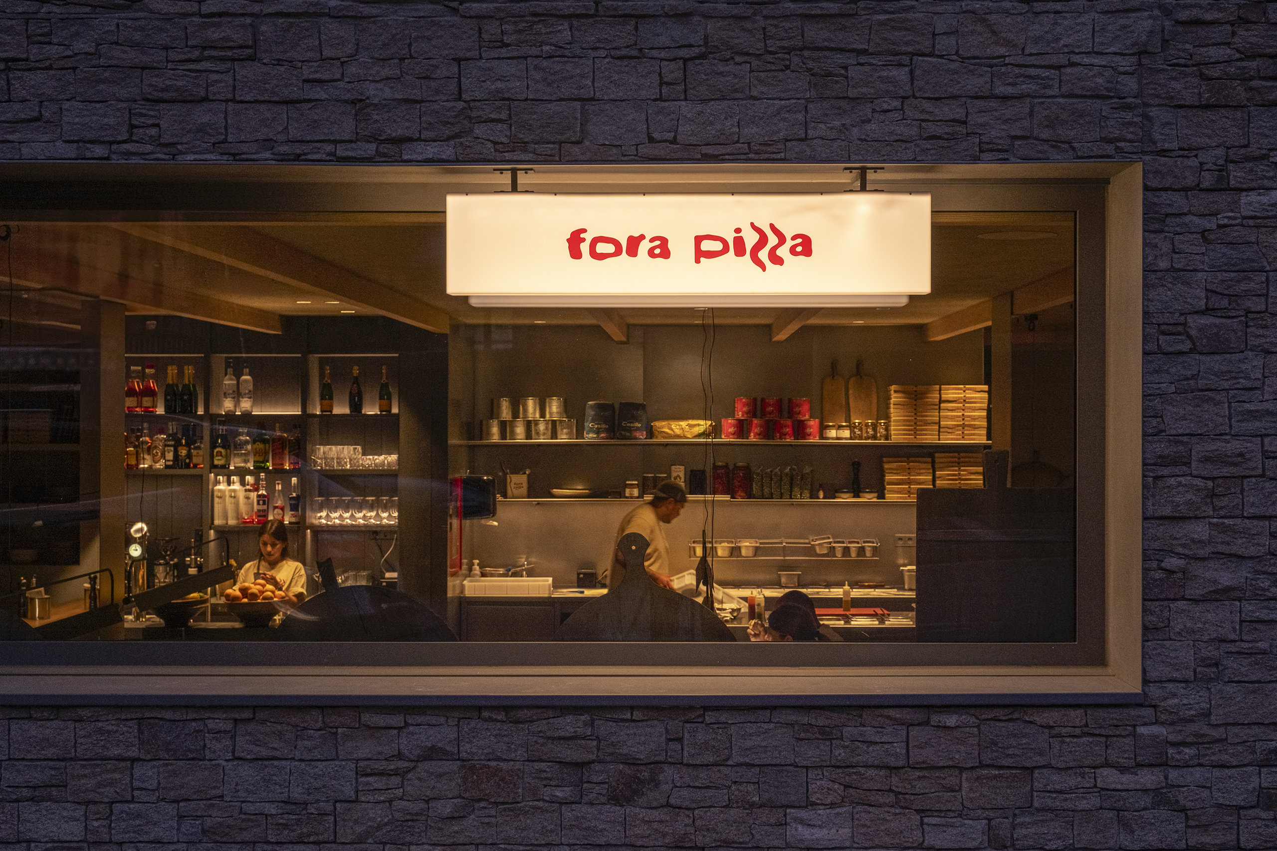
The signage on the facades of the various restaurants is also taken care of. Each one, with its brand seal turned into cut-out letters emitting light, is distributed along the facade to attract the attention of passersby, blurring the separation between the exterior and interior.
Explore more restaurant projects designed by Sandra Tarruella Interioristas.
