Puro Market restaurant design, the main purpose is to create a cozy space that becomes a meeting and leisure point for local residents, following the slow food philosophy. The owner aims to give this new restaurant in the center of Borken a Mediterranean touch to generate a relaxed atmosphere and evoke memories of holidays in the South.
The team at Sandra Tarruella Interioristas, along with Núria Martínez, Blanca Comín, and Alex Vila, drew inspiration from images of markets from around the world, especially those with Mediterranean influence.
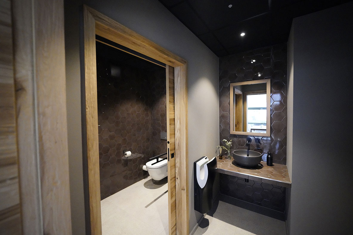
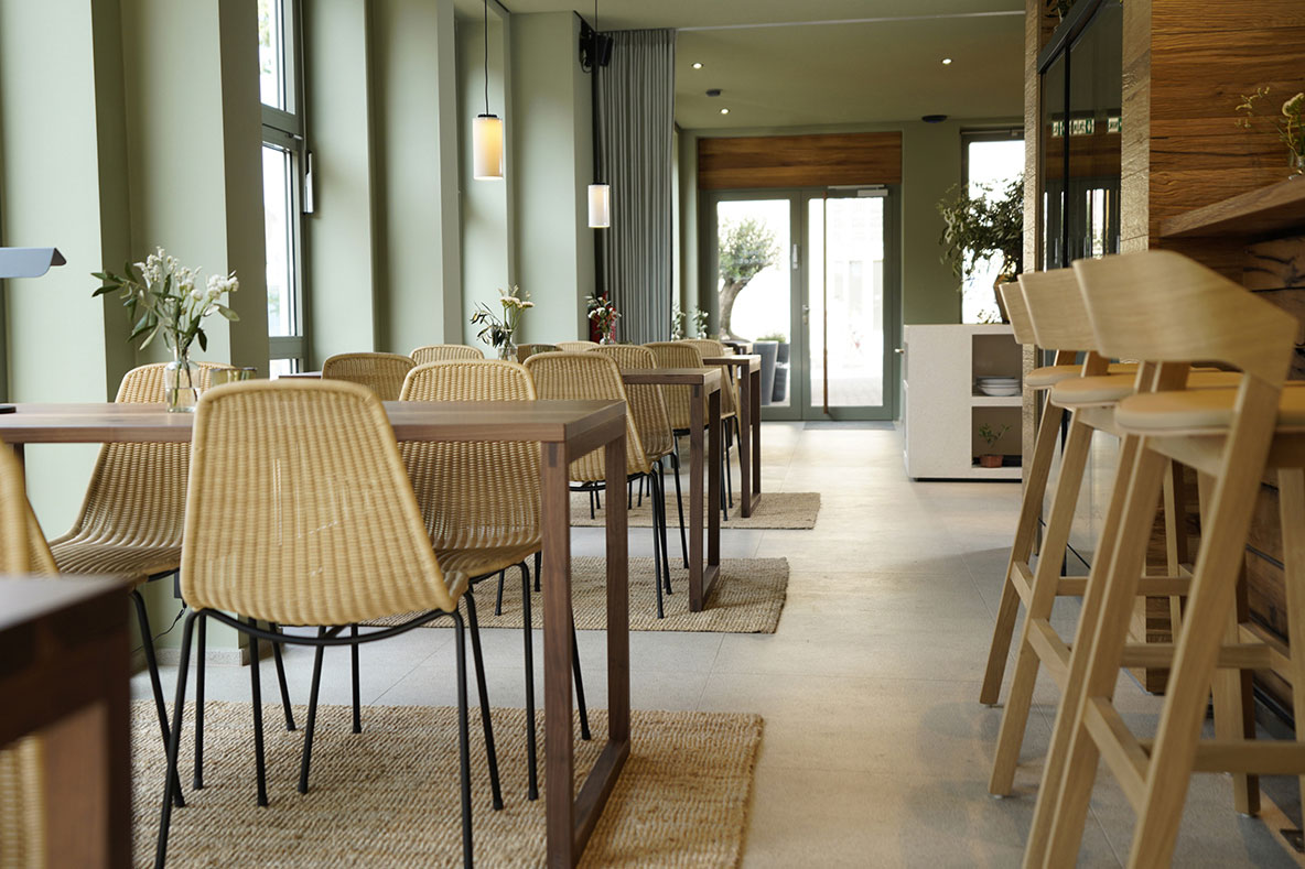
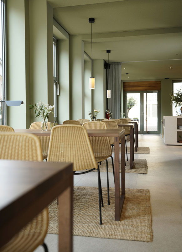
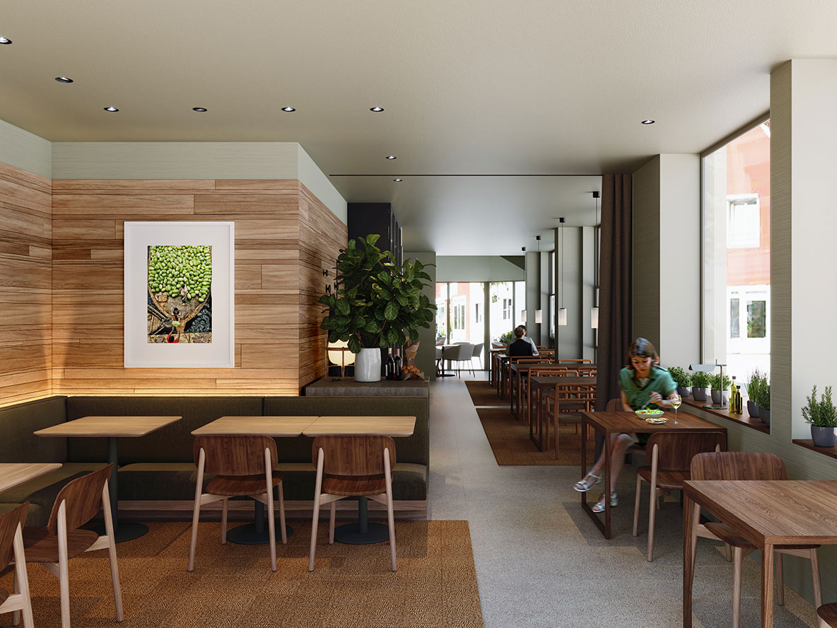
During the renovation, noble materials and natural colors were chosen to support the owners’ slow philosophy, using a lime paint in a greenish tone for the walls, natural oak wood, and a stone-like flooring to create a warm and pleasant atmosphere throughout the space.
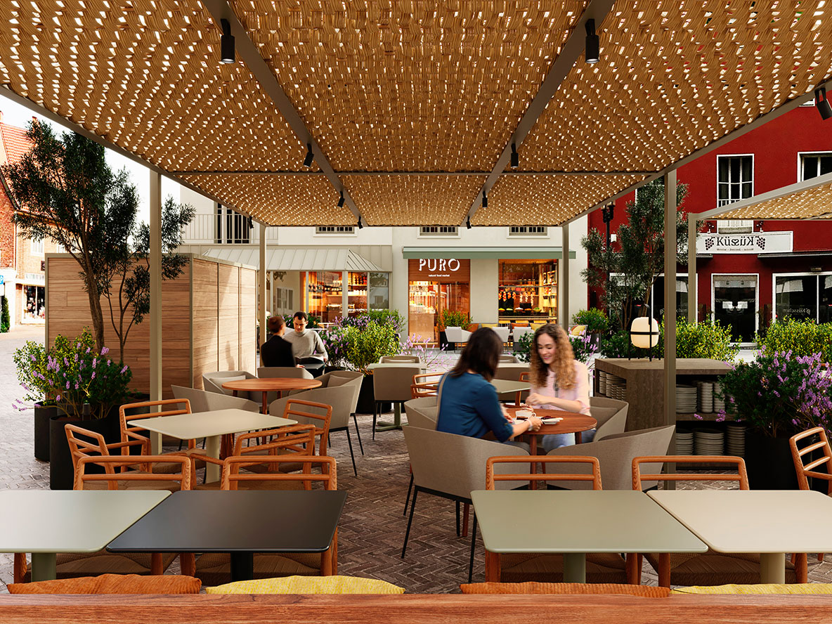
Despite being a long and narrow venue, it benefits from plenty of natural light thanks to its large windows overlooking the city’s two main squares, creating the feeling that the venue opens up to the outdoors. Additionally, covered terraces with pergolas were projected in both squares to expand the restaurant’s capacity.
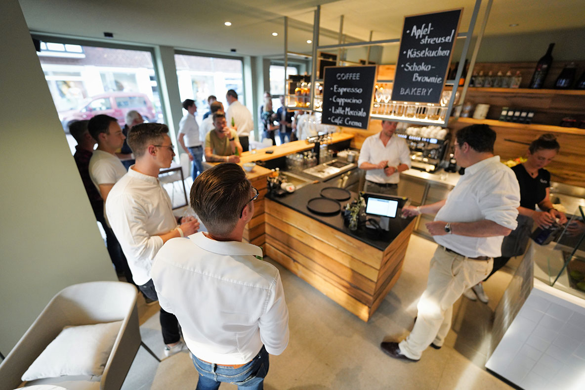
The design of the Puro Market restaurant incorporates oak wood counters for the different types of cuisine and an exhibition area for unprepared products. A large oak wood shelf acts as a distinctive element in this area.
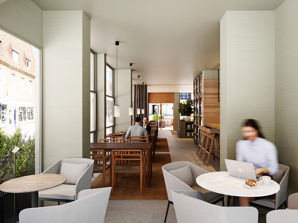
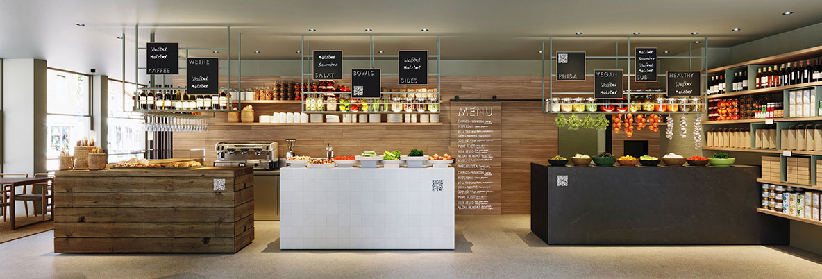
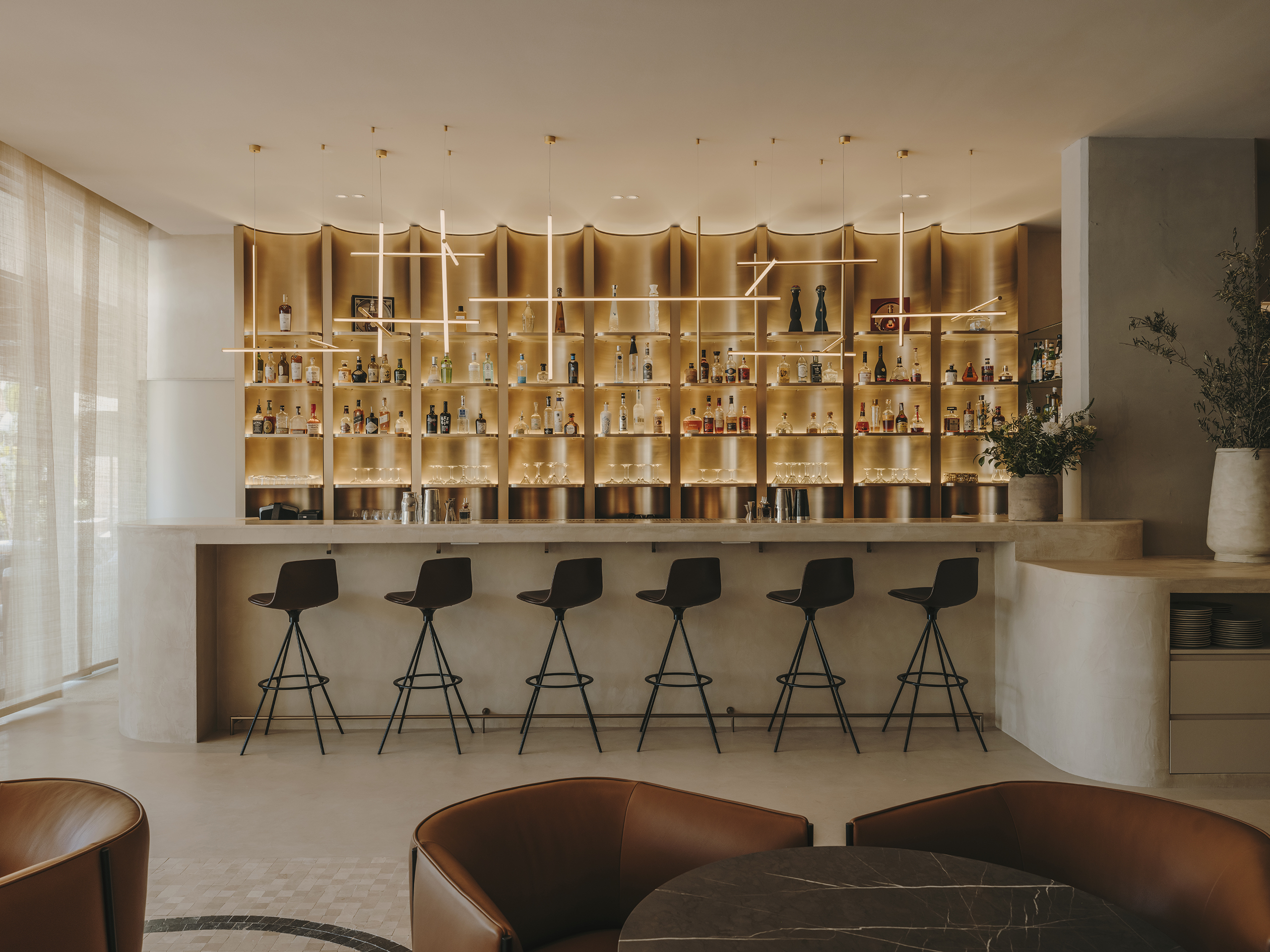
The furniture layout aims for versatility and movement in the space, using small bars with stools, a glass-enclosed greenhouse, rectangular walnut wood tables, and a bench in the dining area. Additionally, communal tables with benches were projected on the terrace to create continuity between the interior and exterior.
The design of the graphics, tableware, and other elements was also carried out by the Sandra Tarruella team, seeking a natural and casual aesthetic in line with the restaurant’s concept. The creative direction defined these details to achieve visual coherence throughout the space.
Explore more restaurant projects designed by Sandra Tarruella Interioristas.